

Lost in the Labyrinth: Production Designer Jeremy Hindle on Deepening the Designs in “Severance” Season Two
Season two of Severance managed to do the impossible—it justified the historic wait that fans had endured. It delivered a deeply satisfying mind-bender that answered plenty of season one’s pressing questions while leaving more than enough mystery for season three. In the frighteningly real sci-fi show created by Dan Erickson and directed by Ben Stiller, the scale of drama, conspiracy, and fear spreads across a range of new environments, much like a disease manufactured by Lumon Industries. Production designer Jeremy Hindle (Zero Dark Thirty) and his team created new sights and sets that took us deeper inside Lumon’s rococo workshop and well beyond the confines of the creeptastic corporate purgatory.
In the latest chapter of the Apple TV+ show, Mark’s (Adam Scott) innie and outie unlock more questions about himself and his employer, as well as the company he keeps inside and outside work. Hindle had the joy of crafting new environments and revealing greater depths of the innie’ and outies’ lives. Season two masterfully deepens fans’ understanding of the mystery the characters are enduring while keeping more than enough in the dark for further exploration.
Hindle describes the process of creating these new sets as pure play, often in reference to the film Playtime. “It’s not just the aesthetic,” Hindle told The Credits. “It’s just that they played. We got to make theater, art, all in a television show shot like cinema.” Hindle breaks down the challenges and joys of creation in season two.
There’s usually a contrast between the innies and outies’ lives, but Burt’s (Christopher Walken) homelife is artful in a way similar to his innies’ art-centric gig. How was it decided that Burt’s innie and outie were closer in aesthetic compared to the rest of the ensemble?
I think that’s the beauty of Burt’s [home]. The interiors are the easiest. Exteriors are hard because we don’t want to give away too much. You have to do a lot of VFX. When Burt is in the phone booth, there’s a ton of VFX work to make him look like he’s in this black space. Since it’s on location, you see a little bit of the bridge, but we really paint over it to bring it into something mysterious, that you can’t find anywhere. For Burt’s interior, what’s interesting about Burt is that I don’t know how many times that dude has been severed. That’s what I love about him – I don’t really know. You could say that about any of them. Burt has probably been there the longest, though. We want to show that, because he’s been doing it for a long time and has this lifelong partner, he’s kind of really living the best of it.
We finally learn more about Gemma (Dichen Lachman), seeing her earlier life with Mark. How’d you want to communicate their love through their homelife?
It’s a hundred percent David Schlesinger, the set decorator, and Jess Gagné, who shot and directed it. We all worked closely on them, being both professors. There’s so much detail in the paperwork and the posters. You really get what they’re studying. The vibe of the house is that it’s a professor’s house that they’re given while they teach, so some of the stuff probably came with it. They have a really nice space. You get to bring all those colors and warmth into it. It was really just to make you feel like how in love these people are. Basically, she was abducted. It’s unbelievable. When I thought about it sometimes, like, oh, she just disappeared, but no, they really had this beautiful life, and she was ripped away from it by this company. It is horrific.
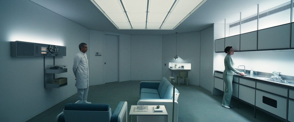
Those brainwashing experiments at the beginning of her abduction are especially horrific. How’d you want to make those Lumon spaces unsettling? Did you make them tighter sets than usual compared to most interiors?
You start to play with angles and make things that are quite not what your brain understands – every angle’s a little bit off. Everything’s a little bit broken, too. Like, the carpet is safe, comfortable, and practical, but also, the table she sits at is a triangle. It’s the sharpest point coming out to you. Everything’s just a little bit violent – but again, practical and comfortable. Also, low ceilings always help there. We play with a lot of low ceilings.
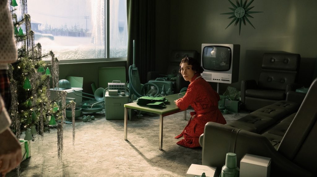
For example?
The Christmas room was probably the most fun set any of us has ever done. It was hysterical, and the spaces were really playful. You’re making a Christmas room where she writes letters and thank-you cards, and everything in the room is the same color. Literally, every object is 3D printed by them. Everything they do is so fabricated, foreign, and bizarre, yet real.
What about Harmony Cobel’s (Patricia Arquette) journey to her past? How’d you want those sets to provide new insight into her psyche?
The main thing is that Lumon is a pharmaceutical company at heart. Whether it was Ether or something else, they’re like a plague. They move from place to place and suck the life out of it. We spent a lot of time at VFX on all those exterior shots. Every building has a sense of decay, which we control. The whole image is controlled to show where she came from, and that her only salvation was leaving. Because she’s so embedded in Lumon, you keep going through the process until you’re disposed of, which she is. Now, when she goes back, it’s powerful, especially in her aunt’s house.
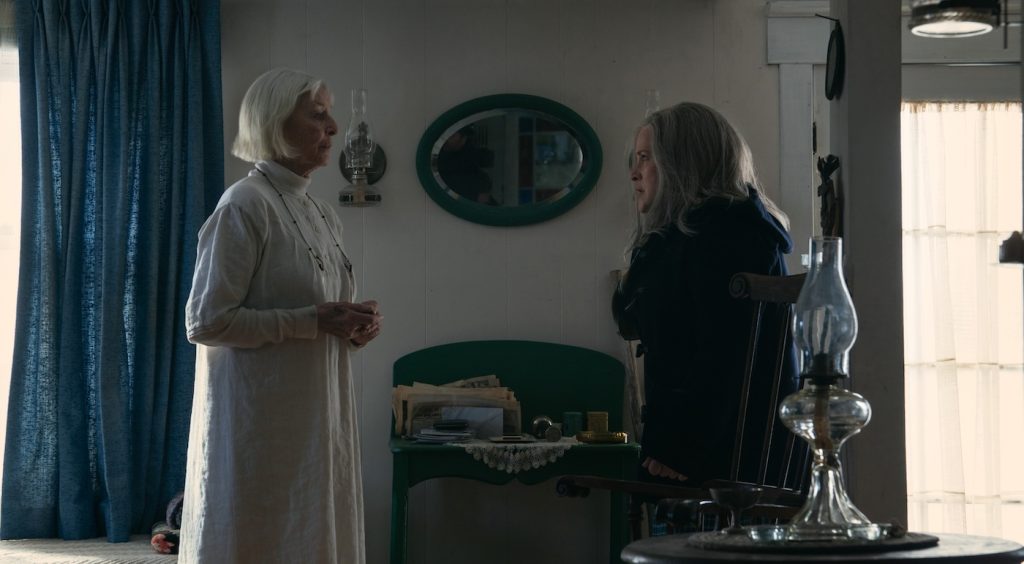
What did you want that space to say?
In those scenes, I love how beautiful the place is and how hauntingly creepy it is. The wardrobe sells it. What Aunt Sissy wears is amazing. Even though we don’t talk about what the cult is, there’s the power of the cult. Putting an image of her in that long white gown in those spaces, seeing how everyone is messed up from Ether and decaying, you can’t help but feel sorry for Harmony. You oddly fall in love with her.
Have you considered what Mr. Milchick’s (Tramell Tillman) home looks like yet?
Oh, I know what that looks like. I already scouted the concept, and we’ve drawn it up. We already know what it is.
How many years of material do you have in mind for designs?
I have a folder of bonus things that we’re always trying to slip in. We’ve designed sets from Season 2 that might be used in Season 3. Sometimes Dan will have an idea, and we’ll explore it for a month, but then it doesn’t make it into the show that season. I had millions of ideas from season one, because when I first met with Dan, I asked, “How far underground does this go?” And he said, “Oh, miles.” My head exploded with ideas, so you start to have all these different ideas of where you get to go with five years of percolating and playing around.
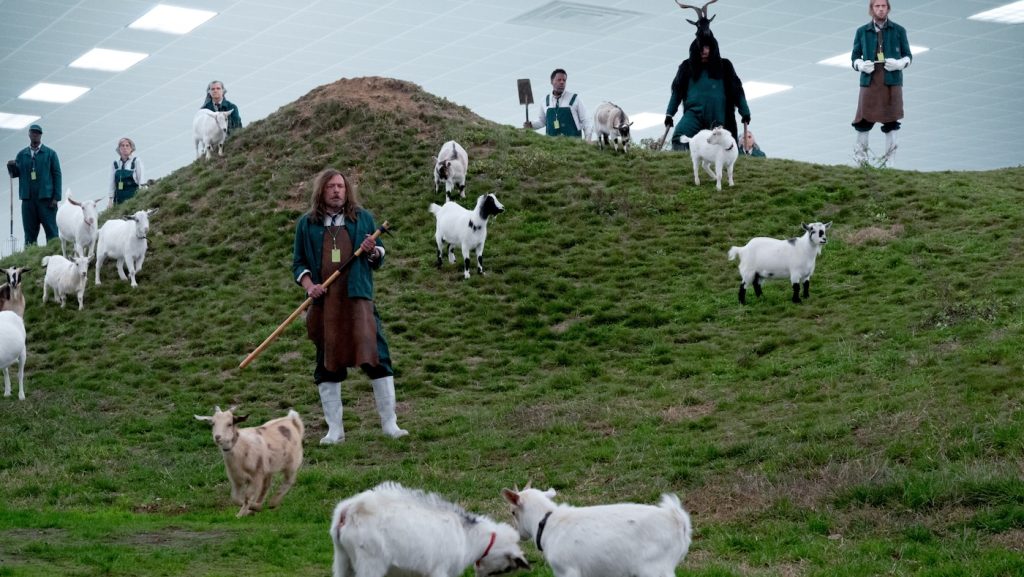
One of the most surreal aspects of the Lumon office is the goat department. Where did your mind and instincts first go for that set?
When I read the word “Mammalians,” instantly I knew. That’s what I love about Severance: that Danny writes these worlds that I get to dream up. It’s a football field underground with rolling hills. I get to play with that. That was always in my head – that this is going to be massive ,whenever we get to do it. There are certain things that just resonate with me, why they are the way they are, because we play with scale all the time.
For more on Severance, check out these stories:
How “Severance” Cinematographer David Lanzenberg Captured a Chilling Corporate Nightmare
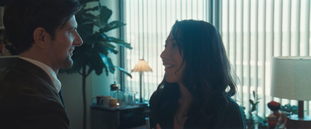
Featured image: Britt Lower and Adam Scott in “Severance,” now streaming on Apple TV+.

