“Here” Production Designer Ashley Lamont on Building an Entire Life in a Single Room for Tom Hanks & Robin Wright
Robert Zemeckis’ new film Here is based on an unusual concept: the entire movie takes place in one location, and the camera never moves. The living room at the center of the film is set in an early 20th-century house in New England, although as the story revisits different eras, the set also transforms into a forest and a colonial-era drive, both of which represent the same site before the house’s construction in 1907.
But for the most part, we’re in a living room that touches almost every decade from the early 20th century to the present as different families move in and out, raise their children, and encounter joy and tragedy. The story focuses on one family in particular: the Youngs, starting with Rose (Kelly Reilly) and Al (Paul Bettany), who buy the house at the end of World War II and wind up sharing the home with their oldest son, Richard (Tom Hanks) and his girlfriend, Margaret (Robin Wright) when the couple become teen parents. Much to Margaret’s chagrin, she and Richard and their daughter put down roots in Richard’s parents’ home, establishing a multigenerational setup conveyed as much by Margaret’s slow takeover of the space as by the decades that appear on the actors’ faces.
In addition to the Youngs, there are the house’s buttoned-up first occupants, Pauline (Michelle Dockery) and John (Gwilym Lee), followed by the happy-go-lucky Lee (David Fynn) and Stella (Ophelia Lovibond), who move into the charged space in 1925 and stay on until 1944, when Lee, the inventor of the Laz-E-Boy chair, makes it big. And in the present day, Helen (Nikki Amuka-Bird) and Devon (Nicholas Pinnock) grapple with the Covid pandemic and raising their son, Justin (Cache Vanderpuye), to stay safe in the face of police violence.
For production designer Ashley Lamont, who previously worked with Zemeckis on Pinocchio, getting a single room right through the ages took meticulous planning and precise detail work across doubled sets. We spoke with Lamont about the unusual process, from centuries of timeline maps to recreating identical sets:
Did you start with a particular time period and work your way out from there?
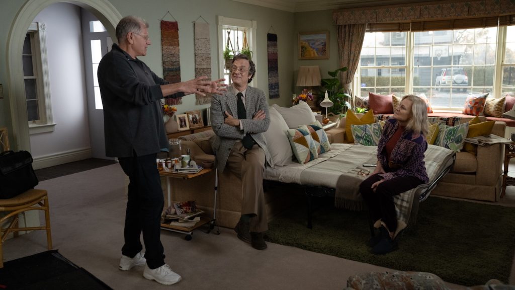
It’s very important to lock down what Bob and I call the constants of our show and the relationship between them — them being the colonial house in the background, the position of the window, how that colonial house interacts with it, and our camera. Once we locked them in, we could only move on to any specifics. Then we could jump into the key elements we come across, the whole exterior outside of our window and room, and what that looks like before the street and house arrive. Then we started moving into the overall design of the room, which, being 100 years old, gave us what era we should be building it in. Once we had that laid in, we moved on to the general looks of each family, their colorways, and the positions of their furniture within the same space. Obviously, we knew most things couldn’t move — the fireplace, the window, the door. So, we tried to come up with unique ways to address each era, which would complement said era and allow fluidity throughout the scene and space.

How did you plan one look as it related to another?
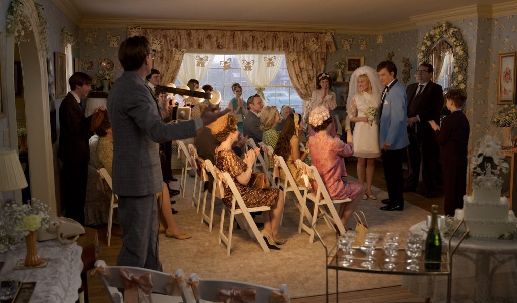
We started with the Youngs, Tom and Robin’s family. We spend the majority of our time with them. That brought about a family timeline that evolved into a whole timeline for the entire film. We had a huge timeline, which would literally go all the way around my office, mapping out all these periods. So you could look at a block or an era with that family or spanning between them and assign a different look or colorway. Once we’d landed on some key elements, we broke down what should be specific to that era, which immediately gives you the sense that you’re in the Sixties or the Eighties. It was quite fun trying to come up with clear, decisive, definitive looks for each family and era, getting them all on the wall, and mapping your way through the entire show.

How did you manage to coordinate all the different objects for each era?
Our timeline for the entire show grew into timelines for just about every single item that would come and go in the room. Obviously, sofas come and go, and fashion and shape change and you have to keep up with that. So we ended up having timelines for everything: a timeline for a couch, timelines for armchairs, televisions, and magazine racks, knowing you need to understand the complexities between all of those items.
What’s the set like for a project like this?
We actually had two rooms built on two different sound stages, both absolutely identical. The reason we had two is so we could we could turn around one to a different era while shooting simultaneously on the other stage. That allowed us to get through our shooting day. On paper, if someone said to you, oh, we need two of the sets, absolutely identical, [you’d think] absolutely, no problem, and start building it. And to your eye, it looks absolutely identical, but once you get the camera on, and you start fading one in and one out to start to try and see where those imperfections are, you very quickly realize that a millimeter out here or there, you can really see. We were quite particular about making sure everything lined up all the way down to the smallest details like an architrave turning around the door properly. It was quite something.

Did you keep the eras separate by assigning each family a colorway?
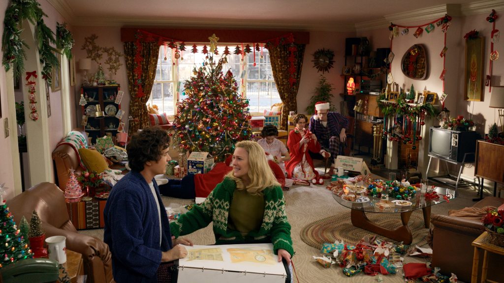
I suppose in my head I did. In the early years, everything would tend to be quite dark. So we have this dark wood wainscot moving around the bottom of the room and a dark red wallpaper, quite reminiscent of the time and fashion. For whatever reason, I always associate the Youngs’ colorway as being pink. Although they have many different looks throughout their lifespan there, the room that I could relate to the most was the pink room with the brown sofa. We might have even had both of our sets dressed in the same way for a short time, sharing a few items of dressing here and there.
How did you source items from different eras?
The film is set on the East Coast. And that clearly means that everything has to be American, quintessential Americana. We wanted to make sure we had the biggest scope of choice we could possibly get, so we ended up sourcing a lot of stuff in LA and shipping it over here. Our set decorator, Anna Lynch-Robinson, and her team put together a wonderful lot of stuff that was brought over that really meant you could be immersed in this sort of Americana-wonder.
How much was already on the page as you started working?
I always felt like Bob knew exactly what he wanted. So, it was very clear both what was on the page and from meeting with Bob that specific things had to be there, be it a model of car in our exterior driving past the window, or the TV, or some small item of dressing. And so, actually, being able to take what you got in the script became very easy to source. It was quite remarkable how much Bob could draw from his memories and life experiences through the years and eras. His vast experience working in the movies meant his knowledge was just impeccable.
Here is playing in theaters now.
For more upcoming films from Sony Pictures, check out these stories:
Ralph Fiennes Says That Danny Boyle’s “28 Years Later” Was Shot Partly On an iPhone
Swing Time: Tom Holland Says “Spider-Man 4” to Start Filming Next Summer
Featured image: Tom Hanks and Robin Wright star in HERE. Courtesy Sony Pictures.


