Lights, Camera, Recreation: “Saturday Night” Production Designer Jess Gonchor on Bringing “SNL”‘s Studio to Life
Production designer Jess Gonchor felt right at home on director Jason Reitman’s film Saturday Night, a pulsing recreation of the moments leading up to the first-ever broadcast of Saturday Night Live, which aired on October 11, 1975. Similar to Reitman, who fulfilled a dream of being a guest writer on SNL for a week on Season 35, Gonchor also worked in sketch comedy, so he knew “the inner workings of what this is and what it needed to be.” What that meant for the two-time Oscar-nominated production designer was that everything had to be interconnected.
“I do a lot of things that are nostalgic to me,” says Gonchor, whose list of credits includes No Country for Old Men, True Grit, Hail, Caesar!, and Little Women. “But this was really special to be able to go back and make it about scenery.”

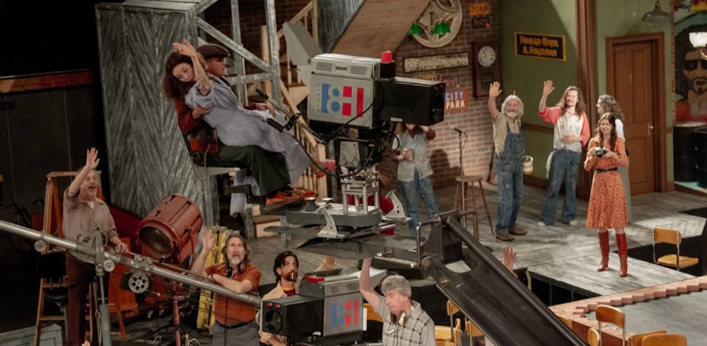
In turning back the clock to recreate the now iconic Studio 8H, Gonchor found the original blueprints for Rockefeller Center to fully conceptualize the engineering of the original floorplan. The research informed the designs that would be built on soundstages in Atlanta, where Reitman and cinematographer Eric Steelberg would shoot 360 degrees with a pace that didn’t allow for any holes in the set builds.
Below, Gonchor shares with The Credits how he designed the 1970s period sets, how pace influenced his work, and the one thing they had to shoot in New York.
This is your first project with director Jason Reitman. What made you want to be part of this project?
A lot of times, I’ll get scripts, read them, and do them for many different reasons, but this one, as soon as I started reading it, I was like, I actually think I can make a difference in this movie.
How so?
It’s beyond up my alley. I have spent a lot of time in the exact situation of trying to get a show up and running that had to launch, either open a curtain or turn on a camera at a certain time. I really felt connected with the material more so than I have on any other project. So as I am reading it I’m seeing all these things unfold and getting more and more excited about it.
In designing Saturday Night, did Reitman suggest any specific themes or ideas to guide your approach in prep?
Jason was a big part of the process. This got started before the writer’s strike, so we started a little, and then we were down for several months with the strike. But all that time, I was noodling away at what I thought it could be, so I had a really long runway to figure things out on my own time. We both agreed that we wanted to honor what was there historically but put our own little twist on it, which allowed for the functionality of the script that he had written.

When you say functionality, are you referring to how there’s this kind of real-time feeling to how the story unfolds?
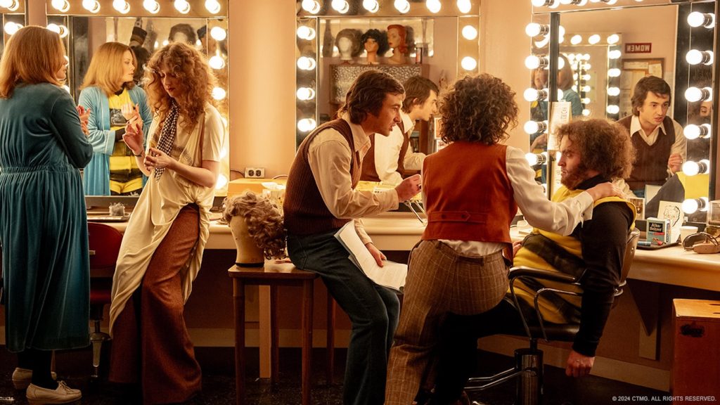
Yes. I think the best note that Jason gave me was, he said, listen, we’re going to be moving through these environments very quickly, so I want to personalize each one so nobody’s confused about if they’re in hair and makeup or if they’re in wardrobe, or if they’re editing, the control room, which on paper seems academic and easy. Somebody’s going to go into a control room and see monitors, but in some of these environments, you really fly through pretty quickly. So he wanted to make sure that the production design told the story of just how lost you could get in the environment. He leaned on me a little bit to create chaos through the scenery and how that can build tension.

How did that real-time feeling of the story affect your approach?
First of all, you don’t get to do a movie these days where there are zero visual effects in the production design. So the whole thing was built on a stage where the camera could look anywhere, and it all had to be ready on day one of filming because they were flying through all the hallways, the rooms, up the balcony, up to the ninth floor… all those things. So it all had to be ready at one time. We really studied it through a couple of physical models that we made in prep, and then Jason and Eric Steelberg, our cinematographer, taped it out on the stage. It was a very theatrical approach, which is the world I come from anyway, so I really thought of it less as a movie set and more of an environment for theatrics to unfold.


You taped out the entire set design?
Yes. It was a big stage, like 40,000 square feet. We taped out the stage from the elevator to the back wall. Then Jason and a couple of people grabbed a script, and we all walked out of the scenes to make sure the timing was right. All of the movement was calculated and timed to see how long it would take to get from stage left to stage right. It let him figure out how the cameras would flow, the pace, and how all these things came into play while figuring out the sets.

You can tell there is a real harmony between the production design and the story, not just a string of locations the characters visit.
They really lived in it because there was nothing fake about it. We couldn’t take anything for granted as far as what the camera was going to see, and that was a good thing. I think that’s really the difference, and it really inspired the performers and the crew to be in that environment.

It couldn’t have been easy to recreate SNL‘s Studio 8H, one of the most iconic stages in the world, yet it feels like we’re seeing it here for the first time. How did you pull that off?
Most of my movies I try to make something stand out in the environment whatever it may be but in some ways it was actually different on this film. I think it was William Eggleston, the photographer, who started framing things in photos so people would look around the photograph and not just stare at the center of it. I didn’t want to take anything away from the performances, but I wanted to create an environment that people could look around the screen to absorb.
Besides shooting in Atlanta, production also shot in New York, right?
Yes, we only shot for two nights in New York outside for the marquee and on the skating rink. We didn’t get all the work done on the skating rink, so we had to recreate some of that on stage in Atlanta as well. But even if you had all the money, you owe it to the audience and everyone involved to shoot outside the marquee in New York.
The costumes, hair, makeup, and shooting on 16mm take us back to the 1970s. What was your approach to the 1970s palette?
The costumes, the hair and makeup, and everything transports you to that time and place right away. For me, I was trying to get into the history of that studio. 30 Rock was built for Arturo Toscanini and the NBC Symphony Orchestra. It was a recording studio before it became a TV studio, so the big picture of Toscanini outside the control room is no accident. It was meant to be as if Toscanini was looking at Lorne Michaels every time he went into the control room. It was this idea that it was bad enough that TV had taken over radio, and now, this show where he performed as the maestro is taking over the stage. There are a lot of those types of things in the design—I always tried to make it feel timeless.
Saturday Night is in select theaters now.


