
“Manhunt”: A Visual Journey Through Time with Graphic Designer Gina Alessi
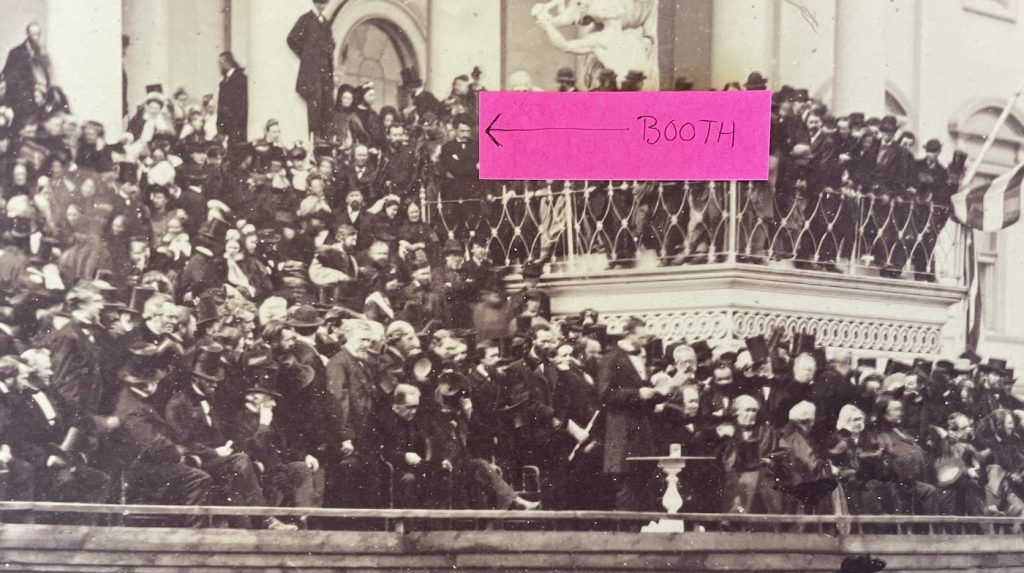
Manhunt graphic designer Gina Alessi had a significant assignment when she was brought on board Apple TV+’s stellar limited series about the hunt for John Wilkes Booth (Anthony Boyle) in the aftermath of Abraham Lincoln’s (Hamish Linklater) assassination—among other historical recreations, Alessi was tasked with making sure Abraham Lincoln’s deathbed at the Petersen House next to the Ford Theater, down to the pattern on the blanket, was period perfect. It was not an insignificant challenge, even if most of us would be hard-pressed even to name the place Lincoln died (show of hands for those of you who thought he died at Ford Theater—I’m raising mine), let alone what the wallpaper looked like. But it was Alessi’s job to make sure that every detail was period-perfect, including every object you see on screen, from antique maps to newspapers to telegrams, canvas banners, police wagons, store signage, and all the scraps of paper you see scattered around the bustling War Department, the HQ for the titular manhunt.
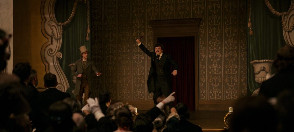
The details piled up in the telling of the 12-day manhunt, tracking an effort led by U.S. Secretary of War Edwin Stanton (Tobias Menzies), as Stanton’s allies, including Detective Lafayette Baker (Patton Oswalt) and a maid, Mary Simms (Lovie Simone) with intimate knowledge of Booth’s movements, help him ferret out a conspiracy that’s larger than one delusional, murderous former-actor.
Alessi and the production team, including Sarah Stimpson and David Tousley, relied on local vendors throughout Georgia to design and dress the show, including Speedi Sign and Graphics in Savannah, Dangling Carrot East in Atlanta, Saga Boy Studios in Atlanta, and more. We spoke to Alessi about her hunt to create or find the perfect pieces to give Manhunt its stunning verisimilitude.
How’d you first get involved with the series?
I worked with production designer Chloe Arbiture on Drunk History, which was such a good kickstart for my career because you have to do these sketches for all these different time periods, and the best boot camp for a graphic designer getting into film because you’re rapidly progressing through graphics. I did medieval graphics one day, 1980s graphics the next, and futuristic graphics afterward. Then Chloe landed Manhunt, and she brought me on. It was our first really big period show. I was super excited.
Do you have a favorite time period?
A lot of people ask me what my favorite and least favorite time period is, and I’ve heard graphic designers say they love the Victorian era, for example, but are terrified of any futuristic era. For me, I love the process almost more than any particular time period. I hadn’t done a show set in this time period before, but I love the process of figuring out this period. You have to immerse yourself in the script. Manhunt is set in the 1860s, and my next show was set in a video game office in the present day, completely different. For the below-the-line crew, it’s a job at the end of the day, and you take what comes at you and do your best. It’s always exciting when a job also aligns with something incredibly exciting, and that’s what Manhunt was for me.
Tell me about the filming process in Georgia.
It was primarily filmed in Savannah, Georgia, and we had a unit that shot in Philadelphia. We didn’t shoot in D.C. or Virginia or the regions where some of this stuff is located, but we did research a lot.
One fascinating element of Manhunt is how little many of us—speaking broadly for the American public here, always a good idea—actually know about the specifics of Abraham Lincoln’s assassination and aftermath, save for the location, maybe the date, and the assassin John Wilkes Booth. So, what was your brief when you came on board?
Research was a huge part of this. The show is based on James Swanson’s book, so my first introduction was I picked up the book. I read as much as I could before we got thrown into the chaos of building it. The first couple of chapters were mind-blowing for me—it was a conspiracy of all these guys, and I think the original plan was to kidnap Lincoln and all these different cabinet members—to me, it kind of seemed like Booth was making things up as he went.
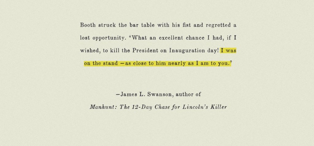
A lot of the book is written from his words in letters and people’s accounts, and the humanity of these characters really comes through. Booth came across as this sniveling, whiney, entitled, and very emotional guy.
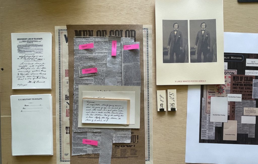
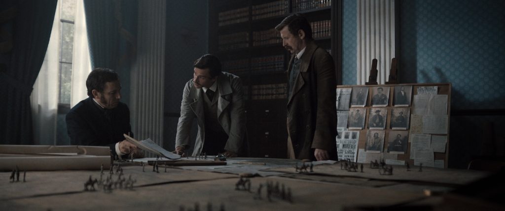
The performances were really great. For graphics research, it’s like each of us researches our specialties. So, the art department might research the architecture of the War Department. I would be going in with a team of three graphic designers: myself, David Tousley, and Sarah Stimpson. Three of us would be asking what pieces of paper are on the tables.
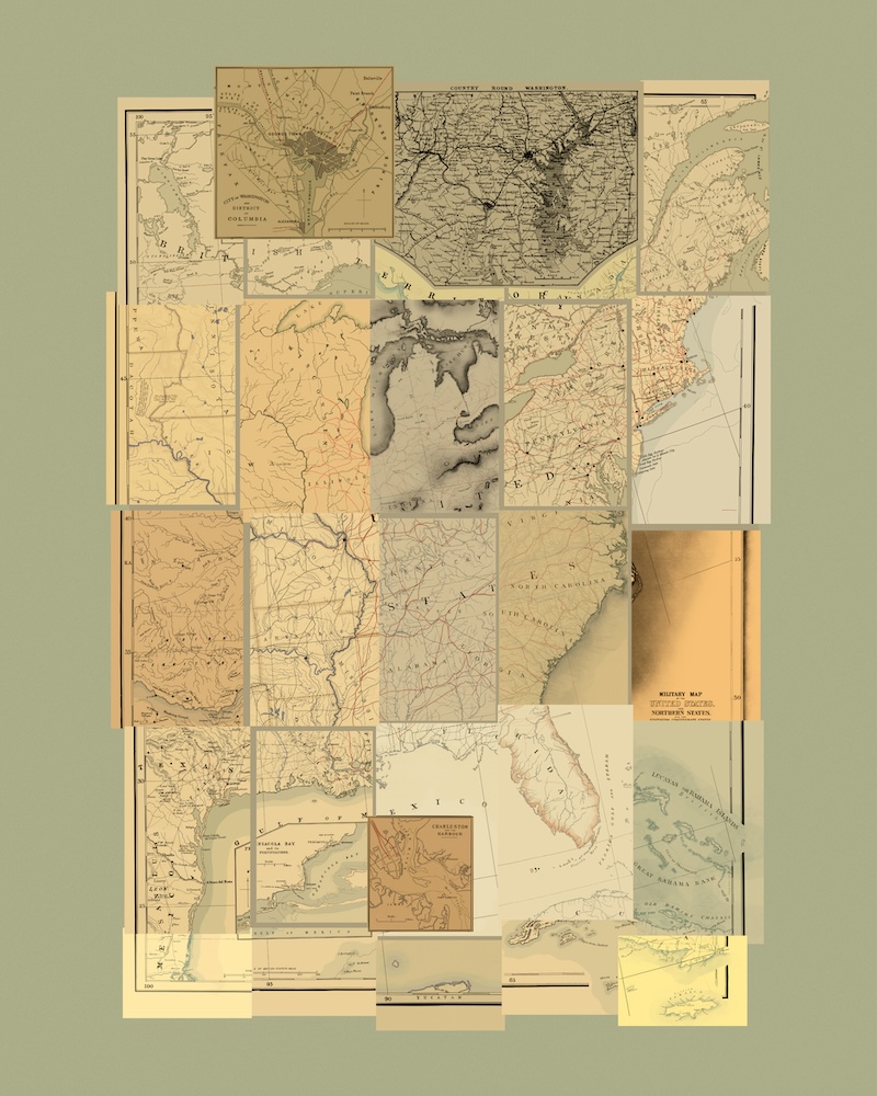
What do the telegrams look like? We called it the strategy room where they disused Booth’s whereabouts and the conspiracy, that room is covered in maps, so we had to research how maps were made at the time, we spent a lot of time on the Library of Congress site. They have an incredible collection of scanned maps and battle plans and all the things, so part of the cool thing is we got to reproduce maps from the Library of Congress because those are in the public domain, so we could resource them and reprint them and put real 1860s material into our sets. Obviously, you can’t get more authentic than that.
What materials were used in the maps made in the 1860s, and how did you reproduce them?
We noticed that sometimes we think of giant maps as giant pieces of paper where a single map is printed very big. Now we have the technology to make large-scale prints. Back then, looking at all the research, I found that a lot of it was copper plate engraving. They’d take a piece of copper, etch out an illustration of map lines, and use that plate to print it. That’s how engraving was done in those days, either with wood or copper, and they’d put ink on it and press that down onto paper. A large map would have been made up of several sheets of smaller paper because you’re not going to print a 20-foot-wide piece of copper. We made design rules for ourselves, and even though we have the capability, we’re not going to print a 20-foot-tall map of the United States. So the graphics team made a custom collage of smaller sheet maps, so when you step back and look at the whole thing, it’s the entire East Coast. We traced over real maps for that and redrew every sheet ourselves for that particular piece.
Was there any favorite piece of the show you worked on?
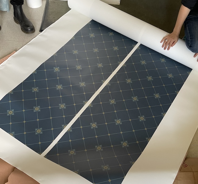
I’ve been calling Manhunt the wallpaper show. Every set is wallpaper-drenched because they loved wallpaper back then. Our production designer wanted to lean into color because when modern people think of the past, we think of this sepia tone or black and white, but when we looked at samples from then, they were so colorful. The War Department has two patterns we were involved in; the Telegraph Room is dark blue with a starry cross pattern, which I custom drew for that set. A lot of the other wallpapers are similar to how we’d go onto the Library of Congress for vintage maps; we’d find sources where we could scan actual antique wallpapers, so Sarah [Stimpson] and I resurrected these scraps, and if they had damages, we’d clean up the pattern, restore the color digitally, tile it out, and then print it and install it on the set. Now I’m completely in love with wallpaper, it’s such an interesting artistic medium.
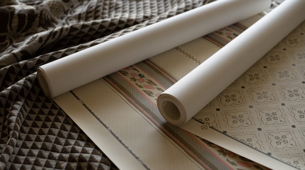
Lincoln’s death wasn’t in Ford’s Theater, which I’d wrongly assumed for my whole life, but it’s next door at the Peterson House. How did you recreate his deathbed, and specifically, the blanket that covered him?
This is my favorite project to talk about in Manhunt. It was my first day hired on the job, and the set decorator came to me and said, ‘So, welcome to the show. I just talked to this blanket fabricator that we were going to use for the blanket, but unfortunately, they say they need the print files this Friday. So I jumped in straight in on day one to that blanket. In the 1860s, photography was very new. It was a little bit tricky when you were trying to be as authentic and accurate as possible, but you only had one historical photo of the actual room, which contained the blanket and the vertical striped wallpaper. It’s an antique vintage photo, so it’s super blurry and grainy and black and white. I studied the pattern in Photoshop; this beautiful floral medallion was in the middle, with this field of geometric triangles. That surprised me because they looked so different and modern. Then, there was a beautiful floral border. So I got my iPad and redrew that whole pattern. Studying Lincoln’s death, one of the things that was really interesting was the Peterson House was like a little boarding house; it wasn’t special, it wasn’t fancy, and a lot of the men were standing around while this was going down. The opinion of the time was it wasn’t a stately place for the president of the United States to die. It was an everyman’s house, and I think that’s really interesting to think about when you’re trying to recreate something. My own little sappy addition is I picked out a flower that had symbolic meaning, an Irish flower, and I drew that into the blanket because it fit with the style. It symbolizes courage, wisdom, and leadership.
For more stories on Apple TV+ series and films, check these out:
Apple Original Films Planning Sequel to Brad Pitt & George Clooney Film “Wolfs”
“Disclaimer” Teaser Reveals Alfonso Cuarón’s Star-Studded Limited Series
“Fly Me to the Moon” Screenwriter Rose Gilroy Reimagines the Apollo 11 Moon Landing
Featured image: The wanted poster for John Wilkes Booth, created by Gina Alessi for “Manhunt.” Courtesy Gina Alessi/Apple TV+

