Best of 2023: How the “Spider-Man: Across the Spider-Verse” Visual Team Created a Mesmerizing Multiverse
*It’s our annual “Best of the Year” look back at some of our favorite interviews from the year.
When Spider-Man: Into the Spider-Verse was released five years ago, its web of 2D and 3D animation became a box office hit and went on to win the Oscar for best animated feature. Incredibly, the return of Miles Morales (voiced by Shameik Moore) in Across the Spider-Verse has lived up to the hype, earning over $270 million worldwide in ticket sales (at the time of publication).
Visually, the sequel continues to marry artistic styles to make it feel as if a comic book has come to life, but this time around, there is more of it. A lot more. The story is bigger, more villainous, and a heck of a lot more Spider-y. Thankfully, the emotional arc doesn’t get lost in the multiverse – it’s only Miles who physically gets trapped and tries to sling and swing his way out. The new story brought in a fresh trio of directors (Joaquim Dos Santos, Kemp Powers, Justin K. Thompson) and behind-the-scenes creatives to reinvigorate the success of the original.
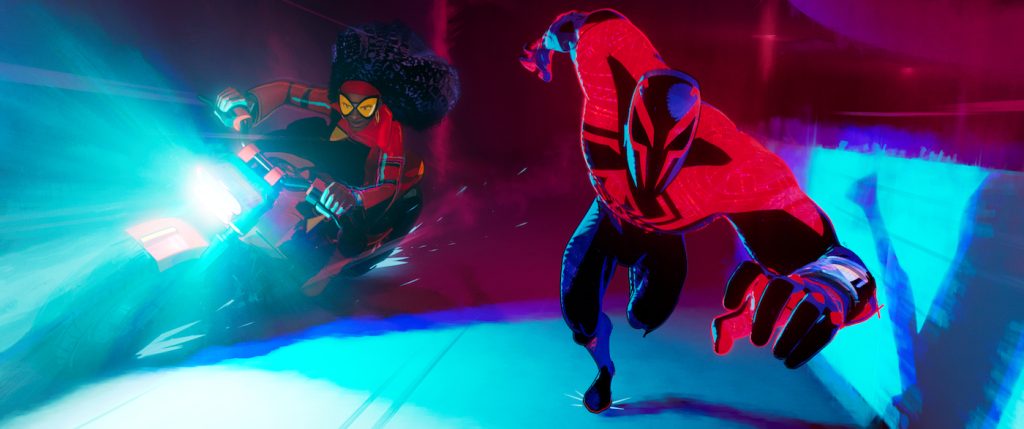
“They wanted something entirely fresh,” says character designer Kris Anka about the approach to the visual language. “The whole thinking was just because the animation of the first film was good doesn’t mean it can’t be better.” Anka was one of several character designers on Across the Spider-Verse and oversaw the creation of Miguel (voiced by Oscar Isaac), a Spider-Man-like superhero responsible for producing the multiverse travel technology that has Miles and Gwen (voiced by Hailee Steinfeld), along with new characters, Spider-Punk Hobie (voiced by Daniel Kaluuya) and Jessica Drew (voiced by Issa Rae) fighting a portal-jumping “villain of the week” named Spot (voiced by Jason Schwartzman).

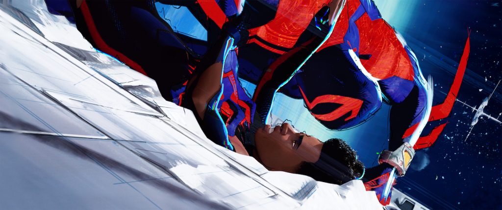
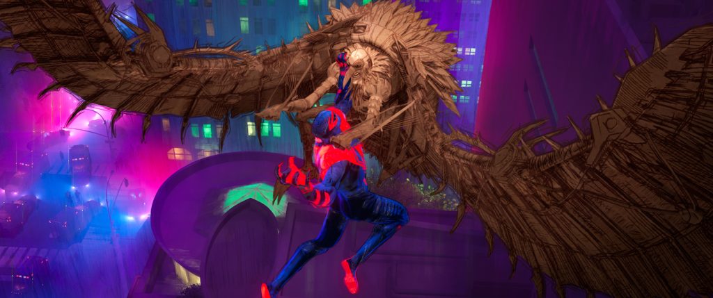
Anka spent around 15 months in creating Miguel, adding new layers to the suit design and silhouette of the character. “Depending on how close you are to him, you see different layers of detail. At the macro level, it’s this simple red, black, and blue design, but as you get closer, there’s patterning on everything,” says Anka. The designer added layers of cultural specificity to Miguel’s suit. “I went on a deep dive into Mesoamerican patterns and tried to find ways to add culture to the suit.” In using textiles and familiar patterns, the design language was grounded in something tangible instead of arbitrarily conceived.

“Another aspect the directors had coming into the film was that Miguel was intentionally giving himself his powers. It wasn’t a bite or an accident, but he was actively doing this,” notes Anka. “Miguel’s entire persona is that he’s willfully doing all this, and he takes things seriously. He puts in the work compared to someone like Peter Parker [voiced by Jack Quaid], who has a naturalistic body and attitude. Miguel had to be the opposite, where everything is designed, and everything Miguel is doing is with intent. It was about trying to find a balance and a look that suggests Miguel takes this way too seriously.”

In creating how Miguel moved on screen, head of character animation Alan Hawkins took inspiration from the character Stringer Bell (Idris Elba) from the hit television series The Wire. “He [Stringer] has this really interesting posture,” notes Hawks. “He looks like a tough guy, but there’s a slouch to him. It feels like he’s burdened by the weight of responsibility, but still seems like he’s aggressive. That nature inspired Miguel’s posture for most of the film.”
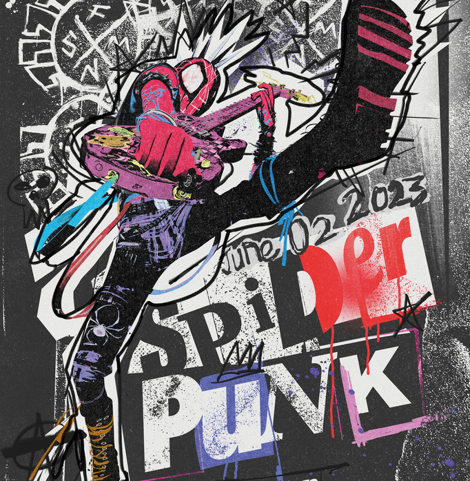
For Hobie, a very English (and cool) punk version of Spider-Man, Hawkins and the team used mixed frame rates in his design to make him feel chaotic and inconsistent. “The jacket he wears is on 4s, but his body is sometimes on 3s, and his guitar is even lower,” says Hawkins. The 4s and 3s Hawkins is referring to are the number of individual drawings for each second of animation based on a 24 frames per second timeline. Animating on 1’s means there are 24 individual drawings for each second of animation – the action is fast and fluid. Animating on 2’s has 12 drawings, 3’s there’s 8, and 4’s has 6 drawings. The lower the number (3, 4…), the slower the animation can look. Having Hobie’s body and jacket on different animations delivered a juxtaposed style that matched his rocker personality.

Miles, now slightly older, saw a refresh to his look (based on models by Omar Smith) that combined new fabrics and reflective patterns to a black suit that has a red stripe down the side and different-sized Spider-Man logos on the front and back to differentiate him while in motion. “We wanted that immediate read for the audience,” notes Anka. In animating Miles, the team referenced the first film to pose his eye and get the angle of his cheeks right. Gwen saw subtle changes in her costume, adding different hints of pink to her suit.
However, the biggest hurdle was creating a near-infinite number of Spider-Man found in the so-called Spider Society – the central “lounge” (created by Miguel) for all the Spider-Man traveling through the multiverse. For the climatic sequence that has Miles being chased by every single society member, the animation team aimed to make it as interesting as possible, creating different looks to avoid repetition. The edge-of-your-seat scene is packed with action and well-placed humor that even sees a T-Rex version of Spider-Man chomp on screen.
Though Across the Spider-Verse immerses you with a visual style where any frame could be used as a promotional poster, the guiding light for the creative team was the emotional beats of the story. “Animation is hard, and making a strong acting choice is different from a strong animation choice. Something the movie has always strived for was good acting and not good animation,” says Hawkins. “We ignored animation. It was the tool we were using, but we thought about how a real person acts who is feeling these complex layers of emotions. We wanted to inject that into each one of our characters.”
Spider-Man: Across the Spider-Verse is in theaters now.
For more on Spider-Man: Across the Spider-Verse, check out these stories:
“Spider-Man: Across the Spider-Verse” Composer Daniel Pemberton Reveals a Few Score Secrets
A 14-Year-Old Whiz Kid Animated a Scene in “Spider-Man: Across the Spider-Verse”
“Spider-Man: Across the Spider-Verse” Review Round-Up: Web-Slinging Bliss in Truly Epic Sequel
Featured image: A visual development image featuring Pavitr Prabhakar, aka Spider-Man India, Gwen Stacy and Miles Morales fighting The Spot in the city of Mumbattan on Earth-50101 – a kaleidoscopic hybrid of Mumbai and Manhattanfor Columbia Pictures and Sony Pictures Animations’ SPIDER-MAN™: ACROSS THE SPIDER-VERSE.


