“Spider-Man: Across the Spider-Verse” Look of Picture Supervisor Bret St. Clair on Spider-Punk, Mumbattan & More
Not bad for a sequel. Following on its 2018 Oscar-winning predecessor, Spider-Man: Across the Spider-Verse ranks as the best-reviewed wide-release movie of the year, boasting a 96 percent approved rating on Rotten Tomatoes while grossing $390 million worldwide since its release earlier this month (at the time of publication). Critics have hailed the film’s ability to stitch together a dizzying array of looks informed by comic books, action painting, Brutalist architecture, and more.
Master-minded by writer-producers Phil Lord and Chris Miller, Across the Spider-Verse required three directors and more than three years to make. Some 1,000 animation artists (including a 14-year whiz kid) contributed to the story of Brooklyn’s one and only Spider-Man, Miles Morales (Shameik Moore), and Spider-Gwen (Hailee Steinfeld) as they journey through alternate universes populated with previously unknown Spider-People. One of those people is actually a T-Rex.
Look of Picture Supervisor Bret St. Clair helped fine-tune the movie’s array of painterly styles. Raised in Tennessee and schooled in animation at Dallas Institute of Art, St. Clair, a self-described “jack of all trades,” initially worked in video games before taking on Hollywood blockbusters like Matrix Reloaded to Haunted Transylvania. At the start of the Pandemic, St. Clair began work on Across the Spider-Verse, rarely leaving his home office in South Pasadena. Speaking from a parked car outside his house, St. Clair talks about digitized paint brushes, Indian comic books, and Blade Runner production designer Syd Mead as inspirations for Spider-Man: Across the Spider-Verse.
You’re not the production designer, you’re not the VFX supervisor, you’re the “Look of Picture Supervisor.” What exactly does that mean?
My job is to develop the tools and techniques to match all the various styles in the rendering and compositing stages. The title is unique to these films, and it’s actually listed as “Spider-Verse Look Supervisor” in the credits.
Can you give an example of what that entails?
A lot of it has to do with creating techniques for brush strokes or various kinds of line work.
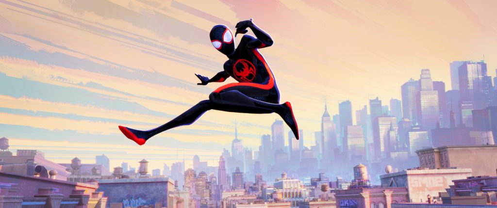
How many of these techniques did you repurpose from the first Spider-Verse movie, or did start from scratch?
For Miles’ world, we maybe added a couple of new tools for brushing on his face. For every other world, we had to go back to the well and figure out new ways to do things.
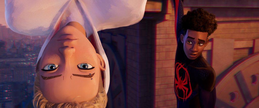
Can you deconstruct each of these new worlds starting with the movie’s opening set piece that takes place on “Earth 65,” home to Gwen Stacy?
Gwen’s world was based on comic book art by Jason Latour. Jason’s art is beautiful, but it’s also loose and subjective, so sometimes it’s hard to tell what’s represented by a particular brush stroke. There were all these visual things we had to dissect and interpret. Earth-65 was the most intensive of any of the worlds we worked on. It was really about writing tools to create brushes that exist in 3-D space while also moving in ways that look good.
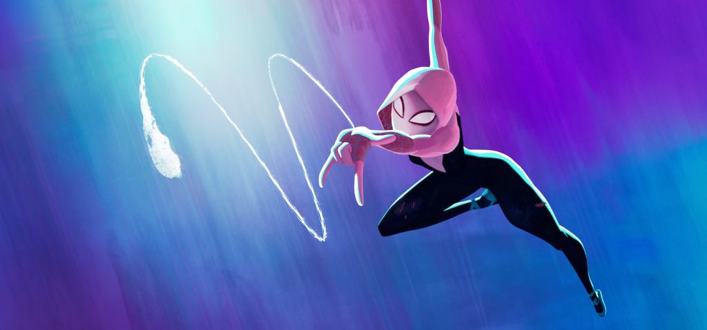
Jason Latour applies ink on paper with a brush. You created that same kind of texture with digital tools. How did you do that?
I bought a scanner and bought a lot of paint and during the first month of the film, I spent my weekends painting and scanning and building up a library of things so we could test out different ideas. And a lot of those ended up being used in the film. We studied the way paint diffuses, how paint rubs, the way a brush picks up different colors and smears them together.
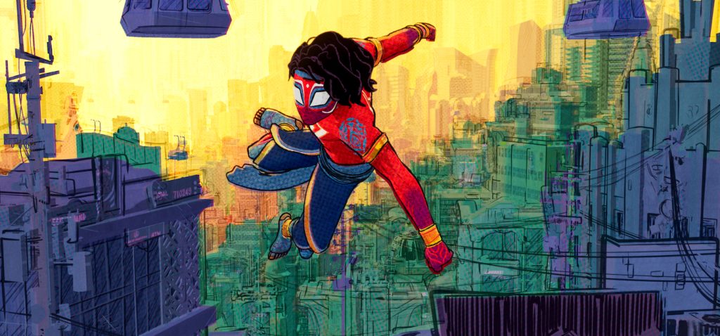
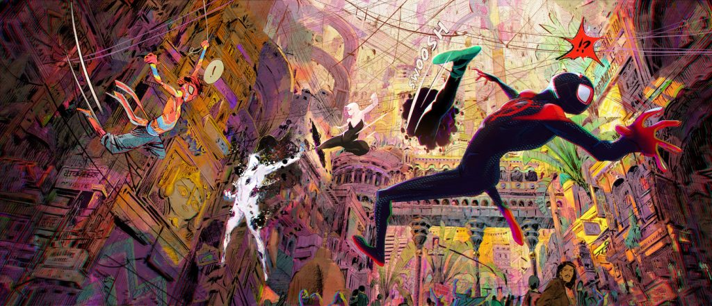
After spending time in Miles Morales’ “Earth 1610” world, the story moves on to a futuristic Mumbai AKA Mumbattan, Earth-50101, home to Pavitr Prabhakar/Spider-Man India.
The Mumbattan style was based on Indrajal Comics from the seventies. It’s a very simplified style in India created by artists who didn’t have a lot of time working for a publisher who didn’t have much budget. The artists worked under incredible constraints. In art school, you learn that it’s through limitations that great artists innovate and create unique things, so it was really fun that the directors want to pay homage to that look. For example, a background in Mumbattan would dissolve into a very simple representation with a heavy reliance on outlines because [in the Indrajal era] the artist wouldn’t have had time to hand paint the building.
Then we’ve got Miguel O’Hara’s “Nueva York,” Earth-928, populated with hundreds of Spider-people.
That style was based on Syd Mead, the designer famous for Blade Runner. It was exciting to look at his art and dissect it. The unique thing is that Earth-928 was less about paint strokes and more about markers.
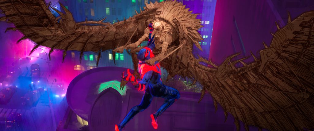
Markers, as in felt-tipped “Magic Markers?”
Yeah. Markers are transparent, so they have to be layered in a very certain way. If you put one marker stroke on a piece of white paper and then put a second marker stroke on top of that, [the image] becomes darker where the two things overlap. Because our rendered markers are transparent, we can’t add too many layers before we hit a dark value, so it becomes really important to control the placement of the marker stroke so it won’t become too dark and opaque.
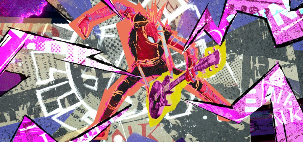
Along the way we meet Spider-Punk with his cool Mohawk haircut. He embodies the DIY punk rock aesthetic famous for its cheap Xeroxed graphics. How did you approach Spider-Punk?
Early on, I worked with the artists who developed Spider-Punk, and we did a lot of exploration, playing with things like the question of should the layers of collage cast shadows? Should we be using little pieces of tape that would be included in the Xerox or staples? A lot of it had to do with taking traditional renders and then coming up with treatments aimed at emulating different styles of printing or copying that reflect posters from that era.
Animated features often have two directors, but Spider-Man: Across the Spider-Verse, like its predecessor Into the Spider-Verse, has three. How did you deal with three different people steering the ship along with writer-producers Phil Lord and Chris Miller?
On the previous film, you might get comments from all the directors at once, and sometimes they didn’t agree. This was much more streamlined. Justin Thompson had been the production designer on Into the Spider-Verse, and here, he was promoted to director, so Justin was the one we interacted with. Obviously, Chris and Phil also had very specific artistic ideas. Occasionally we’d get comments from Phil to change something.
The visuals for Across the Spider-Verse are so dense and rich, it must have been a very labor-intensive project. When did you start work on the show, and when did you finish?
I came on in early 2020 when we went home for the lockdown — maybe a week after that — and I’ve been working on Across the Spider-Verse until a few weeks ago. I went into the office twice and did pretty much everything from home. We wrote the tools, and then we rewrote the tools to make them faster, and then we rewrote the tools again to make them even faster. Knowing we had to deliver so many shots was stressful. The way to deal with that stress was to make sure our tools were as fast as they could possibly be so that we could hit our target.
You spent many months watching Across the Spider-Verse scenes in bits and pieces on your computer monitor. Last month, you finally got to see the whole thing on a big screen at the world premiere in Westwood. What was that experience like?
It’s hard to be objective about the visuals, but having spent years looking at this stuff from my tiny little room in my house, to see everything together on a giant screen, with the music and the sound effects? That was pretty impressive. But the biggest part for me was hearing the audience’s response. When you’re trapped in your room working, you don’t really know what people will think. You worry, “Are people going to get it? Are they going to understand this little corner frame that we put so much effort into?” But people have responded so well to the artistry, it makes me proud. This is the kind of movie you want to make every chance you get. It’s the reason I got into the industry.
For more on Spider-Man: Across the Spider-Verse, check out these stories:
“Spider-Man: Across the Spider-Verse” Composer Daniel Pemberton Reveals a Few Score Secrets
How the “Spider-Man: Across the Spider-Verse” Visual Team Created a Mesmerizing Multiverse
“Spider-Man: Across the Spider-Verse” Review Round-Up: Web-Slinging Bliss in Truly Epic Sequel
Featured image: Spider-Punk (Daniel Kaluuya) in Columbia Pictures and Sony Pictures Animations’ SPIDER-MAN™: ACROSS THE SPIDER-VERSE.


