Oscar-Nominated Cinematographer Erik Messerschmidt on “Mank” – Part I
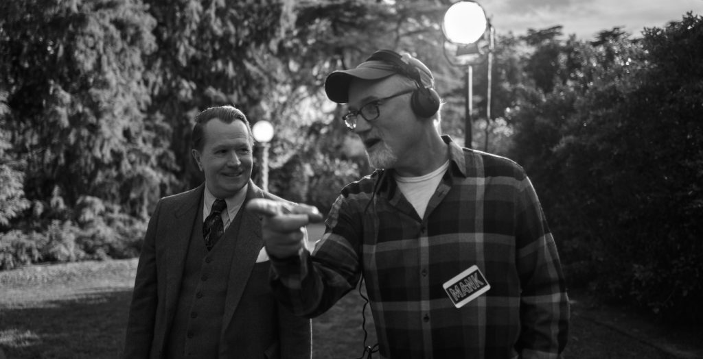
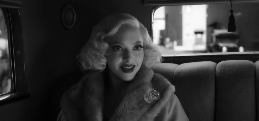
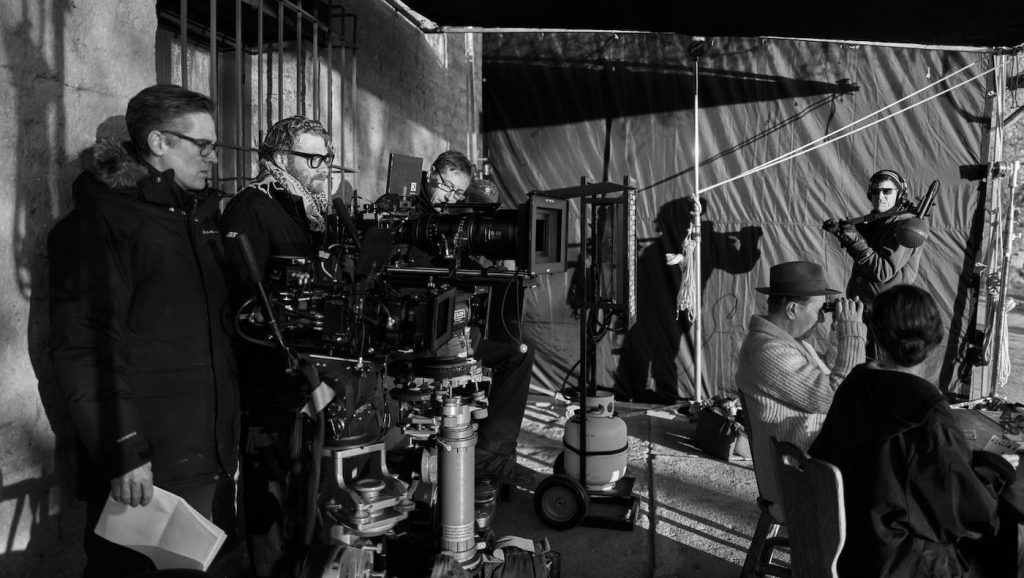
Actors Gary Oldman and Amanda Seyfried go for their characters’ leisurely evening stroll outside San Marino’s Huntington Library, which is subbing in for William Randolph Hearst’s Hearst Castle at San Simeon. The only thing is, it’s not night – and the actors are wearing custom-tinted contact lenses to help them avoid squinting, due to the additional bright lights director of photography Erik Messerschmidt has added to make his day-for-night photography appear correct in the final image.
Day-for-night is not the only classic technique the Oscar-nominated cinematographer utilized on David Fincher’s Oscar-nominated movie, Mank. The film, which tells the tale of screenwriter Herman J. Mankiewicz’s path to writing the screenplay for 1941’s Citizen Kane, pays homage not only to Mank himself but to that film’s legendary cinematographer, Gregg Toland. And while the two made use of some of Toland’s techniques, they did so with great care. “We refused to allow ourselves to think of Toland exclusively,” says Fincher. “We didn’t want to ape – we wanted to inhabit.”
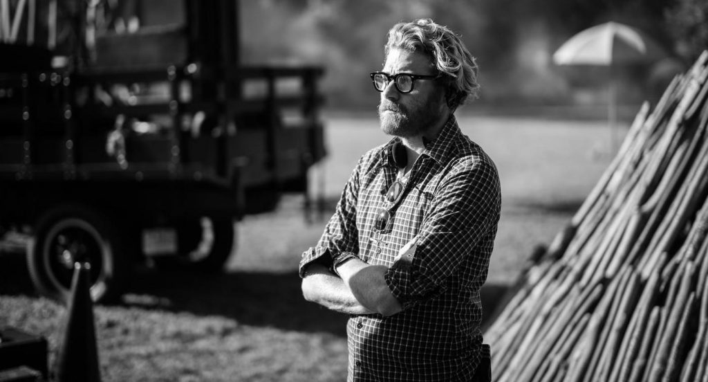
He and Messerschmidt have worked together over two seasons of the director’s intriguing crime series, Mindhunter, and Fincher had mentioned the film project, written by his father Jack Fincher, to his DP on occasion. The two were prepping another film, World War Z 2, but when the project came to halt, Messerschmidt went off to South Africa to shoot several episodes of HBO Max’s Raised by Wolves. While there, he says, “David e-mailed me and said, ‘Hey, I’m gonna do this movie, Mank, about Herman Mankiewicz. Would you like to do it?’” The answer, of course, was yes.
Messerschmidt hadn’t seen Citizen Kane since his student days, so he got himself reacquainted, and not just with the look. “There are these signature moments in the movie,” he notes. “But also the plot structure, the cutting pattern, and the composition. It was something I knew I absolutely needed to revisit if we were making a movie about that time.”
Over the course of a few weeks, he built a look book, comprised of several hundred images, which he sent to Fincher, some of which the director felt fit and some not. “That’s how we built our vocabulary for the movie,” Messerschmidt says.
It was clear from the get-go that they were going to be shooting Mank in black and white. That was essentially a given, due to the subject, period, and, most importantly, the film being referenced, though there were others. “We talked about black and white photography of the period,” Fincher explains, “and then expanded our research to include some of our favorite later work, whose technique might apply,” movies like 1957’s Sweet Smell of Success, shot by the legendary James Wong Howe, and In Cold Blood (1967), filmed by Conrad Hall.
One thing they were both conscious of and concerned about was avoiding the tendency of some modern filmmakers to use black and white in such a way that it becomes a parody of itself. “I was very concerned about getting seduced by that, and going, ‘Oh, great, I can do my best Big Combo (1955) here,’” Messerschmidt says. “David was sensitive to that, too. For us, it was, ‘Okay, black and white is appropriate for the movie. Now, how do we appropriately approach it?’ It was a matter of staying sensitive to how it served the movie, and then leaning into it, and paying homage when it felt appropriate.”
Neither really considered shooting using film, but more about what film looks like. “We talked about the qualities of film that we liked, and qualities of film that we didn’t like, as well,” Messerschmidt says. “The hope was to emulate and lean into the things that we liked and exploit them.”
Though they would be shooting digitally, as they began testing, using both color and black and white cameras, it quickly became apparent that they wanted the latter. “It forces you to make certain concessions,” Messerschmidt explains. “For example, you can’t use blue screen to make tonal separations in the DI,” the digital intermediate stage, where color grading takes place since the blue tone wouldn’t appear in a black and white image. “So that decision informed a bunch of other choices.”
The filmmakers had used RED Digital Cinema’s Dragon-X, which has a 6K sensor with a frame that emulates Super 35mm, on the first season of Mindhunter, and graduated to the 8K Monstro for the second – but actually had RED make them five camera bodies with an 8K Super 35 black and white Dragon sensor for this project. “We shot Super 35, specifically, because we wanted lots of depth of field, for which the large format Monstro sensor would be been antithetical to,” the DP explains. “The camera has a tremendous tonal depth to it that you just don’t get when you shoot color and simply desaturate the image to get black and white. It’s rated at ASA 3200, and when you push it really fast, you get a little bit of noise in the signal, which looks a lot like grain,” which they supplemented in post, or even attenuated it when a scene didn’t call for it.
For lenses, even though he spent quite a lot of time with Panavision’s Dan Sasaki, testing possible candidates, Messerschmidt eventually went with the same Summilux spherical lenses he and Fincher had been using for two seasons on Mindhunter. “We looked at larger format lenses, Master Primes, ARRI Signature Primes. I was mostly looking for lenses that would perform well at an f8.0 or f11.0 – and we even shot some at f16.0. And most modern lenses really fall apart past f5.6 or f8.0. They lose a tremendous amount of resolution. And part of that is that diffraction happens when the light is going through the really small iris producing an almost astigmatism-like blurry image. We needed lenses that would give very high resolution at deep stops, with minimal diffraction. And it was a pleasant surprise that the lenses we had used on two seasons of Mindhunter did just that.”
The aspect ratio was also one that was a carryover from Mindhunter, Fincher’s favorite, one which is midway between widescreen “Scope” and the 16:9 HD frame: 2.20:1, which Messerschmidt affectionately calls “Finchervision.” “I feel 2.40 is too ‘cropped’ for a television display,” Fincher says, “and 1.78:1 is too tall for a theater, so 2.21:1 is a good median range, to my eye.”
For part II of this interview, click here.
For more on big titles on Netflix, check these out:
Costume Designer Deborah Newhall on Dressing the Dastardly in “I Care A Lot”
Oscar-Nominated Makeup Department Head Gigi Williams on “Mank”
DP Marcell Rév on Going Black and White in “Malcolm & Marie”
“To All the Boys” Producer Says Goodbye with “Always and Forever”
Featured image: Gary Oldman as Herman J. Mankiewicz, apparently outside Paramount’s historic Marathon entrance, actually recreated instead by production designer Don Burt on the studio’s New York Street (Photo: Miles Crist)

