How Mood & Lighting Established Tone in The Last Black Man in San Francisco
The Last Black Man in San Francisco marks the feature debut for director Joe Talbot, an allegory that puts a spotlight on the childhood dream and the effects of gentrification.
Inspired by the real-life story of Jimmie Fails, who plays a fictionalized version of himself, Fails, with the help of his best friend Mont (Jonathan Majors), go on a journey to take back the family home his grandfather built but lost ownership of when he was a young child.
To detail the visual language, the director looked to production designer Jona Tochet and cinematographer Adam Newport-Berra.
Having first met Talbot in 2016 while working on the short American Paradise, the predecessor to Last Black Man, Tochet immediately fell in love with the script. “It was years in the making,” says the production designer. “Visually, we knew we wanted each frame to be composed like a fine-tuned painting with every piece of set dressing carefully curated. It was a constant back and forth during preproduction with Joe keeping me up to date on any inspiration or colors of note.”
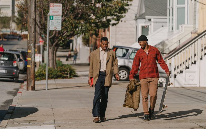
Staying authentic to San Francisco design, symbolism stirred the visual grammar and color subliminally connected characters and themes. Jimmie’s iconic reddish and brown flannel linked him to the bible the Preacher (Willie Hen) holds in the opening scene. Red hues also connected Jimmie to Mont’s rain jacket and journals, and more significantly, the home Jimmie dreamed of living in.
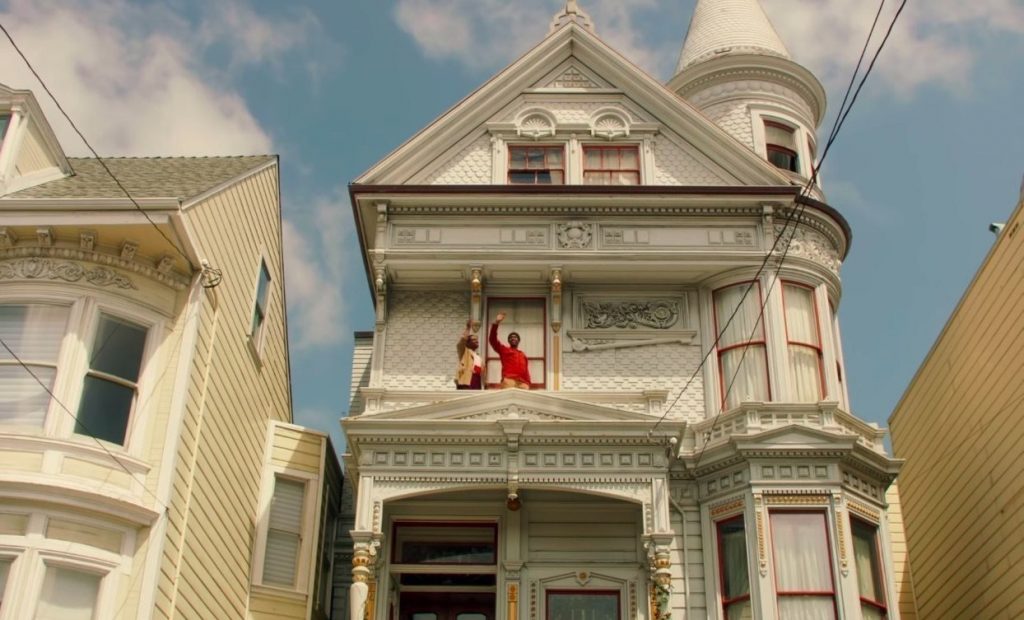
Finding the film’s iconic Queen Anne-styled Victorian house was a “happy accident” recalls Tochet. Built in 1889, its hundred-year-old bones sit on South Van Ness in the Mission District of San Francisco, only blocks away from where Talbot grew up. “We were on a scout and drawn to it because of its witches hat and we just so happened to knock on the door and the owner, Jim Tyler, greeted us and gave us a tour. It had such a magic to it,” says the production designer.
Tochet detailed the home with three different looks for the story – a kind of before, during and after Jimmie’s stay – starting from an unkempt state and then shifting to an updated design. The most challenging was its depleted appearance as the interiors of the home were almost too perfect. “They needed to pull it back to a neglected, unmaintained state to make it a home that was once forgotten,” notes Tochet. “Thankfully, the owner really gave us a lot of creative freedom to take over his home.”
Its exteriors were trimmed in red and gold and the interior walls a dusty rose for its soft yet romantic gesture –a color that also complimented the skin tones of Jimmie and Mont. Red, gold and yellow hues extend throughout the film connecting the two best friends, while others, like royal blue and green, touted a different subtext.
Green was reserved for moments of greed and found in scenes taking place inside the realtor’s office where the home has been put up for sale and inside the bank when Jimmie tries to apply for a loan. No detail was left unnoticed as the color attached to the “For Sale” sign on to the front gate and a moving truck parked out front.
Extending the visual flair Newport-Berra leaned on a photographic style inspired by Finnish filmmaker Aki Kaurismäki. “We wanted to honor the people and the city, but what was important to Joe was to have a film with its own style and language,” says Newport-Berra. The photographic but classic feel brought a nostalgic vibe to the screen with the cinematographer treating Jimmie and Mont as pioneers in the city.
While San Francisco is known for its foggy and drastically changing weather conditions, the 25-day shoot saw beautiful sunshine every day electrifying the city — the green grass was more vivid, the light reflected off houses like paintings, the clothing of the actors and skin tones allured vibrancy. “We got lucky and were able to harness the beautiful palette San Francisco gave us and make it pop while we were shooting,” Newport-Berra adds.
Shaping the exterior lighting sunlight was bounced making for a “fantastical version” of San Francisco that elevated those in the frame. The director and cinematographer also used mirror boards as a way to front light the actors’ faces. “It’s something you’re taught not to do – something that’s not commonly used anymore – but we really liked the look of it,” says Newport-Berra. “It created a visual style of the past – old Hollywood – where they would just light over the camera. We found a way to do it so the characters separated from the location in a bizarre, beautiful way.”
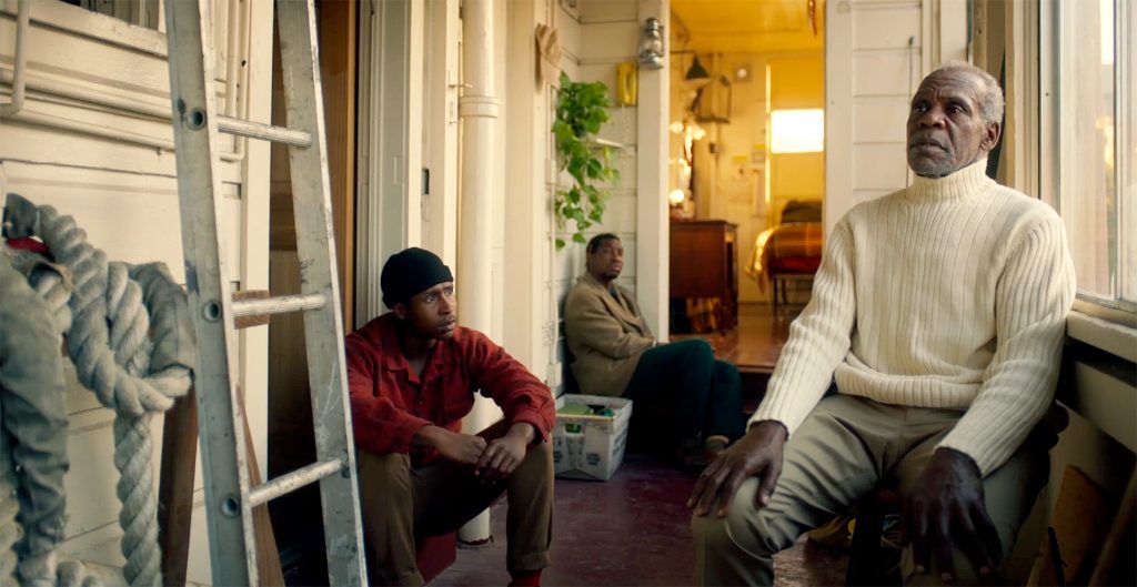
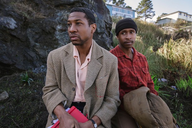
The bond between Jimmie and Mont was solidified not only with color but through framing too. To do so, the cinematographer made sure they shared the frame in nearly every scene. “They are best friends and in a lot of ways, they want the same things.We wanted to start the film by framing them together as much as possible as they are each other’s safety net in a city that’s becoming more inhospitable to them. Establishing this early allowed the moments when we do break them apart later in the film to be even more resonant,” explains Newport-Berra.
The rule worked extraordinary well as two of the most impactful scenes take place when Mont is at the realtor’s office trying to get back Jimmie’s dream home by himself and when Jimmie is at the bank. “Seeing Jimmie in that scene, he looks completely helpless,” says the cinematographer. “If feels that way because it’s basically the first time we see him alone.”
Lighting the Victorian home was a challenge. “Joe wanted the house to feel like a sacred place, and if the lighting didn’t allow for it, it wasn’t worth shooting,” notes Newport-Berra. “We did a lot of light studies to figure out the best times and when the sun was setting so it really glowed adding to the aesthetics of the story.”
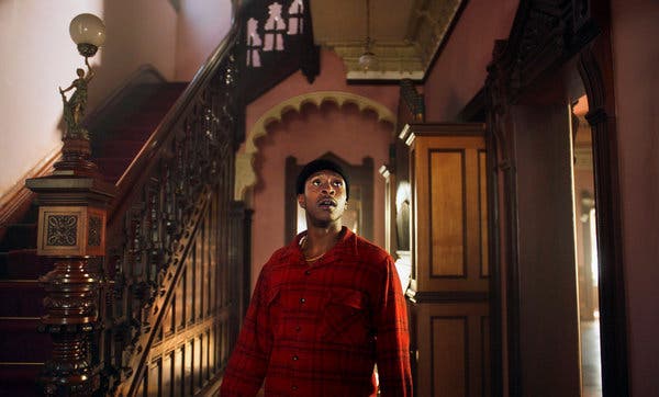
The narrow rooms inside the home didn’t allow much space to place fixtures. Lights were placed outside through windows, but the first floor stood 10 feet off the ground which required more setup. While camera moves used the geometry of the space to create a shot that was more elegant and simple. Since scenes were timed with the sun setting, it only allowed for a short window to shoot, but the cinematographer notes “the crew thrived off the energy.”
Throughout the process, both Tochet and Newport-Berra expressed how much Talbot was a creative outlet and how it rubbed off on everyone. “The crew that was put together really poured their hearts into the film and it made for such a unique experience,” adds Newport-Berra.
The Last Black Man in San Francisco is in theaters now.


