How Chilling Adventures of Sabrina‘s Production Designer Creates the Occult
Based on the “Archie” comic book series “Sabrina the Teenage Witch,” Riverdale creator Roberto Aguirre-Sacasa cast another spell with Netflix’s Chilling Adventures of Sabrina. The series takes the source material from the comics and infuses them with equal parts horror and humor. Here Sabrina (played by Mad Men‘s Kiernan Shipka) struggles with trying to reconcile her two very distinct natures—she is half mortal, half witch. She’s buffeted by occult forces that threaten both her and her family. She’s also a teenager, living part of her life in the regular teenage world of high school, which comes complete with its own set of horrors. Once again Aguirre-Sacasa has adapted an Archie comic for our current age, eschewing easy, feel-good messages for a much darker take on the source material. It actually imagines what it would be like to be a teenage witch. The short answer is; hard.
Production designer Lisa Soper has bathed the show in the colors of fall; yellows, oranges, reds, and greens. A show about a young witch straddling adulthood, humanity and the occult is inherently a show about transformation. We spoke to Soper about how she uses colors to chart Sabrina’s increasing maturity, finding inspiration from classic literature and iconic horror films, and how to design sets for an occult world.
Let’s talk about the color palette for the show. How do you use colors—subliminally and explicitly—to subtly affect the way we feel when watching the show?
Very carefully. No color is on the “no” list when it comes to Sabrina as each color gives us a varying emotional response. Taking an approach to color coordination I explored assigning personal color palettes to various characters, with adjustments depending on mood using color to isolate characters, keeping them emotionally apart from the world that surrounds them. The world itself is built around the colors of fall and the representation of divine feminine energy. The season of autumn symbolizes a time of self-reflection and increasing maturity. It symbolizes the balance between light and darkness, not so dissimilar to the choice Sabrina had to face. I could talk to you for hours about all the varying colors and how I used each one. For now, I am going to talk about two.
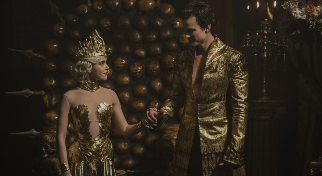
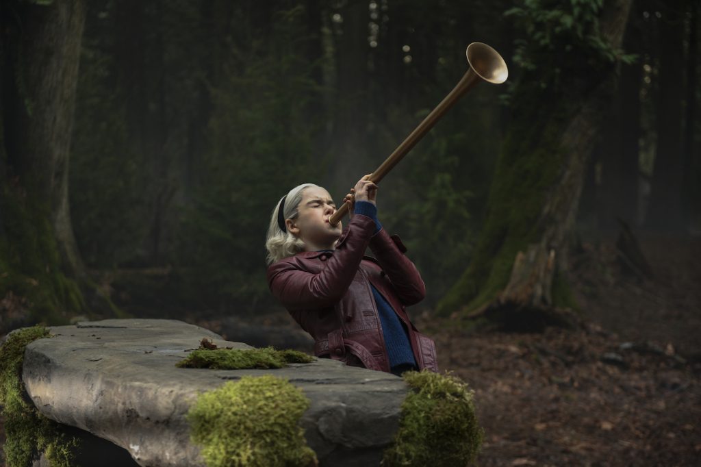
Our woods are primarily built form the sequoia tree. There is an eternal green in our woods accentuated by the red bark within, as blood and flesh in a body. Green has two sides as it does in the world of witchcraft. The more earthy greens are associated with Harvey, whereas vibrant glowing greens represent the witch world. Both associations with the color green are traditional and can be seen in the earliest folktales. For example, because green can represent the spring and the rebirth of nature, it is also associated with the life after death embodied by ghosts and spirits, as in Sir Gawain and the Green Knight.
Red is the path to darkness in Sabrina, the symbolic link used to show key sequences. The jarring use of red enhances the unsettling desire of a reaction with the visions as well as terrifying sequences. Red and green are two main symbolic rivals in the series. Lust carries red well. When Sabrina is in a moment of lust or passion, she may have a ruby red lipstick. When she is on her way to the witches school or into the woods, she may wear a red cape or scarf.
What kind of differences do you layer into the world of the occult and the human world?
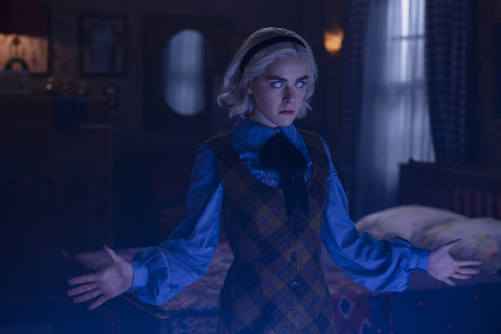
It’s not as easy as having the path of light and the path of night. The beauty of Sabrina is that she breaks the mold and starts to blend the two worlds. This is exciting for sure but also makes it more challenging to distinguish the human and the occult world. I started by setting a tone from the beginning that the occult world almost has a bioluminescent motion to it, while the human world is more grounded with less organic lines. Man likes level, parallel, and organized lines. It is the foundation of humanity. Witches are born from something otherworldly. The floors look like fractals that tunnel to infinite realms, walls and stairs are a couple of degrees off, and there is a symbiotic relationship that nature has with the environments that witches claim.
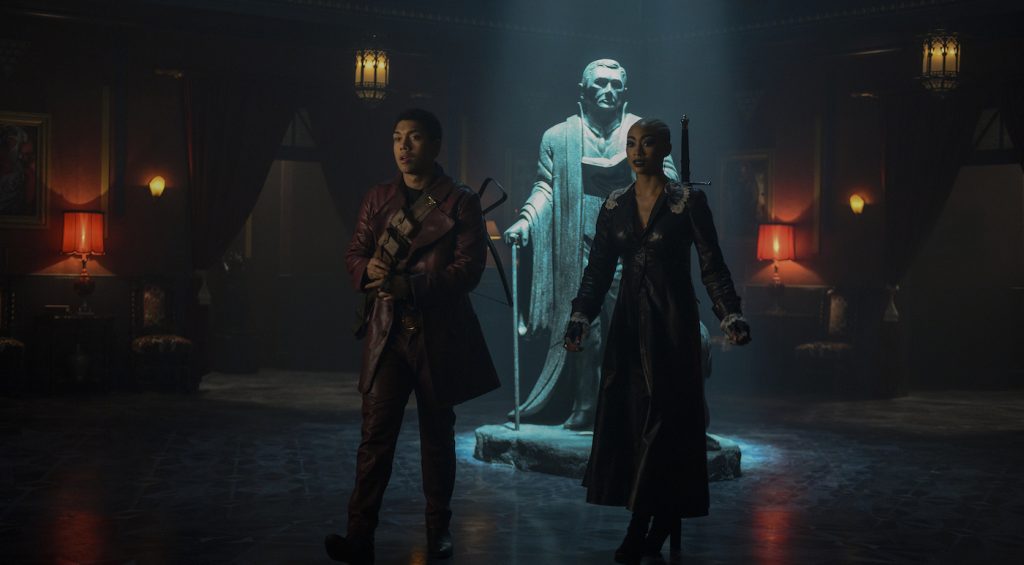
The show has a lot of gorgeous sets—can you tell me a little bit about designing some of these spaces?
I believe the best lies derive from the truth. We elevated the visuals in Sabrina by looking at the very horrific untapped well of history with witchcraft. The Wicker Man and sacrifice is as much part of the pagan backstory as boiling herbs to make poultices. I like to warp and play with viewers’ sensibilities —slight surreal twists and turns as we open a new scene. You have to get into each character’s head when creating their environments. I start with a pencil and paper next to the script and let the design grow from there the same way I would design a layout in animation. I start without rules or physics to get a feel. Then we can ground it just enough to be believable.
Tell me a bit about your work with costume designer Angus Strathie—are you actively creating spaces that will pop with the show’s unique sense of style?
Yes! The relationship between all the departments is important. Part of what makes this series so special is how well all the departments work together and the passion everyone pours into it. It is always a pleasure to walk into Angus’s department and get inspired by the incredible fabrics and silhouettes. There is a constant collaboration with developing the compliments of the characters in the sets. The first part is starting with what the story is trying to tell us. Angus and I will sit down and talk about the spaces for what I have in mind and what he has in mind as to how to animate it with his fabrics.
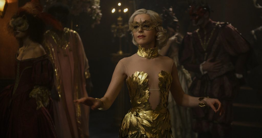
How much inspiration do you draw from the Archie comics?
I take just enough to know where we came from and an homage to what Sabrina is. After that, I wanted to let the Chilling Adventure stand on its own. With designing, the only element we should slave ourselves to is the script. I love to nod or pay homage, but the story always has to come first. By basing too much off of something else, we are limiting ourselves right out of the gate.
Do you have any other touchstones, be it in film, TV or literature, that inspired you when designing for the show?
Absolutely. There are tones we looked at like Rosemary’s Baby and the Exorcist, but the story itself is so unique with its tones and approach that it gave me a very clear direction to start from. I turn to mythology, history, legend, fairy tales, and in literature. This is how I stimulate my visuals when building a world. Lately, I have been diving back into “The Divine Comedy” and Milton’ “Paradise Lost.” Words on the page design the most powerful visual without having the blinders of someone else visual interpretation.
The first films I remember watching as a child were Alien, The Exorcist, and Star Wars. The first book my mother read to me was “The Hobbit.” I fell in love with horror and fantasy. My mother is a writer and always fed me incredible writings from T.S. Elliot to Lovecraft, Hawthorn to Neil Gaiman, and, of course, Clive Barker. I find the bulk of my inspirations from reading a good book in the woods.
Featured image: L-r: Michelle Gomez, Luke Cook, Kiernan Shipka. Photo by Diyah Pera/Netflix


