The Imitation Game‘s Production Designer Maria Djurkovic – Part I
All the buzz for The Imitation Game is surrounding the phenomenal performance of Benedict Cumberbatch in the role of Alan Turing, the mathematician and logistician who, along with a team of linguists, chess players and logicians helped break Germany’s Enigma code during World War II. Turing was a genius, and a difficult, unusual man, and Cumberbatch’s performance is indeed a marvel, bringing this still relatively unknown enigma (to American audiences) to vivid life. He needs no help from us to applaud his performance, but let’s throw a little light on the impeccable performance of production designer Maria Djurkovic, whose detailed, obsessive work on The Imitation Game might have had an admirer in Turing himself.
This isn’t the first time Djurkovic has worked on a serious drama set in the world of spies, secrets and life or death decisions. Her design work on Thomas Aflredson's slow burn Tinker Tailor Soldier Spy was the antithesis of the sleek, luxurious world of James Bond. Tinker Tailor is based off John le Carré’s novel, following the highly unglamorous (but no less deadly) world of dour, diligent (and sneakily brilliant) MI6 agent George Smiley. Smiley’s obsession with uncovering a mole amongst his fellow spies at MI6 involved no greater commitment to getting things exactly right than Djurkovic brought to her role designing the look of the production. This explains why she’s still annoyed about the film’s opening.
“If you remember in Tinker Tailor’s opening sequence, you’re being taken through MI6 via a lift for documents,” Djurkovic says. “You see this lift carrying a bunch of classified documents through all these different layers of the MI6 building. When Thomas [Alfredson] had this idea, he gave us about, oh, a few hours to build this document carrier out of cardboard, and I wince to this day because I can still see the joints in the lift, no one else will see it, but I notice it," she said with a laugh. “I don’t like the last minute stuff, I like to be able to plan it. I hate delivering something I don’t think is perfect. I think you have to be obsessive compulsive to do my job.”
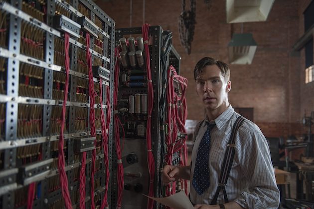
Which made her the perfect production designer for a film about Alan Turing, a man whose obsessiveness helped the Allies break Enigma code, thus turning the tide of the war, saving millions of lives. In every frame of the film, Djurkovich’s decisions can be seen hanging on the walls, in the design of the wallpaper, in the color of the paint and down to the very sketches you see Turing making as he designs the machine, his beloved Christopher (based on the real life Bombe) that will help win the war.
“When you just look at any space, look at the number of objects that are in that space, whether they’re props or graphics, and consider that everything had to be thought about, put on a list, bought from the right place or created in time,” Djurkovich says. “I always look back on films and think, ‘How the hell did we do that?’ It’s always like that, you don’t want to stop and think while you’re working, because it’s such an escalated thing where you’re creating a visual identity for a film, along with all the practical things you need there, and you have to find that hook very, very quickly.”
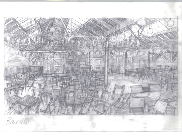
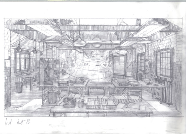
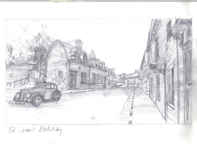
This included re-creating the codebreaking headquarters during the war, Bletchley Park, in England. Bletchley Park was made up of a village and its' various "huts," where its residents lived, worked and socialized. It was Hut 11 where Turing and his compatriots designed their own codebreaking machine and try to decipher the German's daily communications. There was a beer hut where they blew off some steam over a few pints.
No matter whether it’s a period piece, science fiction or a comedy, a production designer’s job typically starts with becoming as close to an expert about your subject as quickly as you can. This is true for any member of the crew who has to help design the look, including the costume designer, set director and props master. The production designer’s research has to include all of their work. “For me, whether it’s The Hours or The Imitation Game, the initial starting point is research, but I don’t feel I have to adhere to everything I learn,” Djurkovic says. “I always find that being informed, knowing the background of whatever subject I’m doing, the clues always come from that, the color palette always comes from the research.”
Djurkovich’s ingenious work on The Hours, adapted from Michael Cunningham’s brilliant novel that showed how Virginia Woolf’s “Mrs. Dalloway” affected the life of its author, and, two women in subsequent eras, was set in three separate time periods. The film was also a creation of extraordinary visual wit, thanks to Djurkovic's solution for creating a single aesthetic whole for a film that was set in three locations and three time periods; 1920s London, 1950s Florida and contemporary New York. She managed this through her method of “visual overlapping,” in which she threads similar or, in some cases, the exact same colors, designs and props from one era to the next. As a viewer, you’d have to pause the film and scrutinize every frame to pick it out, but on a subconscious level, which is the level the production designer is often manipulating, it draws you in.
“The Hours was about overlaying props and fabrics and patterns, which absolutely nobody picked up on, it’s about subconsciously interweaving those three stories,” Djurkovic says. “The three time periods were shot as three separate films. We shot very little in the states, save some exteriors of New York and Miami, then we built all the studio sets here in London. With the visual overlapping, I’d take a curtain fabric that’s hanging in the 1950s in the kitchen and I’ll use that exact fabric in Ed Harris’s apartment in contemporary New York. There are paintings I had hanging on Virginia Woolf’s [Nicole Kidman] walls that I then used in Clarissa’s [Meryl Streep] New York apartment. I did that to double up on visual images, to make it that one whole.”
One of the crucial decisions to be made by the production designer is the film’s color palette. For The Hours, Djurkovich based the color palette on paintings from Virginia Woolf’s era in Bloomsbury, England. With The Imitation Game, she took inspiration from Alan Turing’s own drawings, his very basic sketches on a breadth of topics.
Djurkovic found her color palette for The Imitation Game when she found a little drawing that Turing had done at a science museum. “It was annotated, this red ring and a black blob, and suddenly this very graphic thing was the hook I hung everything onto. Red became a very key color. The Christopher machine had red cables coming out of it. That was real, but I over-emphasized it,” she says. Djurkovic used red to go against the usual color formula for filming a World War II era film, especially in England. “I wanted to shift the look of that 1940s world, which everyone’s very used to seeing in a fairly sludgy brown palette, a palette we’ve seen it in so many different films. So red became quite key. I painted the floor of Hut 8 a shiny red, and I painted the metal girders where the code breakers work the same red, too.”
For the section of the film set in the 1950s, when the police come to Turing’s house in Manchester to investigate a break-in and end up arresting him (soliciting sex from a man was a crime in England at the time), Djurkovic came up with a novel way of designing his home; she had Turing design it himself.
This part of the film takes place after the war, when Turing was working restlessly on the earliest versions of the computer. “A sequence of drawings from the period after the war, when he was at Manchester University, they were all so complicated, I still don’t think I understand any of it,” Djurkovic says. “But I learned he was studying morphogenesis, which is the biological process that creates patterns, whether it’s spots on a leopard or swirls on a snail shell, he was researching how a myriad of natural forms create their own patterns. He was drawing all these schematics, and I jumped on them for purely aesthetic reasons. What happened was Andrew Hodges, the author of a very, very fat and quite difficult to read biography of Turing (which the film is based on) visited us, and he saw all these references to Turing’s work we were using for the design of the film, and he was completely enthusiastic about them. This is what Alan Turing would have been studying at that period. There’s nothing that was hanging on his wall when the police break that wouldn’t have been plausible when Turing was living there. Hodges’ enthusiasm for what we were doing was motivated by the academic, while I was motivated by the aesthetic.”
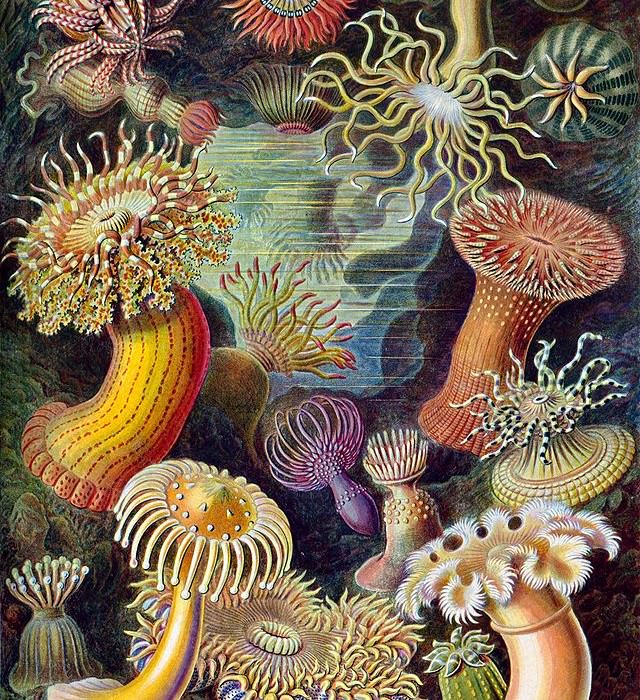
Some of the images you can see on Turing’s wall in the film were drawings Djurkovic found by a German biologist named Ernst Haeckel, who discovered and named thousands of new creatures, and who published more than 100 detailed, multicolor illustrations of animals and sea creatures. “Turing would have had Haeckel’s drawings,” Djurkovic says. “One might think I put them on the wall because they’re beautiful, which they are, but they’re absolutely accurate as well. It’s doing the research and then you land on something, you go, ‘Whoa, not only is this beautiful but it’s also a deep dive into the subject I’m trying to portray.’ You owe it to Alan Turing to get it right. This is why Hodges was so pleased, and I think he felt it was very respectful, being as thorough as we were. It’s not just about historical research, it’s about whatever key, and there will be a key that will jump out, there’s always something within the material that will give you the key. Always.”
Check in tomorrow for Part II.

