Bad Times at the El Royale’s Art Director on Building the Lunatic Lodge
In Bad Night at the El Royale, location is everything. The titular lodge sets the mood and structures the interlocking plot twists suffered by seven shady characters who cross paths there on a stormy night in 1969. Director Drew Goddard wrote the story and production designer Martin Whist defined the vision. It was up to supervising art director Michael Diner to make sure all the physical pieces of the environment came together on time and on budget. “The lodge was Martin’s gem, and I’m his right-hand man,” explains Diner, who previously art-directed The Revenant, Mission: Impossible – Ghost Protocol and Juno. “My job is to get what he needs scenery wise.”
The entire 10,000-square foot El Royale structure was built on a soundstage outside of Vancouver, British Columbia. Diner, who has a Masters in Architecture oversaw the set’s construction. “We had all the motel rooms rigged for major rain and fire, lit for street lamps, everything,” he says. “This period of North American architecture and design is a shining light for anybody in my field. It was fascinating the way Martin pulled tropes pulled from the 1950’s when the lodge would have been built, but then gave it this naturalism. It’s not the Atomic age ‘Gucci modern’ style you see in Palm Springs ranch houses. And it’s not like the stuff you’d find in a magazine or in a store because nothing is off the shelf. Carpets, draperies, everything was custom-fabricated.”
For example, the eerie wallpaper that backdrops much of the mayhem came from an Idaho artisan, one of the few remaining practitioners of the block printing craft. Diner says, “He’d take a pattern Martin designed, make it into a three-by-three-foot block and have this machine lift the block up, stamp it down on the paper, move it over three feet, do it again and again. Traditional wallpaper is made that way and only a handful of people on the planet still do that. In fact, I have some El Royale wallpaper in my office now because the pattern is so beautiful, with little mistakes that make it real and interesting.”
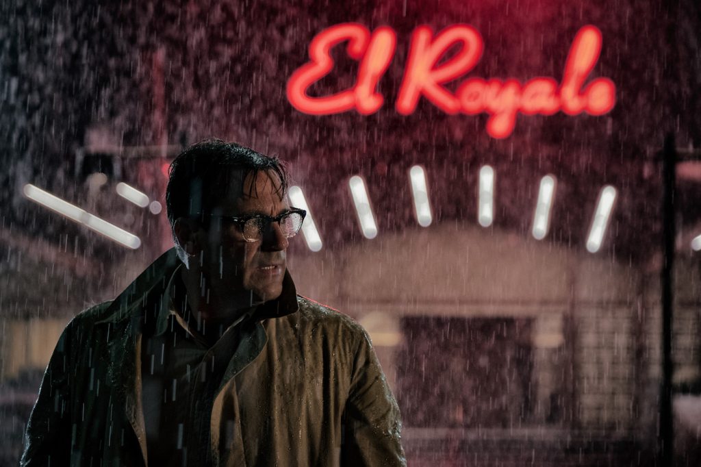
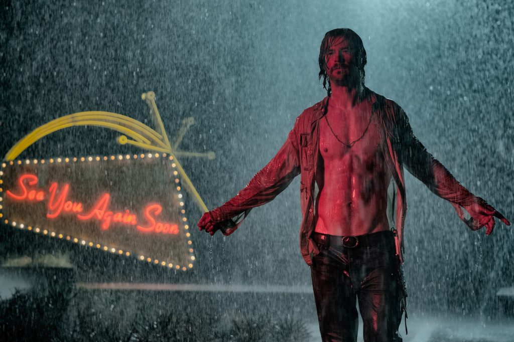
The motel’s neon sign also honors a rapidly-vanishing form of American craftsmanship, Diner says. “The thing about neon signs is they’re harder and harder to get today because hardly anybody’s making them anymore. There are only two guys left in Vancouver who still do it. We had to carry the sign across the highway several times, which makes an art director crazy. Things break. Sometimes you have to wake up a guy at two in the morning asking him to bend glass so the filmmakers can get their shot first thing in the morning.”
While the custom-made furnishings lend hand-made charm to the El Royale environment, the color palette draws inspiration from the motel’s marketing gimmick: The El Royale straddles the border between California and Nevada. “You have the optimistic California side of the lodge with all these reds and golds, whereas the Nevada side is more toned down, with purples and aubergine,” Diner explains.” Martin’s a painter so he has this ability to coordinate unusual colors together and really make them work. That palette manifested it very visually, but at the same time, the overall sense of the place had to feel singular because it’s not like we had two different sets. It was about walking a fine line.”
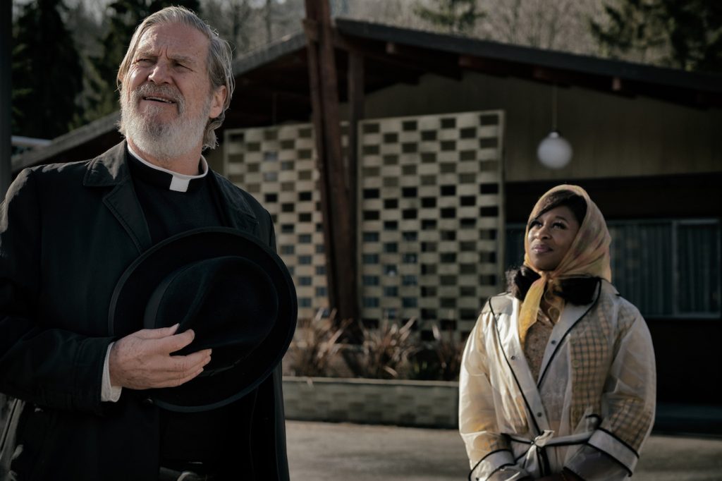
The physical layout of the El Royale also helped shape such “Bad Night” themes as voyeurism and redemption. “When the hotel clerk character Miles [Lewis Pullman] ties to confess his sins to Jeff Bridges’ Father Flynn in the bar, we organized this slight enclosure,” Diner says. “Not that it literally looked like a Catholic confessional [booth], but we built the scenery around the theme of confession, and Drew was with us on things like that every step of the way.”
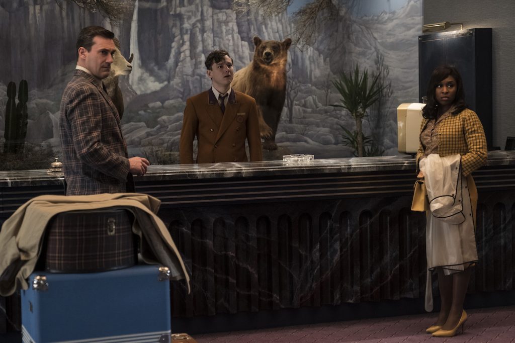
The El Royale décor additionally underscores a sense of impending doom through the display of dueling dioramas in its lobby: a stuffed grizzly bear represents the state of California while a taxidermied mountain sheep occupies the Nevada side. Diner says, “That came from Martin’s imagination. He and Drew seized on the idea of having this diorama behind the check-in desk and again, it’s an idiosyncratic touch that helps propels the narrative visually. The El Royale is almost like a theatrical environment. Everything in that space is very specifically placed there to carry the story along.”
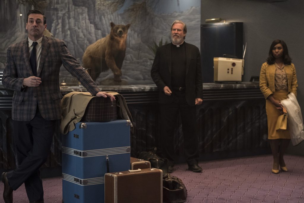
Featured image: Cynthia Erivo in ‘Bad Times at the El Royale’ theatrical poster. Courtesy 20th Century Fox

