How The Shape of Water‘s VFX Producer Turned a Monster Into a Romantic Lead
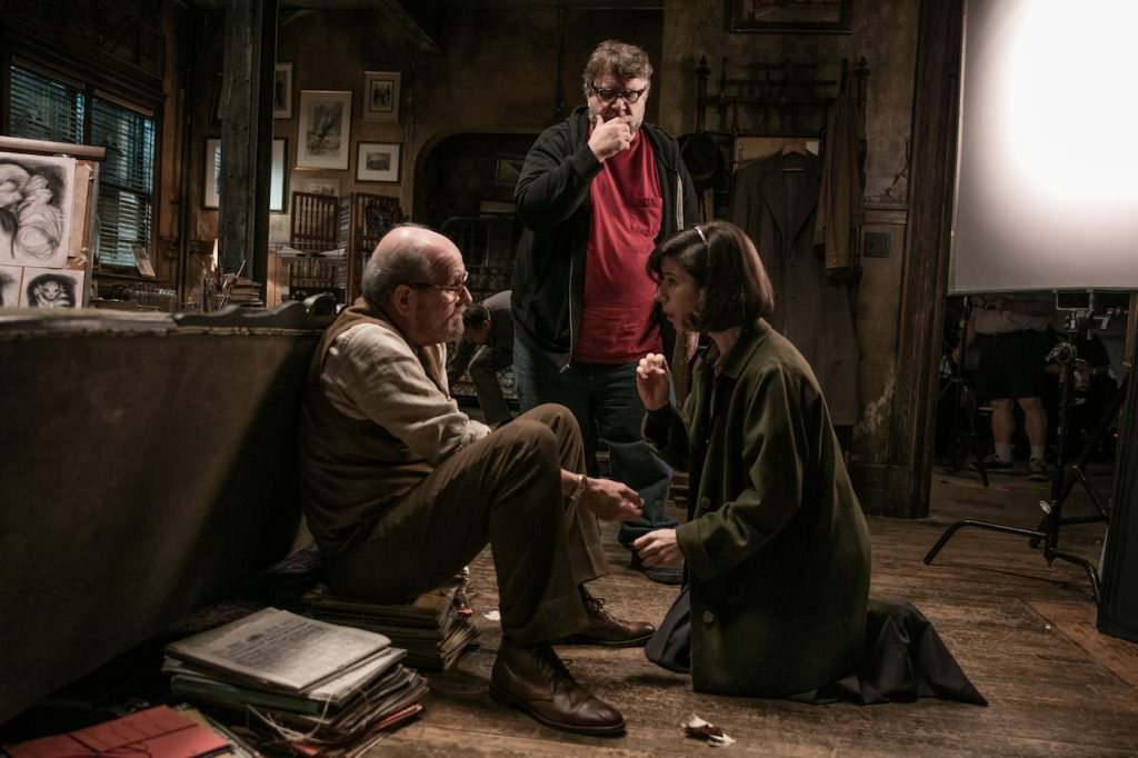
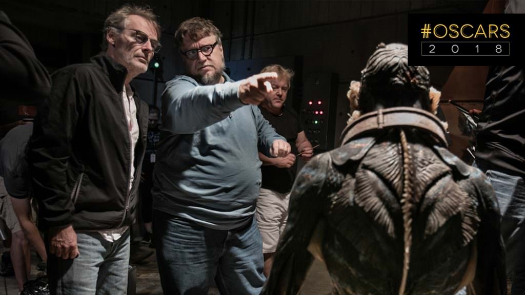
In the final part of this two-part interview, visual effects coordinator and frequent Guillermo del Toro collaborator Luke Groves reveals how he worked with the filmmaker to craft some of The Shape of Water’s most awe-inspiring sequences and reveals how he and the visual effects team at Mr. X walked the line between CG magic and practical effects to create movie magic that looks impressively real.
I want to talk about the opening sequence because I know it was shot wet-to-dry which is absolutely incredible. Tell me about accomplishing that.
The opening of the movie was always a tricky thing because it starts basically on a full CG image that we created and we knew that if the audience doesn’t buy into from that first frame and buy into this idea of a fairytale, you’re going to be lost. And not to mention that the shot’s a few minutes long, so creating something that length has a lot of baked in overhead to get out the door. But we wanted everything to be grounded in reality, a fantasy grounded in reality if that makes sense. So we wanted to create this underwater river bed environment, so we went out and shot reference of a camera traveling along river beds that we were originally thinking could use elements from. Because of the extreme level of direction that we had to maintain, we wound up going CG, but we used that as reference: how murky is the water, how much particulate is in the fluid. And then once we had reality, we could stray from that to level of fantasy. So when we get into the apartment, we have the floating shoeboxes and telephone and stuff like that and then we marry into the dry-for-wet plate once we get into her apartment, which is even more fantasy. So it’s a tricky thing to sell the reality, get into the apartment as the voiceover and music starts, and then get people in the fantasy of it. But that was the key, was always create something that was photorealistic, and then get more stylized from there. And a lot of the underwater stuff, Guillermo would go a lot more stylized, to get an idea of fantasy.
Are there any Easter eggs in the film, things you added to that sequence or others?
Yeah, Guillermo wanted everything to echo the end of the movie as well as scenes throughout the movie. So as you get through the apartment, we see her box of records that she takes to play in the lab later in the movie. On first viewing you would never pick it up, but if you see it now, you may. And there’s plenty of things like that, records, her shoes, to echo her shoe falling off at the end. There’s the duck brush that’s this prop that she uses to brush her shoes in her apartment that’s there, so there’s always these ideas trying to echo elements of the movie and really make it feel like there’s this holistic approach to everything. Which was super fun for us, to constantly be coming up with ideas that Guillermo would be receptive to, who obviously already had every detail mapped out himself. It was a very creative process back and forth with him, but extremely detail-oriented and extremely technical in terms of the photorealistic look that we started with and how we can transition into a fantasy world and have the audience stay for the ride.

One of the more subtle things that we had a lot of creative fun with, all of the billboards were generated by us, all the billboards on the side of the highway as Elisa’s on the bus out to the lab, when Strickland’s driving in his cadillac along the highway. We started with all of these references to provide him with kind of a shopping list of these 1950s billboards in America, and the styles, the fonts, the colors, the cartoon design, stuff like that. And he would pick and choose elements but we were never able to use brands, so we got to come up with all of our own brands that seemed to fit into the movie. But that was something that was really fun because they’re these little keys that really ground it in the period and were very successful, and they were something we got to pitch to him on multiple occasions and give him a shopping list, sheets of brands and billboards and let him pick the ones he wanted and then we just dressed them into the shot. So that was something that was a lot of fun for the artists here to play around with.
I cannot believe this was made for $20 million – if you had told me it was made for $100 million, I’d still say it was money well spent. How did that narrow budget affect your process?
The one thing that we do well is we’re able to stretch budgets to the length and make sure every penny goes on screen. We knew going into this it was going to be a tight budget, it’s relatively considered a low budget movie. But, we knew if we could plan enough and have enough access to Guillermo to make sure we didn’t have to do 70 versions of something to find what he wanted, that we would be able to really make this work. So it probably sounds harder than it was. We obviously had some back and forth there, but we really mapped out as much of the work as possible. The very first post meeting that Dennis [Berardi], the visual effects supervisor and I had with Guillermo towards the tail end of shooting, he had a full cut of the movie done, he cuts while he shoots, and turns it over while he shoots so he can keep working. But that meeting, my notes to this day are basically the exact same creative brief that wound up on screen. So we had a very good plan going into it that everyone agreed on and we didn’t deviate from it too much. Obviously shots come up, and things get changed, but as a team everybody was on board with a very specific creative direction on it so that really helped make the budget work because we knew what we were gonna do and we didn’t stray from it too far. So that was kind of the key, is to really have a good plan, and everybody did. And what we talked about before we started working on it was what ended up on screen, give or take a few things, so that was crucial.

There’s a bit of a trend in the buzz around film right now that practical effects are almost always preferable digital, when in reality nearly all great effects are a combination of both. How do you feel about that misconception?
It is hard for visual effects in general, because there is this kind of stigma that practical is better and visual effects can be too much. There is a lot of that, there is a lot of that that can happen. But this is a great example of how everyone used the tools they had to create a seamless marriage between the practical and the CG and create a very beautiful product to everyone that everyone loves. And there’s a lot of movies that are doing that. There’s definitely cases where people look at certain movies and say, “Oh that had bad visual effects,” but there can be bad movies, there can be bad scripts, it’s kind of the nature of a creative industry to have both good and bad. But we think with this, visual effects has been used as a seamless marriage with all the other departments, whether it’s production design, art direction, prosthetics, where people don’t’ know what was done and what wasn’t is a good example of a movie that everybody likes that visual effects played a big role in that no one’s going to call out the visual effects and that’s what we feel our job is. That’s why our company is called Mr. X, because you don’t want to know who we are, we’re behind the scenes and we make things that people really like. And this movie, and other things we’ve worked with Guillermo on that’s always our goal, is to do something like this. Seeing it work out in this way and that everybody really, really likes it and is really impressed with the work when they see the break-down reels and didn’t know where we slotted it in is a perfect example of what we strive to do. So I can understand why people like to sell the practical because of there being bad visual effects in movies, but here’s an example where we can tout it and say, here’s a really good example of how it can be done beautifully.


