Production Designer Paul Harrod on Building Wes Anderson’s Isle of Dogs
Wes Anderson’s latest caper, Isle of Dogs, premieres today after a warm reception last month as the opening night film at the Berlinale. The film sees Anderson making a return to stop motion animation, following The Fantastic Mr. Fox, and working in both Japanese (the human characters) and English (the canines, who are presumed to be speaking translated dog). A complex set involves a past-futuristic fictional Japanese city, called Megasaki, and a forlorn yet scenic Trash Island, to which an evil mayor has banished Megasaki’s canine population.
There, a plucky hero-dog group, voiced by Edward Norton, Bryan Cranston, Bill Murray, and Bob Balaban, encounters Atari (Koyu Rankin), also called the Little Pilot, a crash-landing tween determined to find his beloved Spots. It’s a Wes Anderson movie; charming hijinks ensue. We chatted with production designer Paul Harrod, who joined Adam Stockhausen, Anderson’s go-to PD, to create the look of the film. He filled us in on dealing with scale, taking inspiration from waste disposal photography, and Anderson’s unique ability to subvert expectations.
Can you tell me a bit about your process in terms of working with stop motion animation on this film?
I’ve been working in stop motion for over 30 years and the basic issues are always pretty much the same. When you’re working in stop motion, you’re more or less always going to have issues with space. You want to create an expansive world, that takes you beyond the margins, and to that end you come up with a lot of approaches that will allow you to cheat space, as it were. Forced perspective being a major one, the technique where you change your scale as you go farther back. On the subject of scale, that’s a key thing to work out at your front end. How big are your characters going to be? How do you scale that world to them? I’ve worked on projects where the characters had a cartoon-y kind of stylization, where they had big heads and much smaller bodies, shows like The PJs, and we had to scale the word to suit the characters. So if they’ve got a hammer in their hand, it can’t be scaled to the hand, but to the head. At the same time, the toilet has to be scaled to the body. It’s interesting as a set of problems you have to work out in your basic design.
Then there’s the issue of creating animator access. Whereas on a live action set you can build three walls and a floor, or four walls and a floor, and the main concern is how you’re going to light it, on a [stop motion] animation set your main concern is how your animator is going to get into it to operate all the puppets. Sometimes you have to design it so there are trap doors, or areas behind the set where the animator can be hidden from the camera with foreground objects or other elements, so they can get in there comfortably. Or somewhat comfortably. Animators are usually used to physical discomfort.

Was there a particularly difficult scene in Isle of Dogs, in terms of these kinds of issues?
Scaling was a really interesting one in the scene where we do a dolly [shot] through the decommissioned animal testing plant. It’s not done as a series of separate sets somehow put together in VFX; we actually built this long set that the camera could dolly through and the dogs could walk through. As we’re moving through that set, it has different depths, so there are puppets of multiple scales. The actual depth of the set was fairly consistent, but the illusion from room to room is that it’s much deeper.
Early on in the film we decided that we would be working with three basic scales of puppets. The largest human adult was about 12 or 13 inches tall. In the case of a medium puppet, they would be 7 inches, and for small, they’d be about 3.5 inches tall. These small puppets could run or walk through a scene in the distance. If you got too close to them they’d kind of break down, especially on the big screen. Medium puppets were used for a lot of medium-long shots, of which there are quite a few. Large puppets were used for close-ups, anything waist up. In the case of the animal testing plant, we used all three scales of puppets.
The same issue applies to animator access, because the animator has to be able to manipulate characters in the foreground and background, and reach over them, and it’s a very touchy situation. For that what we did was hang the very foreground characters on a rail, and the animator could actually get behind those foreground dogs and manipulate the ones in the background.
Kurosawa was very influential for the look of this film. Where else did you turn for inspiration?
Before I came onto the project, Adam Stockhausen, who is Wes’s usual PD, had actually started the project. He and Wes had worked out some early guidelines based on the idea that we’d draw from Hiroshige and Hokusai screens and woodblock prints and Japanese art from the Edo period as basic inspiration for a lot of the compositions. We’d employ a lot of shapes and colors [from those inspirations] and then translate those pastoral landscapes into these trash environments. The idea was that you’d take a pastoral landscape and make it into a trash heap.

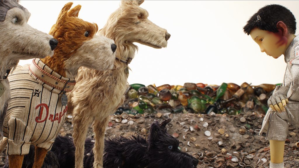
For the trash, we drew a lot of inspiration from contemporary photographers who’ve been chronicling the worldwide crisis of waste disposal and industrial refuse. Edward Burtynsky and Chris Jordan were big inspirations. They’d often have images of a specific kind of garbage or industrial waste, and what drew us to their work was while it was very horrifying and eye-opening in terms of our problems regarding waste disposal, they were also beautiful and strangely aesthetic. The goal all the time was to depict trash island as this kind of living hell, that was also somewhat beautiful to behold.
As far as that was concerned, Kurosawa himself was a bit of an inspiration because of his film, Dodes’ka-den, about people who live in a garbage heap. It’s about a slum that’s this forgotten corner of society where all the trash is dumped. That also served as a big inspiration.
Between complicated Trash Island, Megasaki, and the characters’ homes, there’s a lot going on. What was the hardest part of creating the film’s look?
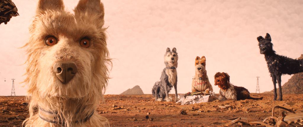
I think one of the interesting challenges was to create Trash Island so that it was not just one thing. Because the characters are traveling through it, we didn’t want it to just look like a city dump from end to end. As we developed the palette, we decided there would be transitions from color to color, which would inform what sort of trash we used. For instance, at our introduction to what we call the Hero Pact, Chief and Rex and Duke and those characters, they were in a completely rust colored environment. The idea is that it’s a place where they dump all the ferrous metals, so as they rusted, they seeped into the ground and saturated it.
Following that, at the [Little Pilot’s] crash site, it was going to be all white. We covered the ground with old faded newspapers, but we wanted to change it up a bit, so then we added old appliances, which were also white. From there, as a contrast, we go into a completely black environment, which is where [the heroes] encounter the dog catchers. The whole place was created from old cathode ray tubes and batteries, and so on and so forth.
The other intriguing design challenge that was a very basic thing from the beginning was: in what time period does Isle of Dogs take place? In the prologue, it says it’s 20 years in the future. But that’s not 20 years from our future, it’s a projection from an earlier period. What we used as a starting point was imagining 1963 Japan, and what 20 years in the future would look like, speculatively. We have a lot of artifacts from that period, telephones and appliances, even the computers the hacker uses are all very outmoded. And the vehicles are all artifacts of a sort of future that never really was.
You’ve worn a lot of hats in the film industry. How was your experience working with Anderson, and how was it a departure from your other work?
It was the first time I’d worked with Wes. Everything about working with Wes is different. I’ve never worked with a director as involved in the design process as he is. He knows his stuff when it comes to just basic design principles. He has a lot of control over everything that happens, and so I can’t recall a time when I was in so much constant communication with a director. He’s someone who has a very personal style, and that was really interesting, finding that. I’m very familiar with his films, and you look at them and think, well he always does this or that, he always frames in a particular way, which is true, but there’s a lot about that that you don’t immediately hook into. He’d often surprise all of us. We’d look at something and say, well this is how he’s going to want to frame this, or structure this, he’s going to want these lines to be totally symmetrical. And he would just really surprise you. He’d say, let’s just make this more chaotic. Then in the final product you see how that chaos fits into his sense of order. It’ really interesting. He’s a pretty amazing filmmaker and my respect for his grasp of the medium grew more and more as I worked on the film.
Featured image: (From L-R): Bill Murray as “Boss,” Jeff Goldblum as “Duke,” Liev Shreiber as “Spots,” Koyu Rankin as “Atari Kobayashi,” Edward Norton as “Rex,” Bryan Cranston as “Chief” and Bob Balaban as “King” in the film ISLE OF DOGS. Photo Courtesy of Fox Searchlight Pictures. © 2018 Twentieth Century Fox Film Corporation


