Costume Designer Luis Sequeira on Giving The Shape of Water its Sartorial Form
Guillermo del Toro’s much-anticipated suspense-fantasy fairy tale The Shape of Water opens this weekend. Much of the moody, Cold War-era film is set in a secret government laboratory, where mute, kindly janitor Elisa (Sally Hawkins), forges a deep bond with a mystery aquatic Amazon creature referred to in the lab as the Asset. For research or worse, various factions want the Asset killed, and with the help of co-worker Zelda (Octavia Spencer) and her artist neighbor Giles (Richard Jenkins), Elisa brings the Asset home from the lab, away from colonel in charge, Richard Strickland (a particularly cruel Michael Shannon). Visually, Del Toro’s film contrasts the bleakness of the lab with Elisa’s sheltered, isolated life, while elsewhere, modernity creeps into the 1960s setting. We talked to veteran costume designer Luis Sequeira about creating a symbolic color palette, costumes to stand up on screen to an amphibious creature, and working (for the third time) with the masterful del Toro.
What kind of considerations did you give not just to the time period, but also to the characters jobs (working in a secret government facility, etc.)?
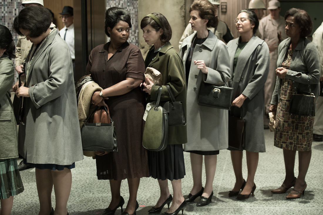
I think for me the challenge was to create a world that had an element of the fantastic, and costumes that felt like clothing. We built an inordinate number of costumes, and then processed them so they didn’t look like costumes. For instance, everything for Octavia was built, and then we processed everything once we built it, to represent a working life.

Octavia Spencer and Sally Hawkins in the film THE SHAPE OF WATER. Photo by Kerry Hayes. © 2017 Twentieth Century Fox Film Corporation All Rights Reserved
Did you work to contrast the human dress with the central character, the Asset? For example, was Sally Hawkins dressed in such a way to help contrast the Asset’s skin color?
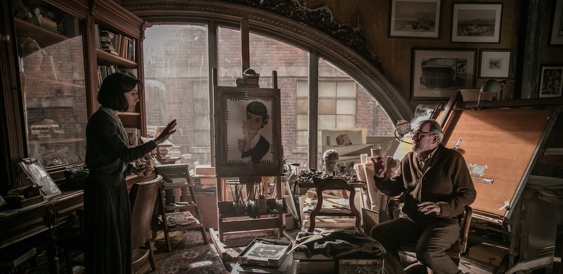
I had nothing to do with the Asset, but in regards to the rest of the color palette of the movie, we had a general color palette that the entire film would live in. The Giles character was a warm character, a warming element throughout the film, but the majority was in the blue-green-cool zone. This worked in conjunction with a sort of black and white feel to the film. Then we had specific themes that had completely different color palettes, like Strickland’s home. It represented the modern 1960s. The film world was content in its black and whiteness, and the bright colors represented the future. So when we went to Strickland’s home, the color palette completely changed.

Richard Jenkins and Sally Hawkins in the film THE SHAPE OF WATER. Photo by Kerry Hayes. © 2017 Twentieth Century Fox Film Corporation All Rights Reserved
Was there any specific planning as to how Sally, as a mute person, might dress?
My thought about Sally was that she lives a fairly sheltered life. She didn’t watch TV, she wasn’t really looking at magazines. We wanted to give her kind of an eclectic feel, from all different periods that got mashed together. In my head, she was one of the original thrift store girls, who kind of pulled pieces together. Everything was something that wouldn’t stand out, since this was all about people who don’t want to stand out, stand up for who they are, and what they think. So basically, the color palette was very muted, and later in the script was when we found the introduction of red, which represented her love but also her strength, where the character who seems the weakest ends up being the strongest.
Did you dress the characters for a warm or cold environment, given the cold nature of the facility, but the warmth of the Asset’s Amazonian home?
The facility itself was half on location and half studio, and was not exceptionally warm or cold. The finale of the movie is in pouring rain. We were shooting that in Canada, overnight in pouring rain. I had to figure out how to keep the actors dry and warm and create water barriers in all their costumes. So we had different costumes that had liners, wetsuits, vests, in order to keep the talent comfortable.
How was working with Guillermo del Toro? How does he inform your process?
I worked with Guillermo on Mama and The Strain, and then on this. So you know, Guillermo had distinct, amazing ideas and a fantastic vision. He’s amazing to work with, obviously. We would meet almost daily to go over the process, the collecting of pieces and fabrics, and starting to collage these fabrics prior to them becoming clothing.
Everything was processed. I would basically take a fabric in its natural state and we would over-dye it in five different tones. Then we would start to combine those. For instance, the cleaning lady uniforms were all built. We had seven different colors, but all varying slightly. Basically we had a patina that we created. Suffice it to say, nothing on screen is ever just a fabric. It was always processed and put through over-dying, sand-washing, an enzyme wash. Everything had a texture. It goes back to creating a life for the garment/ Every garment had a different life and length.
With Carrie, Mama, The Thing, and The Strain all on your CV, you seem to have a special inclination toward horror and suspense. Was your design process similar for these films? How did they inform what you did here?
I’ve done a few comedies as well, and I like to mix it up. I think what ends up happening is when you do one [type of] film, people think ‘oh, he’d be great for that.’ In most of the other films, they involved some special effects or technicality, which I think is what I get brought in for. What was great about The Strain and The Shape of Water was that we were creating an actual world. That meant taking my other knowledge and being super-creative in helping realize the vision.
Featured image: The Shape of Water theatrical poster. Courtesy Fox Searchlight.


