“The Penguin” Costume Designer Helen Huang on Gotham’s Gritty Glamour
Costume designer Helen Huang bridges reality and comic book storytelling in The Penguin, finding a brilliant balance that gives the series weight and a churlish glamour befitting a story set in Gotham’s criminal underworld. The hit series led by showrunner Lauren LeFranc is familiar—Gotham is our most explored comic version of New York City—yet heightened and deliciously detailed, blending a tactical mob story with the haunting metropolis in a period of rapid decay following the Riddler’s bombing and flooding of the city at the end of The Batman—The Penguin is set in that tragedy’s aftermath. Huang’s work, in particular, is not only a treat to the eyes but deepens the duality of the characters and the famous comic book city.
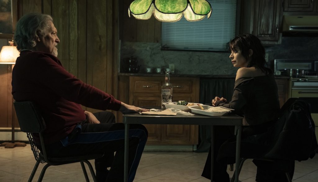
As Oz Cobb (Colin Farrell) attempts to gain control of Gotham’s criminal underworld, audiences see all the good, the bad, and the ugly sides of him. The same goes for Sofia Falcone (Cristin Millioti), whose impeccable, ordered style often contrasts her intense interior life and the barely sublimated rage she has for all the men in her life who did her rotten. Characters are well-drawn through Huang’s eyes, who previously won an Emmy for Netflix’s brilliantly salty Beef.
Recently, Huang spoke with The Credits about crafting Oz, Sofia, and the titular character’s young partner-in-crime, Victor Aguilar (Rhenzy Feliz).
How do you balance showing all sides of Oz, running the gamut between his good and bad taste?
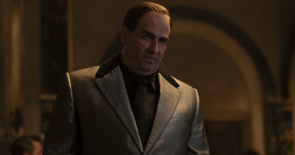
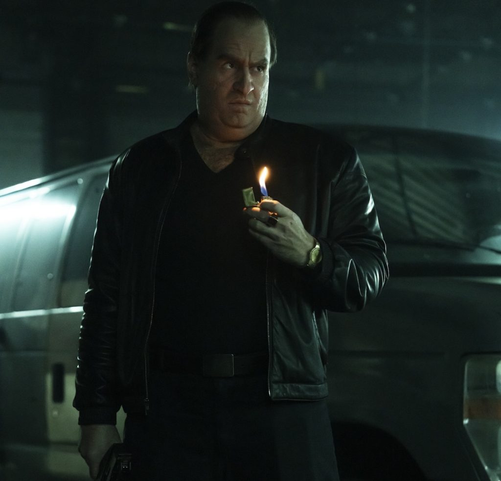
Well, with Oz, first of all, he is very concerned with masculinity. He probably grew up at a certain time, and the guys he idolized in his neighborhood represented what he viewed as masculine. So, his taste runs in that world, which is why he likes suits and structured tailoring. But he likes to think of himself as a rough-and-tough guy, so when he does more practical jobs, that’s what we designed for him.
Since it’s a comic book world, did you want to make some more heightened choices for him as well?
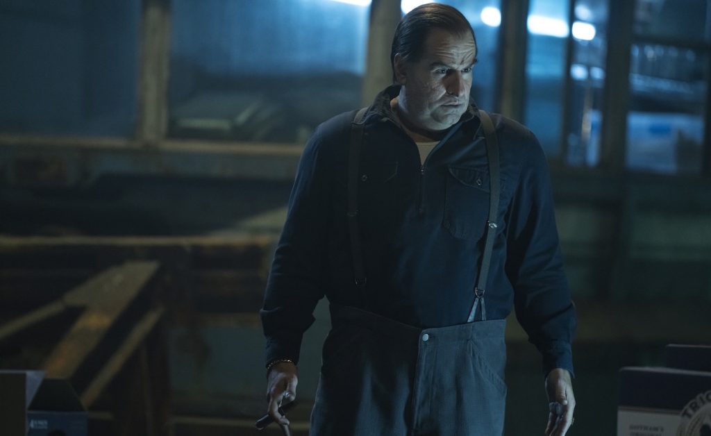
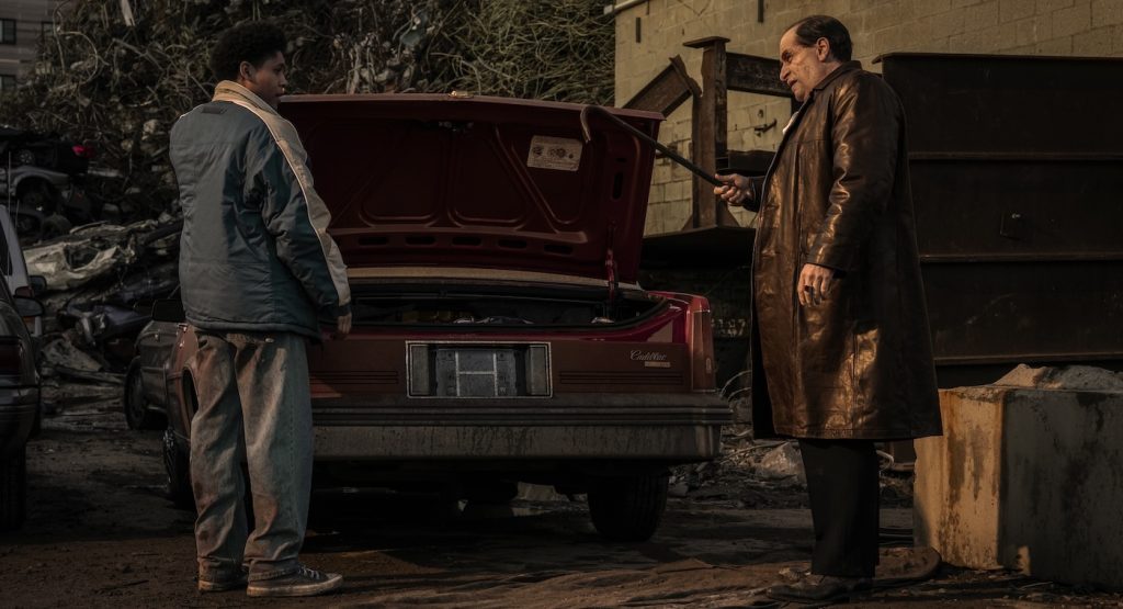
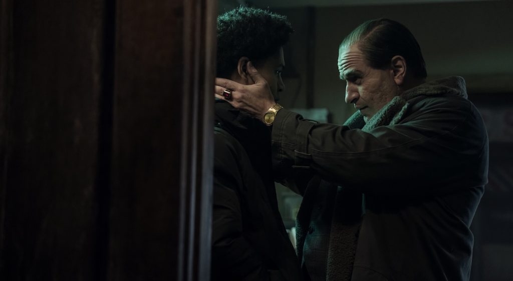
Something like The Penguin, you can never be totally realistic even though it’s grounded. You have to add that extra 20% of something that toes the line. We focused a lot on his silhouette, like how his lapels look. I like to think that Oz thought a lot about things like his head-to-lapel proportion. Later, in the episodes where he’s in the tunnels, we even did some classic workwear because Oz is dressing up for the part. He’s a man of the people, but I also think he likes old movies, so he gravitates toward these classic things, as well as things that might be flashy or distasteful to people like the Falcones.
How did you want the clothes to move with his body?
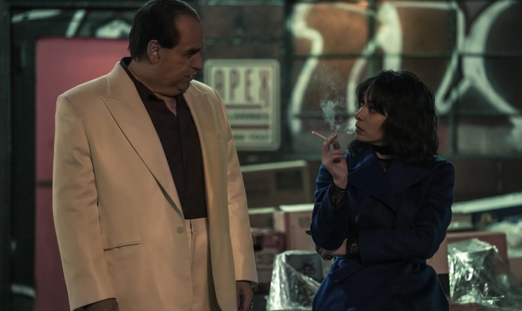
We tried to make it very close to his body. We also made his shoulders bigger, and his lapels were more 1970s-style, with bigger lapels to fit his dimensions and give it a timeless feel. We did take the waist in more. Oz probably really likes that silhouette. There’s a sense of insecurity about how he physically looks, so we tried to imagine what he’d tell the tailor if he got his suits custom-made. He also wore these pointy shoes in the movie, and when I saw them in person, I thought, “Oh, should we get him a more comfortable shoe?” But the decision was, no, he’d cram his foot into the pointy shoes because that’s how he feels his silhouette should be.
For Victor, what were some of your photo references?
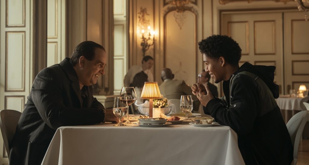
For Victor and all of Crown Point, I looked at many street photographers from the late 1970s to the 1980s, like Jamel Shabazz and Richard Sandler. We wanted Gotham to feel timeless, so I looked at those references for Victor. I personally love the ’90s; it creates a good contrast between his silhouette and Oz’s.
How’d the ‘90s influence you?
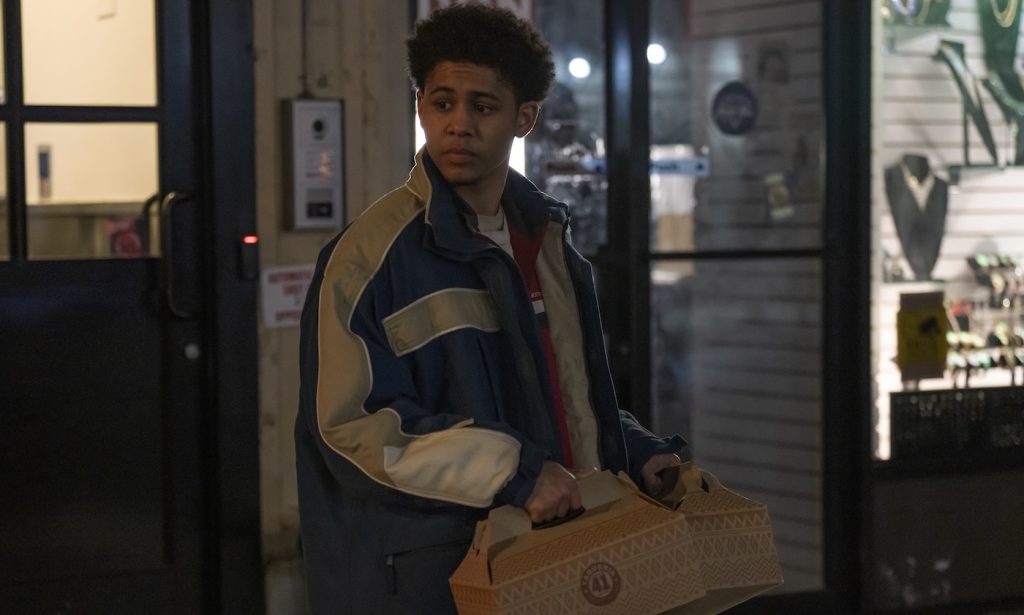
The ’90s silhouette is bigger, which is why I went in that direction with him. Everything he wears in episodes one to three was made just for him. We remade a 1990s starter jacket, something inspired by a Fila jacket. We even printed a Gotham basketball T-shirt for him. I wanted to give him the feel of someone who might have gotten a hand-me-down from his dad that he now thinks is cool. That provides contrast with Oz, who is colorful, but when he goes dark, he goes very dark. Victor, in the beginning, is more composed, so we used more color and brightness for him. He wears denim, whereas Oz doesn’t. It was all about signaling to the audience the generational contrast between Victor and Oz.
There’s a tangible contrast for Sofia Falcone as well. Early in the show, she’s buttoned up, but as an audience, we know there’s a lot of anger and sadness behind her eyes. How early on did you make that creative choice for Sofia?
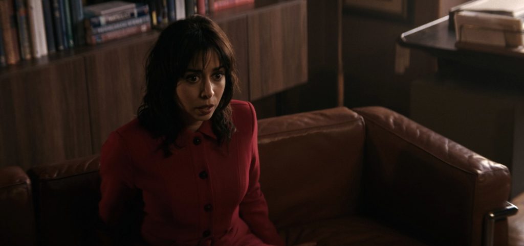
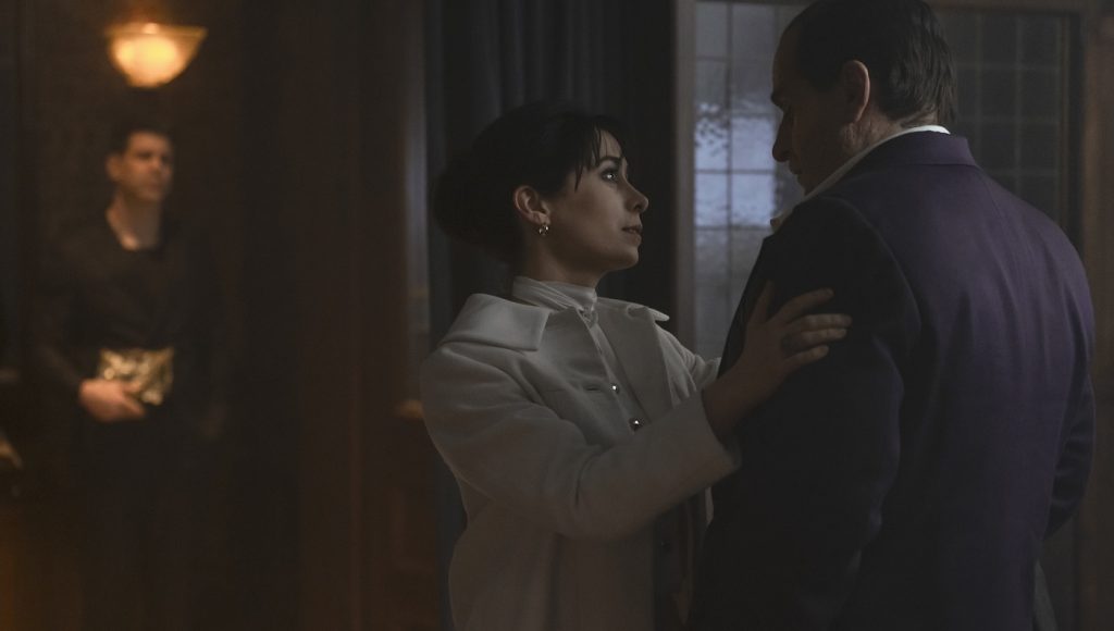
We talked about that a lot. How should she appear when they first meet her? Lauren, the showrunner, wanted her to feel put together. They wanted to avoid the “crazy female” trope but also make her a challenge for Oz. She’s composed, so he doesn’t know where she’s at mentally. Cristin plays it very quietly but extremely threatening until she becomes openly threatening.
What silhouette did you want for her?
We discussed her silhouette a lot because we didn’t want to go down the traditional sexy-female-comic-book-y path. We looked at 1960s silhouettes and ’90s Kate Moss. Her skirts are shorter, but they’re still very feminine in the Falcone world because we wanted her to contrast with her uncles and the other men running the organization, even Oz. We kept her feminine but in a different way than normally seen for a character like that.
How’d you want to show her evolution in the show?
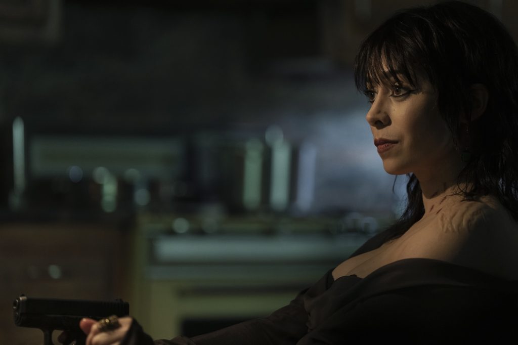
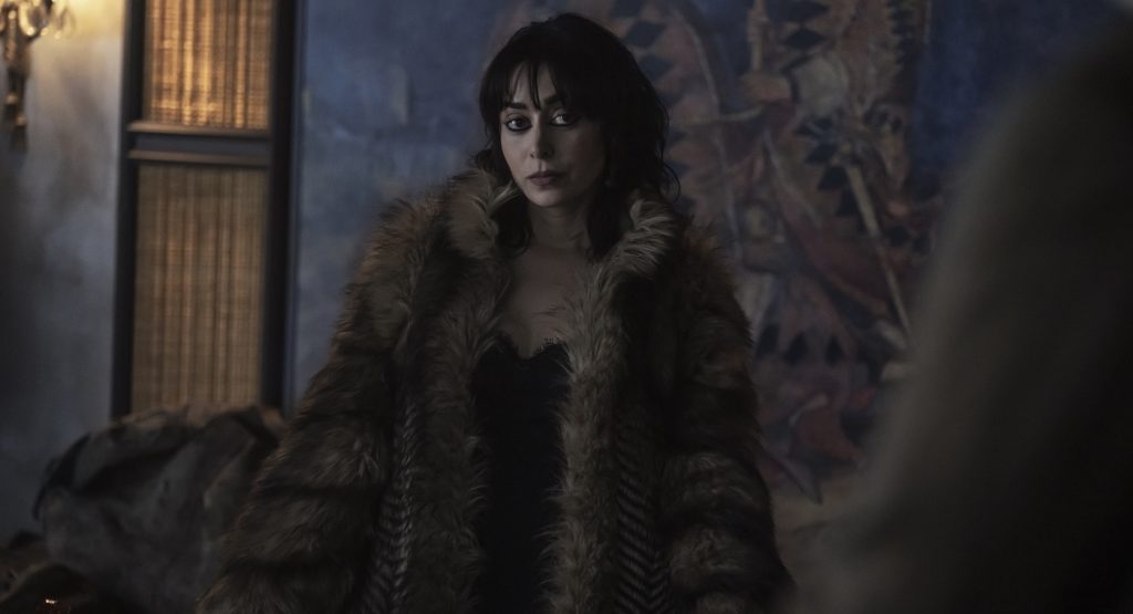
Yeah, as her wardrobe darkened, we brought in faux furs to give her more texture. We wanted to give her a big silhouette and a lot of texture as her character grew darker. Her collars got bigger, and her shoulders got bigger. Everything was about creating a sense of dimension and power.
There’s a fine line there. Earlier, you mentioned adding 20% exaggeration, but what would 21% look like? What’s too much for The Penguin?
21% would take her wardrobe too far. It would make it less polished. If she started looking sloppy, or if we went too far in showing more skin, it would have felt off. We consciously covered her up more in the beginning, even when we began showing more skin later. Everything is still really beautiful. It all feels like it comes from the same closet; she’s just wearing it differently. 21% would make her a completely different person, and you need her to stay in that comic-book realm.
What does that process look like for you when interpreting a character arc? Are you putting note cards along with costumes on the wall?
I always try to think about what works in the world and how you visually want to see characters interact in a frame. I map out bigger themes for the show. For example, this show is about power and institutions failing people. Whether it’s the Falcones, a big crime institution, or Gotham City itself, which is failing its citizens, I break down these larger themes into the characters and try to show that through design. For the Falcones, we did a lot of old European glamour, while Oz and the people beneath him are more street, more new money. And then Victor is in a totally different world. I also look through tons of photographs, magazines, and books and put up what interests me most. Sometimes, you’ll throw an idea away, but later, when you read another version of the script, you’ll realize it fits. My husband calls my computer desktop the “junk drawer” because it’s so chaotic. I try to organize it at first, but eventually, it just becomes one folder labeled “Episode 108,” which is a trash dump of images. It’s all part of the process.
For more on The Penguin, check out these stories:
“The Penguin” Episode 4 Introduced a Classic Batman Villain
Inside the Shaky Alliance Between Oz and Sofia in “The Penguin” Episode 3
How “The Penguin” Production Designer Kalina Ivanov Helped Bring Gotham Back to New York City
Featured image: Cristin Milioti and Colin Farrell. Photograph by Macall Polay/HBO.


