“It Ends With Us” Production Designer Russell Barnes on Crafting Visual Contrasts of Love & Control
Director Justin Baldoni’s film adaptation of Colleen Hoover’s hit novel, It Ends With Us, in which Baldoni also stars as vicious neurosurgeon Ryle, is a surprise hit of the summer. The movie is a romance suffused with darkness, following Lily (Blake Lively as an adult, Isabela Ferrer as an adolescent) as she grows up and falls into a violent relationship that mirrors her parents (Amy Morton and Kevin McKidd).
As an adolescent in Maine looking to escape, Lily strikes up a secret, endearing romance with Atlas (Alex Neustaedter), a runaway fleeing his own violent stepfather. Both desperate to get out, as adults, they land separately in Boston, where Lily opens a flower shop and starts dating Ryle. When the former teenage sweethearts unexpectedly reconnect at Atlas’s (Brandon Sklenar) restaurant, it sets off a string of jealous, brutal incidents inflicted by Ryle on Lily.
At first, Lily denies what’s really happening in her relationship and carries on at her shop, assisted by Ryle’s funnier, kinder sister, Allysa (Jenny Slate, as both comic relief and moral center). As she gains clarity and a closer relationship with Atlas, she also finds herself in a situation where she’ll never truly be rid of Ryle. As a backdrop to this difficult web, Lily blossoms professionally—her lovely floral store does well, and she inhabits the kind of spaces reflective of hip young professionals, whether it’s Atlas’s stylishly homey restaurant or her boyfriend Ryle’s cold, if nicely turned-out condo.
We spoke with production designer Russell Barnes (No Hard Feelings, Americana) about the contrasts in Lily’s life from rural Maine to Boston, designing a unique look for the Lily Blooms shop, and recreating Maine and Boston on location throughout New Jersey.
The scenes the characters inhabit are often breathtakingly pretty, despite what’s happening between them. Was there a directive to pursue a sense of heightened beauty?
I made a deliberate effort to craft a heightened sense of beauty in the environments, but this beauty was always anchored in the characters’ personalities and journeys. The aesthetic wasn’t just for visual appeal; it served as a window into our characters’ inner worlds. We aimed to create spaces that viewers could visually explore, uncovering Easter eggs and character-driven details, much like rereading passages in the beloved book.
How so?
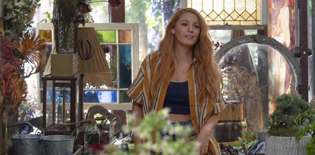
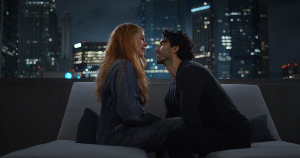
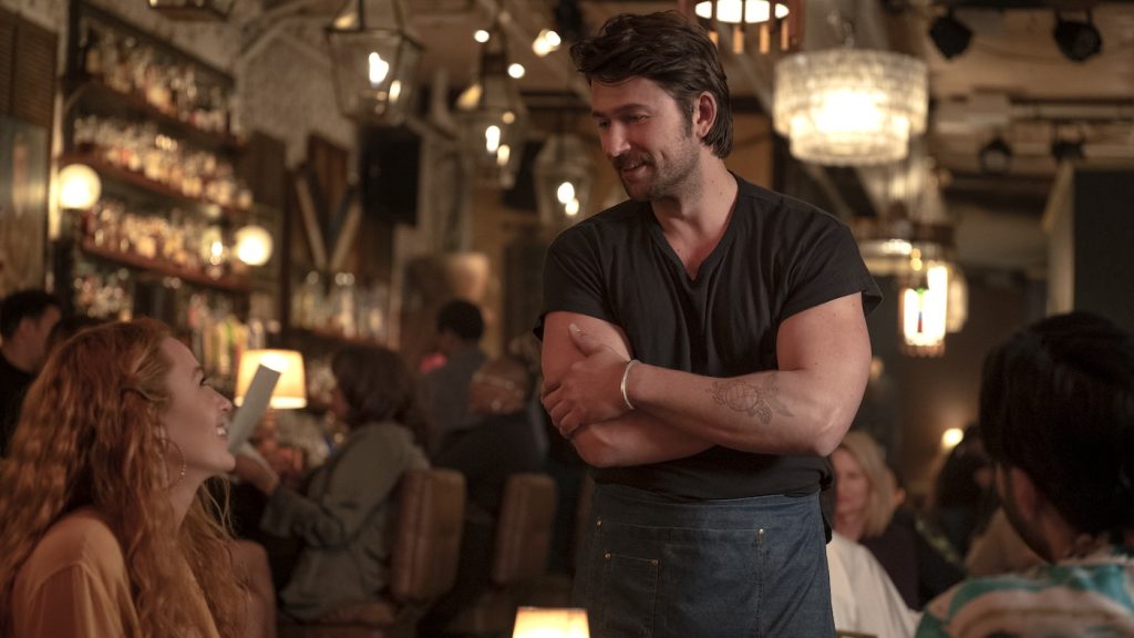
For Lily’s world, the goal was to create spaces that felt relatable and attainable—inviting and warm, with bursts of vibrant color and intricate details that mirrored her creativity and resilience. Atlas’s restaurant subtly echoed the essence of Lily Blooms, highlighting the parallel paths of these two characters. In contrast, Ryle’s world leaned into a regimented, cooler, and more high-end design, reflecting his controlled and structured appearance. We deliberately muted the color palette in certain environments during Lily’s darker periods, reflecting her emotional state.
What did your process look like to create the specific look of Lily’s flower shop?
The design process for Lily Blooms Flower Store began with extensive research into floral stores and social media floral events, extrapolating design elements that reflected Lily’s unique style. Justin and Blake brought their own ideas and inspirations, and from there, we built the aesthetic from the ground up, starting with the origins of the Lily Blooms location before it became hers. We decided the previous store would be a vintage French café—a quiet nod to Atlas—incorporating upcycled elements that followed Lily into her floral shop.
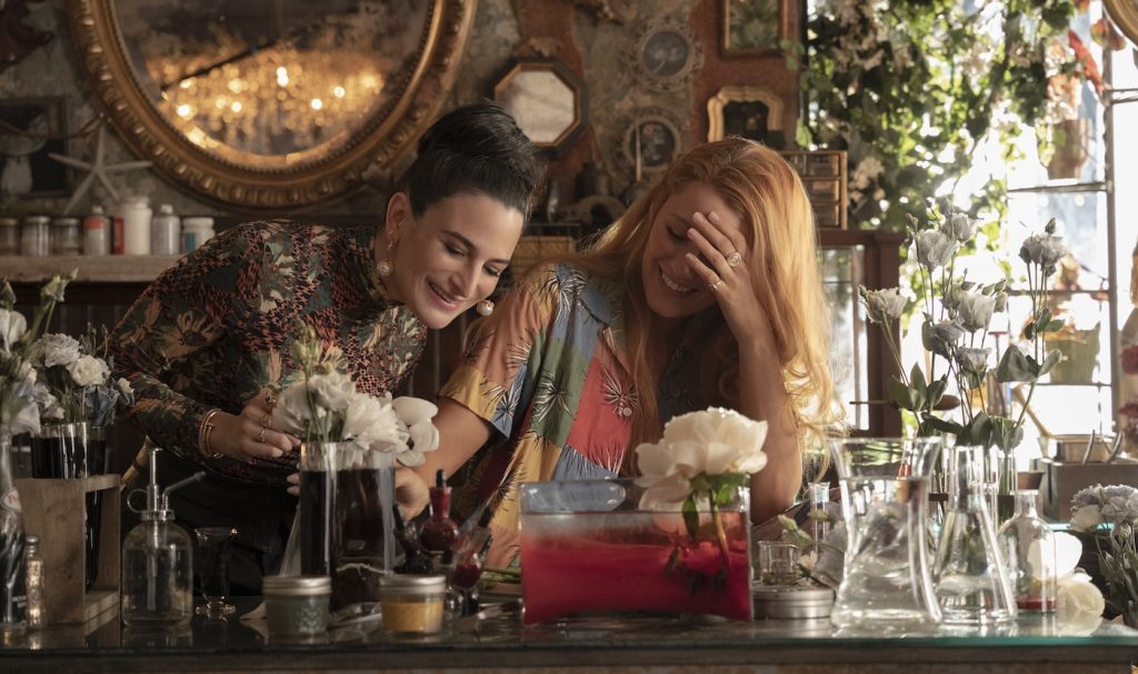
We tested hundreds of paint colors, selected dozens of wallpapers, and explored different finishes for the café. Blake, Justin, and I actually created a custom color for part of the store, we named it BBB (Blake, Baldoni, Barnes). Keen-eyed viewers will see the wallpaper from the abandoned cafe transition into the finished store. I had an image of a beautiful 1800s French tile that I’d saved for the perfect setting, which became the basis for the Lily Blooms floor. We printed it as a vinyl decal, complete with graphically added texture, cracks, and wear—a very effective movie cheat. As a huge upcycling fan, I also pulled set dressing from my own barn, including the iconic cash register, bar, and stools. My wonderful set decorator, Carrie Stewart, gathered exquisite detail pieces and furniture to complete the look.
Atlas’s restaurant feels, in a way, like it mirrors Lily Blooms. Was that intentional?
The mirroring of Atlas’s restaurant and Lily Blooms was entirely intentional. Both characters are building businesses from scratch with limited resources, so there’s a reclaimed aspect to their spaces. Both characters build art from organic materials with limitless passion. We incorporated floral elements and greenery into his restaurant, all with an underlying welcoming, warm feel. Lily needed to feel safe and secure in this environment. I wanted viewers to imagine that they might have both shopped at the same flea market or antique store, potentially missing each other as they wandered the rows of stalls, sourcing decorations for their respective spaces.
Can you tell us a bit about setting up Lily’s childhood home across from the abandoned building where she first sees Atlas?
One of the more complicated aspects of the production involved the location for Lily’s childhood home. The locations department scoured New Jersey for a suitable home adjacent to an abandoned house but couldn’t find one that fit the story and design. We considered building the facade of an abandoned home next to the home used in the movie, but after much discussion, we decided to part out the two locations. We found a house two blocks away that was in the process of being renovated, and we fully dressed it to give it the derelict appearance. The view outside Lily’s childhood bedroom is actually a full VFX shot, as, in reality, there is only a lawn and street there.
While filming, did you work with any local businesses on the production design there?
We shot in New Jersey, with all our offices and support locations based there, including our construction and scenic shops and set dressing warehouse. The goal is always to support local businesses wherever we shoot, so we sourced as much as possible from local vendors. Lily Blooms Store was located next to the wonderful Bwe Kafe in Jersey City—a favorite spot for our film crew, who all love great coffee. There was a constant stream of our crew getting their caffeine fix! It was real joy to experience to see what New Jersey had to offer in the food and coffee scene.
Did you read the original book as part of your prep for the shoot?
I read Colleen Hoover’s book many times as part of my preparation. My wife and I took turns reading it as we traveled through Costa Rica and Nicaragua. By the time it reached the movie’s art department in New Jersey, it was a bit beat up, with beach sand in the creases, covered in handwritten notes and post-its highlighting different aspects related to the characters and design. We generated notes from it for each department, and it became the touchstone for the Lily Blooms store. It’s now a treasured piece of memorabilia for me, especially since Colleen Hoover autographed it!
For more upcoming films from Sony Pictures, check out these stories:
New “Kraven the Hunter” Trailer Finds Aaron Taylor-Johnson’s Marvel Villain Off the Leash
New “Paddington in Peru” Trailer Finds the Beloved Bear Preparing to Head to South America
“Fly Me to the Moon” Screenwriter Rose Gilroy Reimagines the Apollo 11 Moon Landing
Featured image: Justin Baldoni and Blake Lively star in IT ENDS WITH US. Courtesy Sony Pictures.


