How “Lessons in Chemistry” DP Zachary Galler Created a Show-Within-a-Show
In writer Susannah Grant’s adaption of the novel Lessons in Chemistry by Bonnie Garmus, currently airing on Apple TV+, Brie Larson plays a budding chemist, Elizabeth Zott, thwarted in her work by her male colleagues who put politics and patriarchy above credible scientific achievement. Shut out of any hope of a chemistry career despite her brilliance, Elizabeth falls into a television career. It’s the early 1950s, and cooking shows are still relatively new, and Elizabeth, both telegenic and a mother, if not a traditional one, is an excellent cook with a television producer for a neighbor.
Cinematographer Zachary Galler (Paper Girls, Dr. Death), who worked on series’ episodes one, two, five, and six, had to set two stages: Elizabeth’s suburban life, featuring an office romance with cantankerous chemist Calvin (Lewis Pullman) and unexpected journey into motherhood, contrasted with her foray under the harsh lights and even harsher psychological milieu of television stardom. Despite the obstacles she faces, her environments are beautiful, lit in a naturalistic way in Elizabeth’s daily life, and blazing and vivid as she ascends in her studio career.
In either setting, despite being a period piece on its face, the camera work in Lessons in Chemistry intentionally avoids a sense of nostalgia, a tendency we got to speak with Galler about, as well as how he created a show within a show, what makes lighting a lab interesting, and how he and the crew brought a vintage sensibility to Elizabeth’s studio through functional retro-engineered props.
The lighting feels real, whether it’s the sun filtering through the windows onto Elizabeth and Calvin in their lab or Elizabeth, Harriet, and their kids eating dual-family dinner at night. How did you approach that?
We worked with Len Levine, my amazing gaffer, to come up with a plan. We had pretty large builds on these stages and pretty large installs and had to plan for a five-episode arc. Knowing how long we were going to be spending in there, we put in a pretty decent-sized lighting installation and did a lot of it with LED so that we could quickly change from day to night and be able to give the directors and actors flexibility. We used lenses called Canon K35s. They’re like these beautiful old vintage lenses. It was a combination of lighting and those lenses that let us keep it naturalistic. We tried to light more from outside the set than inside, in the interest of creating an environment for the actors to exist in, rather than making them step around too many stands and lights and things like that. Philosophically, to me, everything should be there in support of the actors and great performances because ultimately, that’s what’s going to draw the viewer in most.
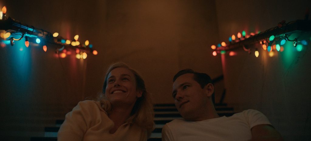
Some of the most arresting lighting also seemed supported by what we see on screen, like in the case of the Christmas dinner in the lab in the second episode.
Cat Smith, our production designer, really helped me out by giving me a lot to work with in there. We tried to motivate the feeling of the lighting from the Christmas trees and the Christmas decorations. Spoiler alert: for these characters, this was kind of the pinnacle of their relationship, and we wanted it to feel as magical and fairy tale-ish as possible within the set of rules we had for ourselves.
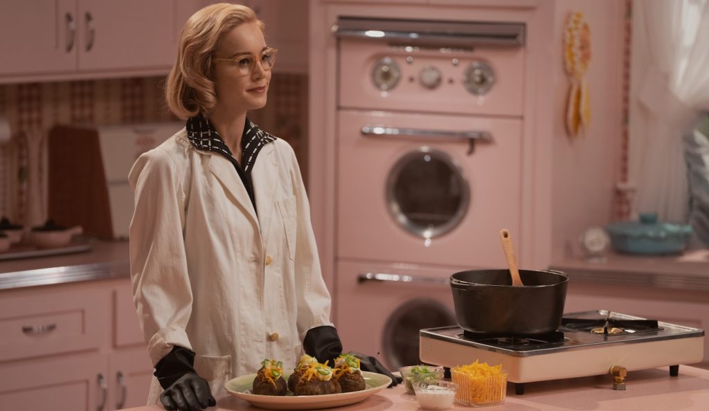
You also had to create a show-within-a-show once Elizabeth starts cooking for television. How did you make that stand apart from her daily life?
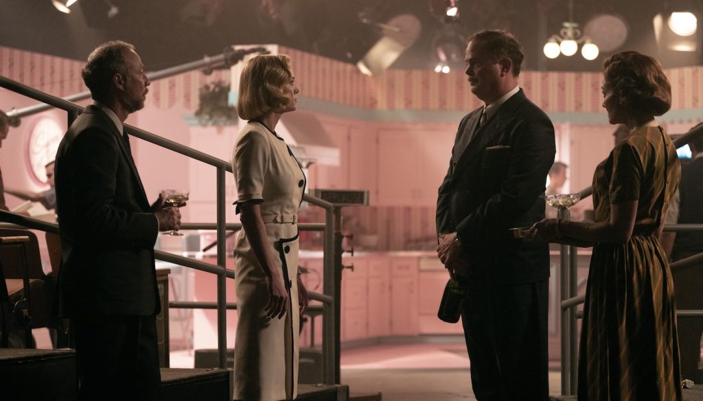
I wanted the show to have a kind of perfection in crispness and sharpness that we hadn’t really seen too much in the subjective, naturalistic parts of the story. In episodes 5 and 6, where she gets into the show, at first, it feels kind of saccharine, and it’s not what she wants. It’s what everybody else wants, and she’s finding her way, and as this character does repeatedly, she smashes through the barriers. It needed to feel sort of fake. It’s all pink. It’s not what she would have chosen. I wanted it to be there as a contrast to the dynamic we had in the rest of the show, this romantic part with her and Calvin that feels warm and soft and moody and cozy. This is a harsher environment where, ultimately, the stakes are very high, but she succeeds. Even though it’s sterile and clean and bright in a way that we haven’t really felt elsewhere in the show, it’s there for her to commandeer and start steering.
Did you also look to vintage cooking shows for inspiration?
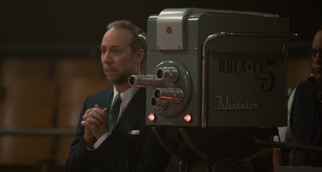
Len, the gaffer, Cat, the production designer, and I did a lot of research about the period and what this place would have looked like had it actually existed. Julia Child is a thing that comes to everybody’s mind, but there were a lot of cooking shows at this time period. And especially researching Los Angeles, to see smaller studios, what the technicians would have looked like, what the lights would have looked like, and how they would have lit the studio, was really fun. Actually, from a prop house, we found a bunch of lights to be on-camera and then were able to retrofit some of them with newer LED technology so that it wasn’t a thousand degrees in the studio, and we could move things around and dim things up and down without changing the color temperature much. At first, I went in and said we should use all period lights; we’ll do it exactly how they did it. Then I realized this is cutting off our nose to spite our face. There’s a much easier way to do it and still keep the aesthetic. But it was cool to use the old stuff that we don’t really get to put our hands on anymore.
So what we see on screen while Elizabeth films in the studio is also providing actual lighting?
We’re seeing behind the scenes, so the character has to be lit, but at the same time, if we’re seeing it from the back, we’re seeing those lights. We could do maybe a little augmentation for a closeup. But everything that you see is there. Cat Smith found the old pedestal cameras that had these turret lenses on them, and they were actually working. We installed these lipstick cams that put a small black and white image — it’s a digital image, but you can’t really tell — on the back of these cameras, which is what the camera operators in the 50s would have had so that we could really have the run of the studio. It was all practical, and we didn’t really have to do the effects and be careful about what we were shooting. Cat gave us an entire 360-degree area to play in.
Outside the cooking show, how did you decide how far along the vintage spectrum to go?
It’s not a nostalgic story. The fact that it takes place in the 50s is part of the story, but it’s not necessarily what the story is about. I think Elizabeth Zott could have existed under circumstances in the 70s, 80s, or 90s, and things would have been different aesthetically, but the themes haven’t changed that much. We didn’t want to look back with rose-colored glasses in a way that sometimes a period piece would. We wanted it to feel alive because the things we’re learning about, what this character is going through, are things that still happen.
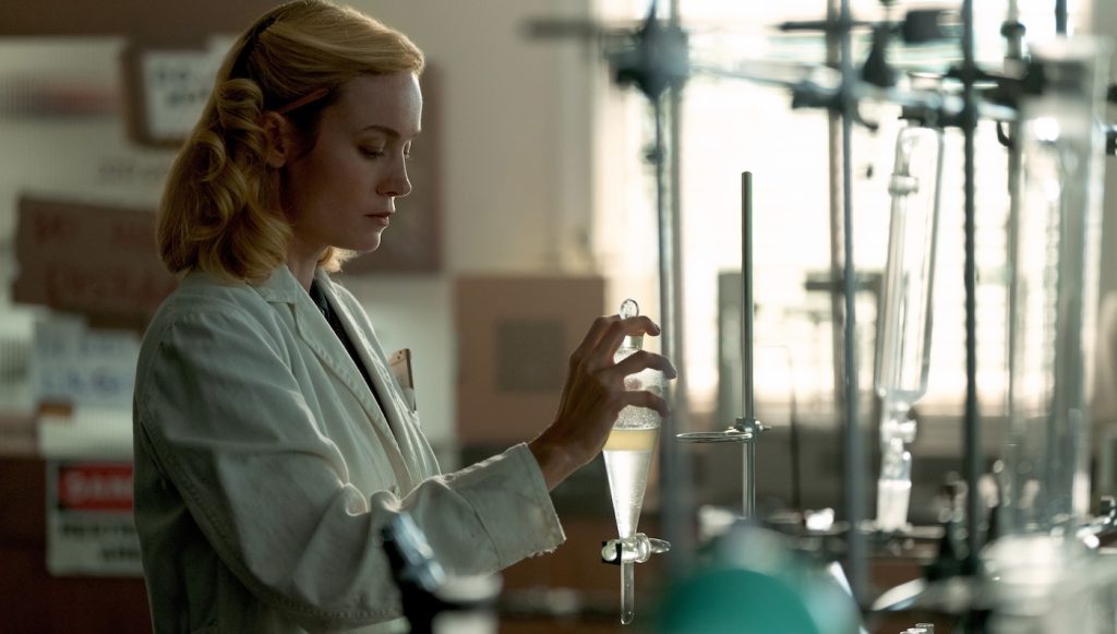
The lab scenes are interesting because they’re quite beautiful but also present a lot of real science.
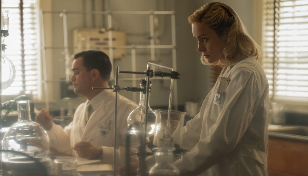
That’s just another testament to Cat Smith’s genius, really. These sets were really beautiful, and then it’s funny, we had these science advisors, and we were also trying to adhere to the book. It’s this huge best seller. We don’t want to mess with the formula that’s working; forgive the pun. But like 90 percent of the things scientists do is just clear liquid going into clear liquids, and so we’re figuring this out in prep, and we’re just like okay, we thought it would be a lot more inserting stuff into test tubes and Bunsen burners. There was just not that much visually that happens. Finding a good amount of glass to keep the space looking busy without having our eyes not be able to understand what’s going on was a fine balancing act. And Calvin’s character had really lived in this space, so there was that added aspect of that patina on everything. The labs were an interesting challenge. It was great because Cat built the floors in a way that we could roll dollies around very easily. It was tricky to shoot because it was just four white walls, and Cat did the best version of it that I’ve seen. I think the props and the set direction really just helped it along beautifully.
For more on Lessons in Chemistry, check out these stories:
Brie Larson’s a Cooking Phenom in First “Lessons in Chemistry” Trailer
Featured image: Brie Larson in “Lessons in Chemistry,” now streaming on Apple TV+.

