How “Poker Face” Production Designer Judy Rhee Built a Winning Hand
Already renewed for a second season, the Rian Johnson-created series Poker Face garnered universally enthusiastic reviews and built a passionate following ever since its first episode dropped in late January. Johnson has said Poker Face was built in the tradition of the great crime series of the 70s and 80s, including Columbo and Quantum Leap. As such, each episode is constructed to stand as its own “How Dunnit” (a twist on the “Whodunnit”), with guest stars playing roles central to each story, but with one character, Charlie Cale (Natasha Lyonne), acting as the through-line for the series as a whole. Charlie is a drifter on the run from folks set on killing her, and she has learned how to live below the radar by taking odd jobs in a series of forgettable small towns. Her uncanny skill at telling lies from the truth involves her in solving the unconnected murders taking place around her.
The Credits spoke to Poker Face production designer Judy Rhee about the hand she played in pulling this delicious new series off. An artist with decades of experience, she excels at creating environments that further the story and offer small revelations about character. The devil, as always, is in the details, and Judy Rhee’s a master of choosing just the right ones.
How did the fact that Poker Face was inspired by shows like Colombo influence your choices as the production designer?
With this series, we knew each episode was going to be its own individual story, and the only thread was Charlie’s character, with Cliff [Benjamin Bratt] occasionally showing up here and there. As a result, we had the opportunity and also the challenge of creating ten specific worlds. The fun part is experiencing parts of the country most people don’t get to encounter, so for the production design, it was about creating places with distinct personalities. Rian and I talked about it feeling more timeless, even though it takes place in the present day. When you travel, you often find places where time has stood still in varying periods, so you may see hints from the 60s through the 90s. Most people don’t upgrade or renovate regularly outside of more affluent metropolitan areas of the country, and people aren’t necessarily buying new stuff all the time, which helps to show the history.
Can you give me an example?
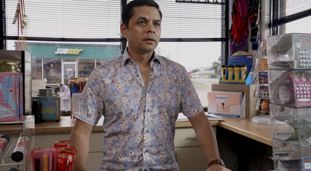
In Episode Two, the aesthetic choices we made for the convenience store were to reflect how it may have been recently acquired by a family with a specific background. Maybe it’s been newly painted on the surface, but the building has been there for some time. In contrast, the garage across the street has been owned by the same man for many years, and he’s made very few changes, so that’s going to have a different look, feel, and texture altogether.

How did you approach designing for episode five, “Time of the Monkey,” which features Judith Light and S. Epatha Merkerson as 60s radicals?
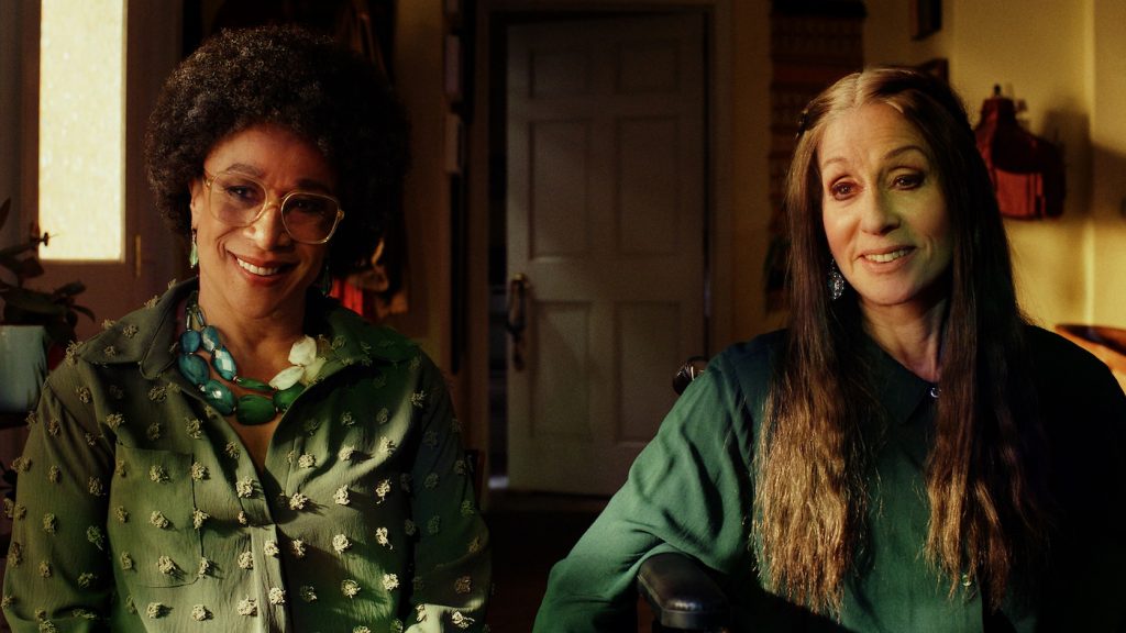
In that particular episode, there’s an overall general aesthetic of a retirement home, which is manicured and impersonal. It’s slightly sterile but also attempts to be homey. Their individual living space, though, has been personalized to show a bit of their history from the 60s and all the things they’ve collected throughout their lives, including their political beliefs, musical tastes, and all that, without being too obvious and hitting people over the head. So, when those flashbacks happen, it makes sense why those posters, or that macramé, or that particular piece of textile is in their home. Then there’s that quick moment where we see a neighbor’s kitchen that has the exact same cookie-cutter layout but is decorated in a less colorful way to reflect her different history. I think it’s important for the design to always visually support the story whenever possible and show how the characters occupy and move through their surroundings.

Did you find a place you could use for the stage and backstage in Episode Six, “Exit Stage Death,” or was it built?
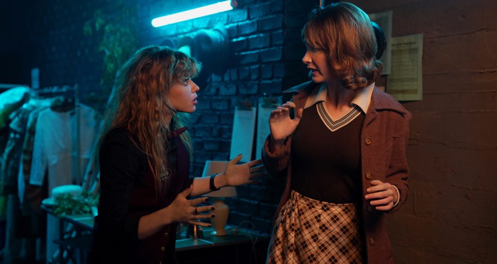
That was created. We built almost everything. We started with the obvious of scouting for an existing theater or stage that we could modify and dress. Rian wanted it to feel like a small-town dinner theater, so it had to feel intimate but spacious enough to accommodate tables and chairs, not theater seats or risers. We scouted every possibility without going too far out of our hub, but couldn’t find the right configuration to create what was needed. Then we realized it had to be separated into different parts. The catwalk we built on our stage in Newburgh, the stage of the theater, the theatrical set onstage, and the dressing rooms were all constructed at a nearby abandoned event space. That’s also where we created all our interior casino floors and bar, crow’s nest, and Sterling Jr’s office in Episode One. The theater kitchen was modified at the same location, with connecting hallways and doorways. There were a lot of specific camera angles that needed to work with each set, so everything was designed and fabricated with that in mind, like her climbing up to the catwalk and looking down from there, the feather falling, the trapdoor, the backstage, and the wings of the stage. All these elements required close coordination with the DP, lighting, and the art and set decorating departments to achieve what was written and how it was shot. I don’t think this would have worked in an actual theater location.

In Episode Eight, “The Orpheus Syndrome,” Nick Nolte plays old special effects artist Arthur Liptin, inspired by special effects pioneer Phil Tippett. Arthur’s workshop is full of pieces representing his entire career. What were your collaborations in pulling that together?
We knew early on in the schedule that Arthur’s barn was going to be a big endeavor. The art and set decoration departments worked together in reaching out to various special effects makeup teams, model makers, sculptors, and puppeteers to ensure we had the quantity and variety we needed to represent Arthur’s years of work. We also had our incredible scenic department fabricate what they could to supplement our rentals. In terms of working with the legendary Phil Tippett, I mean, what an honor and a dream. After a few discussions and feedback with Rian and Natasha, Phil and his team created the “Orpheus Syndrome” stop-motion creatures, as well as the miniature tabletop set. After it was shipped from California, our art department did some augmentation to it for practical shooting purposes. Because Phil and Rian had previously worked together, they trusted us enough to send some of their other existing models for Arthur’s barn and his museum exhibit. After several months, we rented and made enough to represent Arthur’s career and fill his barn. It worked in our favor that it was originally empty and open, except for a few columns, so we could design and lay everything out to be what we wanted it to be. It took a lot of time. Thankfully, we had a great crew to execute it with believability.
All episodes of Poker Face are currently streaming on Peacock.
For more on Universal Pictures, Peacock, and Focus Features projects, check out these stories:
NBCUniversal Archivist Natalie Auxier Takes Us From “Jurassic Park” to “Fast X”
New “Oppenheimer” Trailer Reveals Explosive Footage in Christopher Nolan’s Historical Thriller
“Polite Society” Writer/Director Nida Manzoor on Her Genre-Melding Feature Debut
Featured image: POKER FACE — “Dead Man’s Hand” Episode 101 — Pictured: Natasha Lyonne as Charlie Cale — (Photo by: Peacock)


