“Shrinking” Production Designer Cabot McMullen on Laughing & Crying in Pasadena
Shrinking is that rare hybrid; a laugh-out-loud comedy that turns on a dime into a lump-in-your-throat drama. Created by star Jason Segel, Ted Lasso co-creator Bill Lawrence, and writer (and Ted Lasso star) Brett Goldstein, Shrinking follows Segel’s therapist Jimmy the year after his wife, Tia (Lilan Bowden), has tragically died. Because Jimmy is played by Segel, he’s naturally funny, but we also find him in a personal and professional tailspin, failing his daughter, Alice (Lukita Maxwell), at home and infuriating his colleague, Paul [Harrison Ford], at the office.
Shrinking is also rare in how it lovingly depicts Pasadena, a bucolic city in Los Angeles County that is rarely allowed to be itself on film. As production designer Cabot McMullen explains, it was the mix of comedy and drama and the fronting of the pretty but oft-overlooked Pasadena that drew him to the project.
“The pilot had everything that I loved about Billy [Lawrence]’s work in terms of balancing the comedic aspect and the drama,” McMullen says. “And I loved that it was also a story about Pasadena. Most people shoot in Pasadena as someplace else, but we had an opportunity to create a new character called Pasadena. Our location manager, David Flannery, who’s just brilliant, grew up there, and his nickname is Mr. Pasadena.”
We spoke to McMullen about crafting a series that’s not afraid to pivot from laughter to tears, doing Mr. Pasadena proud in the city’s depiction, and how he helped capture one wounded man’s slow journey into the light.
You’ve worked with a lot of the Shrinking team for years—can you walk us through your history with co-creator Bill Lawrence and the rest?
The real draw for me with Shrinking was the team. I go back with [co-creator and writer] Bill Lawrence and [director] Randall Keenan Winston and a lot of these creatives for almost 30 years now. We all met in New York on Spin City. After a hundred episodes of Spin City, we took a break. Then I was invited to come out to California to work on Scrubs with them, which we did for nine seasons. I was itching to get back to this very special genre that Billy’s created—comedic drama. It’s a very unique balancing act that he does where you’re watching a scene, and you’re laughing your head off, and then suddenly you turn the corner, and you’ve got a lump in your throat, and you’re crying. Randall called and said we’re doing this project with Apple. After Ted Lasso, Billy had a lot of momentum at Apple, and they were hungry for whatever he was going to come up with next, and I wanted to be a part of that.
How did you approach designing the world of Jason Segel’s therapist Jimmy, whose life imploded a year before with the death of his wife?
They really wanted to tell a story about a man in grief who isn’t taking care of himself and isn’t taking care of his daughter. It’s really a story about a guy who’s in the darkness and then emerges from that darkness over ten episodes. So we looked at it like we were planning a five-hour feature film that we’d film in 10 installments. We had a bunch of conversations between Jason, who was an executive producer on it, [director] James Ponsoldt, Neil Goldman, the lead writer, and Billy, and right from the start, I could feel like we were working on something really special here.
You get to play with an interesting juxtaposition here in that the Pasadena of Shrinking is sunny and pretty, while Jimmy’s life has become dark and sad. How did you speak to his inner turmoil with the production design?
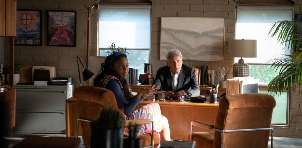
There were references that we talked about, like in American Beauty, where there’s this underbelly going on, a small town/big problems sort of thing. But it was really all about Jimmy’s character. We focused on him as the center of the story. In terms of visual clues and hooks, we made a very conscious choice to keep the drapes drawn in his house and keep everything close and dark in the beginning. The other thing is if you watch the pilot episode, we made a conscious choice to leave half the frame empty with most of the shots of Jimmy, so you always felt like his wife Tia had left. It was also about the color palette, creating window treatments we could control light with. You’ll also note that all the plants in his house and his office are dying. He’s just not taking care of himself. We don’t hit you over the head, but it starts to seep in and permeate your consciousness a little.
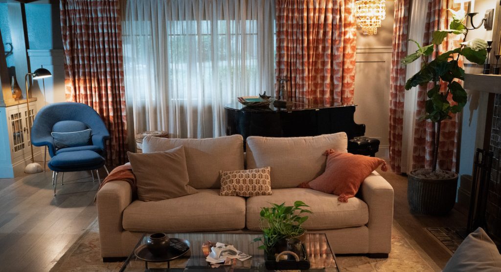
Yet his house and his world are objectively beautiful, which is counter to what kind of environments you usually see on film or on television for people in freefall depression.
We didn’t want him living in squalor where there are wine bottles all over the place, that cliche ‘man in distress’ sort of thing.
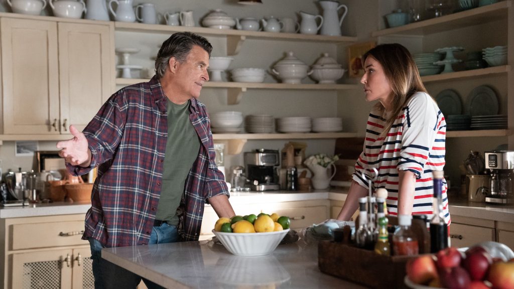
Yet you get the stark difference between Jimmy and his daughter Alice’s house and their neighbor, Liz [Christa Miller], whose house is spotless.
In Liz’s case, she’s tough as nails on the outside, but on the inside, she’s really vulnerable and somewhat needy. So we made this choice to make it feel like she’s living in a Nancy Meyers movie, where everything is just perfect. If you look at the interior of her house, it’s the room from It’s Complicated. It’s Meryl Streep’s interior with the French country kitchen. Andrea Fenton, who’s our set decorator, actually worked on those movies, so we have the right person.
You’re filming primarily on sets, right?
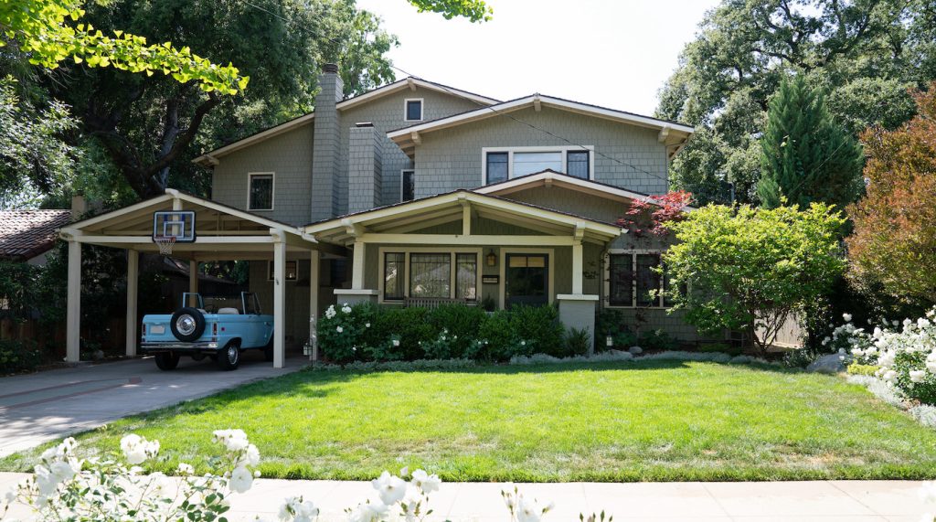
Ninety percent are stage sets, and we shoot exteriors on location maybe two or three days a month. But everything is done on stage four and stage six at Warner Bros. If you look at the exterior of Jimmy’s house, it’s actually right on the county line between Altadena and Pasadena. We found a house that was literally 50 yards from Pasadena. We knew Jimmy’s house wanted to be a craftsman, and then we thought a mid-century vernacular would be great for the office building.
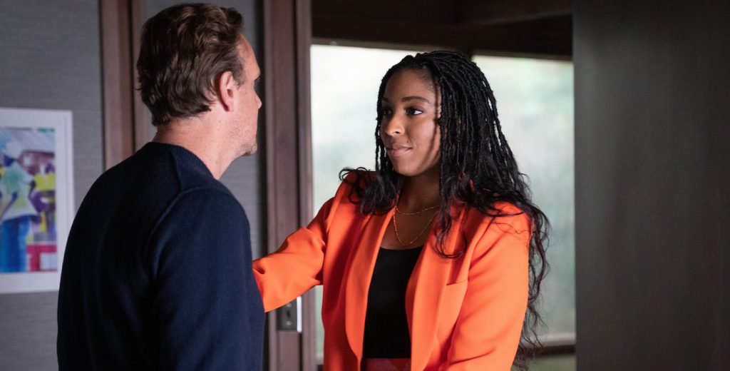
Let’s talk about the office where Jimmy, Paul [Harrison Ford], and Gaby [Jessica Williams] run their therapy practice.
For the office, when I first heard the pitch for this, I was told it was going to be a workplace comedy, like Spin City or Scrubs. But it’s really closer to Bill’s series Cougar Town, which I also worked on, which is kind of a cul-de-sac story about neighbors who are very supportive and love and annoy each other each day. So for the office, I had thought it was going to be the central hub of the show, so we looked for that. What you usually like to do is find the building first and then reverse engineer it and build the interior on a stage to match the exterior. Pasadena has incredible craftsman architecture and mid-century architecture. It’s got great warmth and character. The thing about Paul [Ford], I’m not sure you know this, but Harrison Ford’s character is based on Phil Stutz, a very celebrated therapist that Jonah Hill just did a documentary about [Stutz]. Harrison actually went and met with him at his office, and he had some very specific ideas about his character. We found the office building we loved, where Colorado and the 210 met right near the big Eagle Rock there. There’s a great pocket of mid-century commercial buildings there.
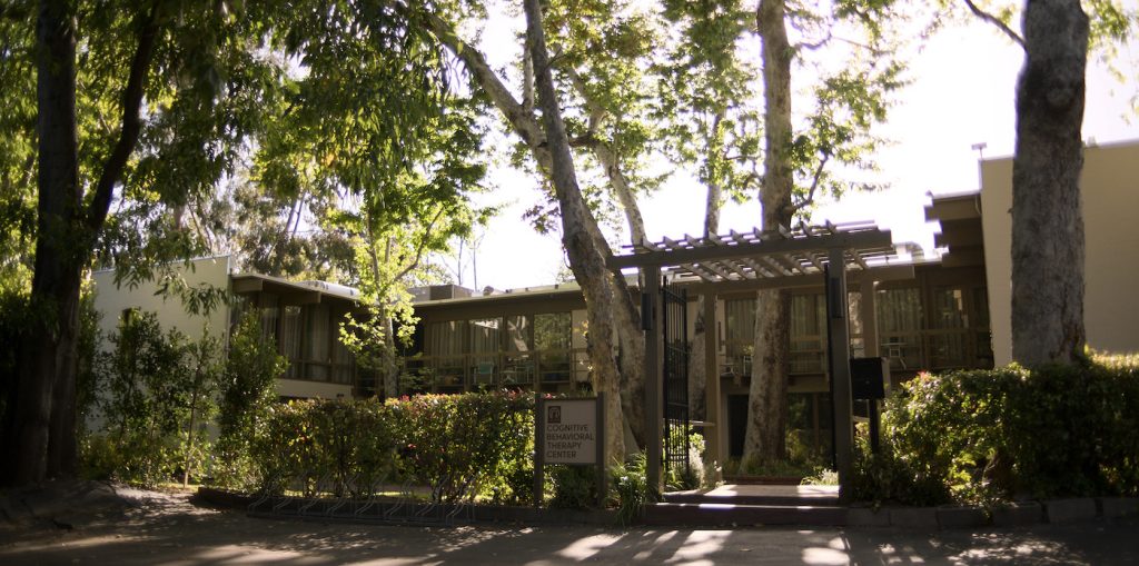
So you find the perfect exterior, and then you build a set to match it?
We built an interior that spoke to the exterior, but it was really our own design. All the rooms and the way they’re laid out in the hallway were very specific for the action of the show because it’s always great to have a lot of entrances for people to come and go and get some good comedic action going. So we created a hallway on one side and a balcony on the other side, so people are always kind of running around and missing each other or finding each other. The strategy was to create something that was visually interesting and functioned for the camera well.
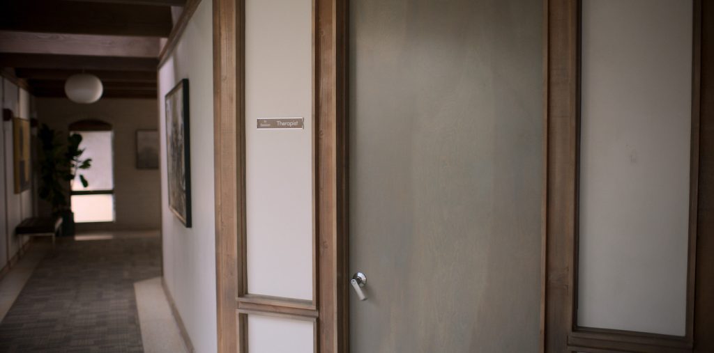
It’s also such an idyllic place for patients to come and talk about their problems, which this show explores with both humor and great warmth.
After scouting a bunch of properties in Pasadena, we came upon this one that was on the second floor, and it looked into the tops of all these trees, so you had this huge green canopy outside. I got the idea that this would be a great backdrop for therapy offices because it’s kind of like walking into an oasis where everything’s calm. So we built a bunch of trees and put them outside the office windows.
Shrinking is now streaming on Apple TV.
For more stories on Apple TV series and films, check these out:
Martin Scorsese’s “Killers of the Flower Moon” Gets Fall Release From Apple
Chris Evans & Ana de Armas Take Love on the Run in First “Ghosted” Trailer
“Ted Lasso” Season 3 Trailer Finds AFC Richmond Facing Off Against a Former Friend
Featured image: Jason Segel in “Shrinking.” Courtesy Apple TV


