“Scream VI” Cinematographer Brett Jutkiewicz on Framing Scenes So They Cut Deep
Brett Jutkiewicz wanted the images to cut a little deeper in Scream VI. Inspired by the franchise’s move to New York City, the cinematographer wanted a crueler and harsher mood. To achieve this effect, Jutkiewicz ditched anamorphic lenses and brought a new aesthetic to the long-running series.
Filmmakers Matt Bettinelli-Olpin and Tyler Gillett, known as Radio Silence, embraced Jutkiewicz’s idea for a new style. The trio collaborated on Ready or Not and the previous Scream film. There’s trust between the collaborators, resulting in some exhilarating sequences in Scream VI that Jutkiewicz recently explained.
What were some lessons from the previous Scream film you kept in mind this time around?
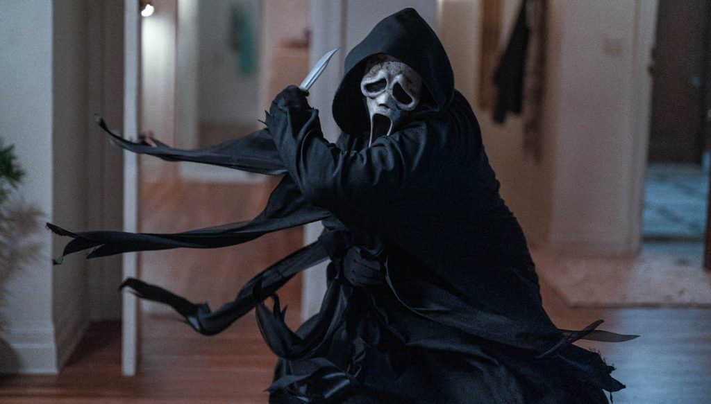
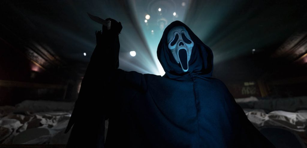
It was familiarizing myself again with the characters and with their backstories. It allowed me to get a bit deeper than with the directors in talking about how Scream 2022 fits into the overall franchise. Visually, Scream VI is a bit different just based on the setting. I also took some things from the past film in terms of understanding how to photograph Ghostface in a way that feels scary and intimidating. It was something that started early on in the last film in the camera testing. What brought out the mask? What made it look scarier? What’s nice about Ghostface is his mask is white, so it pops in these dark environments, which is helpful. You have to be careful not to overlight it, to make it still feel menacing. And then understanding how Ghostface moves, his robe looks, and his mask looks in certain environments. Obviously, in Scream VI, the mask that he’s wearing is a bit different. It’s aged, it’s older, and it has more texture to it. Avery [Plewes], our costume designer, and her whole team did a fantastic job creating this mask that’s so creepy and iconic.
How’d you approach shooting the mask this time?
You know, lighting from below generally tends to give a more sinister vibe to faces. When we brought in the light from below, it brought out the texture. When it made sense for the environment and the close-ups, that’s what we were doing. In Gale Weather [Courtney Cox]’s apartment, when he steps out from behind this shattered bookcase, we were lucky that the bookcase had some lights in it that kind of motivated lowlight. I went with a light right below Ghostface, coming almost straight up.
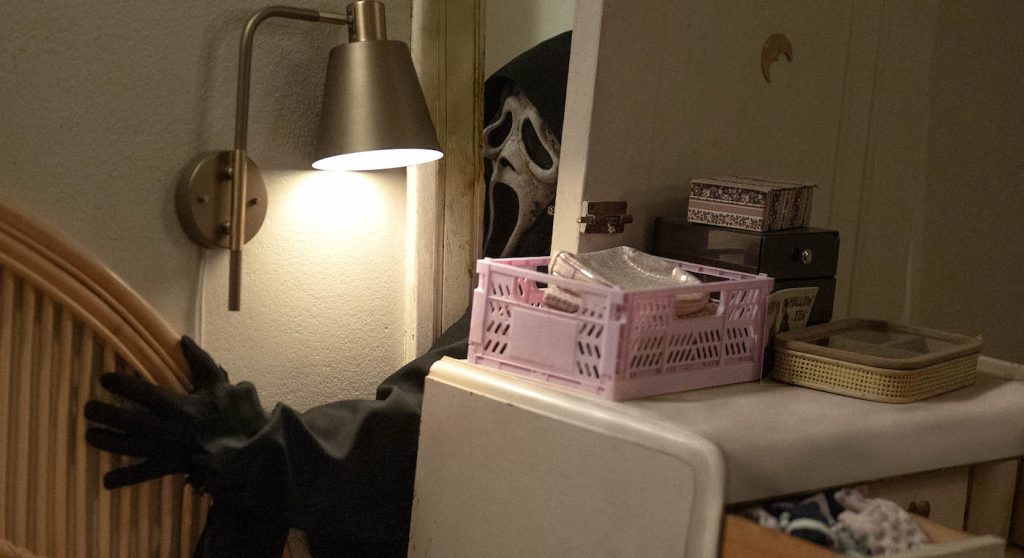
The other advantage of Ghostface is he has no eyes. As a cinematographer, you’re often trying to get light into somebody’s eyes. You try not to compromise the overall look of the lighting to introduce a little sparkle into a character’s eyes. But with Ghostface, we don’t have that issue at all.
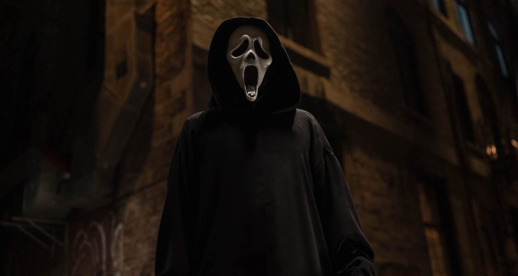
Which lenses work best for Ghostface?
We used different lenses on this film. Previously they’d all been shot on anamorphic lenses. On this film, we switched to spherical lenses, which are a bit different. Spherical lenses are cleaner. Being in this grittier urban environment, I wanted these lenses that embraced that look. It’s subtle, but there’s one less layer of artifice between the audience member and the action of the film.
Since there’s a bit of Ghostface action in a theater, as well as history from the franchise and a lot of character moments, what challenges came with shooting in that space?
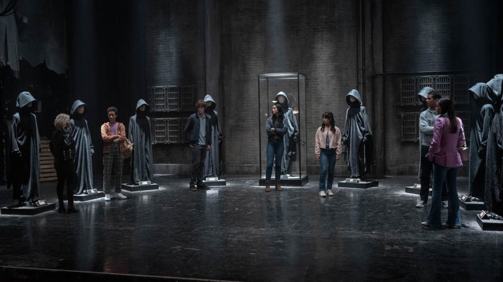
That theater was interesting. It was a great find by our locations department in Montreal. Michelle [Laliberte], our production designer, did an incredible job aging the theater and adding all these elements. It was a complex space to light. There was a lot of action there. We wanted to allow the characters and the actors to move freely in the space. We wanted to light the environment but, at the same time, keep it moody.
I was happy with how the space turned out, especially the stage with all the Ghostface robes and the spotlighting that we did there. I mean, it certainly stretches the bounds of reality that the people who set up the shrine would’ve lit it so, you know, specifically. I think that’s okay, though. When I talked to the directors about it, I asked, ‘Is it okay that this feels lit by a professional?’ We decided the mood was right. We think it looks good. It has the right energy.
When you’re working in horror, are you more accepting of going beyond the limits of reality?
I think it’s all about enhancing the audience’s experience of watching the film. Through every element of the filmmaking process, from the blocking and how the characters move in the space, the directing, the production design, the camerawork, and the lighting, it’s creating the right mood that supports the emotion of the scene or what the characters are going through. You can push that a little more in a horror film because it helps create an ambiance, mood, and tension.
Do you and Radio Silence still spend time discussing Wes Craven and how he’d approach scenes?
Wes’s work is always on our minds, especially the original Scream. We always talked about how amazingly effective the blocking and the camera movement are in that first film. You know, it’s not a super dark film in terms of the lighting. It’s even more impressive how tense and scary it is without relying on too many very dark scenes to hide things.
Let’s talk about blood. Some cinematographers say it’s hard to get the red just right in the light. How was your experience there on Scream VI?
It starts in testing. The special effects people bring in different blood and mixtures, and we’ll look at them on camera. It’s about defining the right mixture of blood that looks good on camera and the color treatment we’re giving the film. So, that’s where it starts. On set, it’s a lot about sneaking in a little light to create some shine on the blood. When it’s a relatively static closeup, it takes a bit of finessing to create a little dimension and a little sheen on the blood, so it doesn’t feel too flat. Blood is a fairly dark red color, so if it’s on darker clothing, it takes work to make it pop and stand out. Our special effects and makeup effects team did a great job with the blood mixture, and it was very consistent. It usually took very little work to look good. Sometimes it just needs a little extra pop from an additional lighting source.
How did you approach filming the epic subway scene?
The train sequence is probably the scene we discussed most in prep. It was just a complicated scene. There’s a lot of action, a lot of characters, and a lot of extras. Michelle, our production designer, and her team wound up building the train car from scratch. We shot on a stage in Montreal. For me, the biggest challenge was creating the movement of the train because the train wasn’t moving. I mean, we were able to pull it in and out of our station, just enough to get the sense that it was pulling in or pulling out. When they were moving through the tunnels, that was all the lighting effect.
How did you light it?
There were hundreds of lights hung spanning the length of the train and then programmed to create this sense of movement. We tested that and tried to find the right combination of color and the right speed. We put a layer of black silk between the windows of the train and the lights. It blurred them enough so you couldn’t tell that it was a light just hanging there that was flashing. Also, using a shallower depth of field with our camera helped.
And for inside the train?
We programmed some clicker effects for the inside of the train that I could cue over the walkie-talkie when I wanted it to flicker at certain moments. I don’t think it was ever realistic, but there was briefly some talk of, well, can we somehow shoot this on a real moving train? Looking back on it, I’m so glad we did it the way we did. We would never have had the amount of control that we did.
Even in the shortest of exterior scenes, what did you want to do to help transform Montreal into New York City?
Knowing New York as well as I do is hard for me. It doesn’t really look like New York. In this case, many of our exteriors were at night, which helped, and our art department did a great job of dressing in street signs and bringing in taxis, buses, and the subway. We had a subway entrance that we could plop down on a corner where we needed it. I was involved early on in looking for locations, specifically streets that felt like New York. I had some input on where things would be staged. It was done to make it feel as New York-y as we could. We took some liberties, but locations and lighting were important. I tried to light things in the way that I know they’re lit in New York, in terms of the streetlight color and the mood of things.
What are some unexpected challenges with Scream VI?
What’s always challenging for cinematographers is daytime exterior scenes. The sun is always moving and never stops moving. If you shoot an exterior scene that’s supposed to take place in the movie across five minutes, but it takes you 10 hours to shoot it, the sun is in a very different place at the beginning of the day than at the end of the day. Clouds come in and go. The scene at their apartment the morning after the ladder escape scene was particularly challenging. We had a lot of equipment to try to control the sun, but it was moving in and out of the clouds. It’s always a challenge to create continuity across a daytime exterior scene. When you watch it, you might think, you just bring the cameras outside, and the light’s already there, right? You put the cameras where they need to go and shoot the scene. Those scenes are always challenging, just trying to control the sun, which always refuses to be controlled.
For more on Scream VI, check out these stories:
“Scream VI” Editor Jay Prychidny on Stitching Together an Epic Slasher
“Scream VI” Review Round-Up: A Clever, Homicidal Shell Game in the Big City
Paramount Reveals “Scream VI” Super Bowl Spot
“Scream VI” Trailer Finds Hayden Panettiere Back Fighting Ghostface in NYC
Featured image: Ghostface in Paramount Pictures and Spyglass Media Group’s “Scream VI.”

