“The Tragedy of Macbeth” Production Designer Stefan Dechant on Joel Coen’s Minimalist Masterpiece
Production designer Stefan Dechant has worked on detail-packed cinematic spectacles like Jurassic Park, Avatar, Pacific Rim: Uprising, and Kong: Skull Island. When he signed up for Joel Coen‘s black and white adaptation of The Tragedy of Macbeth, Dechant had to embrace a new aesthetic, stripping all decorative embellishments that might distract from the drama at hand. As conceptualized by writer-director Coen in concert with Inside Llewyn Davis cinematographer Bruno Delbonnel, Shakespeare’s murderous royal couple, portrayed by Denzel Washington and Frances McDormand, would be best served by stark surroundings devoid of extraneous décor. Dechant enjoyed wrapping his head around the minimalistic Macbeth mindset. “You’re used to bringing layers and tapestry in there, so when you’re paring yourself down so much, you might have doubts, Dechant says. “But then I’d have Joel there to guide me: ‘Yeah, it’s fine.: Or, I just need a little bit more. It’s like writing a haiku: There are only so many lines you get to express yourself so you want to make sure that visually, you’re using the right lines.”
Speaking from his home office in Topanga Canyon, Dechant drills into the old movies that helped inform this Macbeth and explains how something called the Moss-o-Matic added oomph to his spartan sets.
The Tragedy of Macbeth looks unlike any other American movie made in recent years and not just because it’s in black and white. The production design is so spare! How did Joel Coen introduce you to the minimalist vision he had in mind?
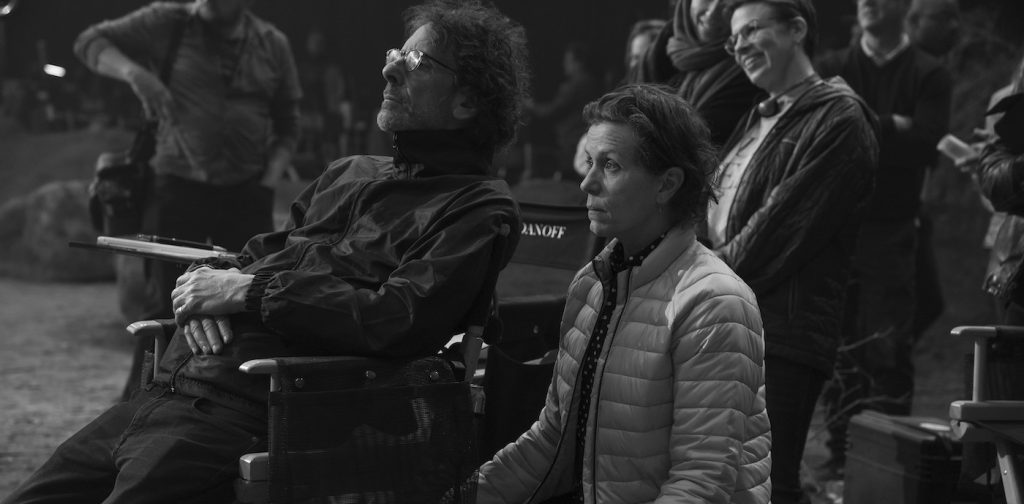
When I first met with Joel in Santa Monica, he said he’d found his own way into Shakespeare through abstraction. He’d been working with Bruno for several months collecting all this imagery — frame grabs from films, architectural photography, fine art, their own photography. They skewed the images into black and white, pumped up the contrast, and printed them out. By the time I got there, Joel and Fran (McDormand) had assembled these four-by-six print-outs and divided them into sets: This is the crossroads; This is Inverness castle; This is Fran’s bed-chamber.
Very organized!
The benchmark image was a photograph of a building in Mexico taken by Hiroshi Sugimoto. You see this tower in the background. It’s just a square. It’s not a castle but Joel felt like it was the idea of a castle. Also, Joel introduced me to Edward Gordon Craig, a turn of the century set designer who used geometric shapes for the Shakespeare plays he worked on. We talked about how there’s a rhythm to the text so there also needs to be a rhythm to the imagery. It was an amazing first meeting.
That’s a lot to take in. What happened next?
The following week we went through the script. Joel would draw on a piece of paper, “This is where Denzel walks in, this is where my camera’s going to be.” So now I had the choreography to go with the imagery. At that point, my job was to project all of this back to Joel. We brought in 3-D modelers who sketched the sets on Rhino, an architecture program that creates virtual environments. That allowed us to put a digital lens in there so Joel could frame it up, we could even light it. We could go in there with Photoshop and draw on the frame. It’s very malleable. Joel might say, “I need five more steps on the staircase” and you could easily make the change.
Where did you turn these concepts into physical sets?
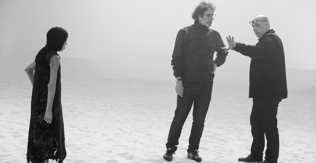
We had four soundstages on the Warner Bros. lot in Burbank. We built large foam core blocks that we moved around on set. Fran would walk the distance delivering a Macbeth soliloquy, even before Denzel arrived, so we could figure out where we wanted the arches and pillars to land.
Were the architectural elements 3-D printed, or. . .
The digital aspect allowed me to quickly engage the director and DP but we wanted the pieces to feel handmade so everything was built like a traditional set: wood flats, plaster on top. The stonework for the ruins at the crossroads, that’s all sculpted. I wanted the crossroads to feel like the wind had come in and torn away [branches] making the tree bend.
The Macbeth interiors often feel as if they’re sculpted from light and shadow. You must have coordinated all of these shades of gray with Bruno Delbonnel?
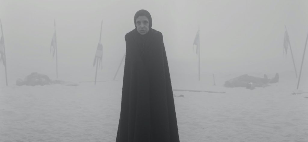
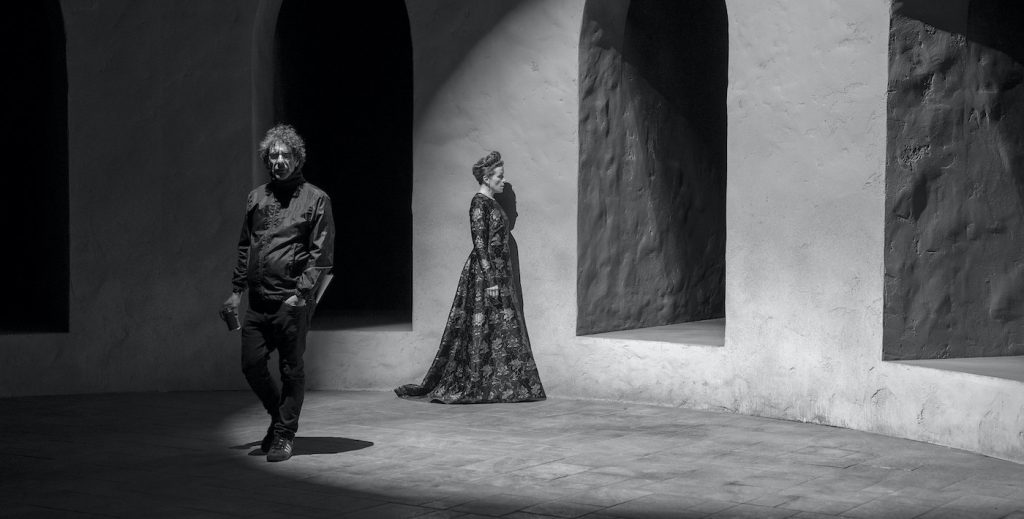
I’ve never worked so closely with a cinematographer before. These sets only exist for the shot, as spaces to hold the psychology of the characters. While we were filming, Bruno brought up the idea of painting some shadows into the columns. We went gradated from lighter gray at the bottom into darker tones higher on the structure all the way up into black. Spaces like the apparition chamber where the witches hover over Macbeth – – that exists only for the shot. There’s no history to it and the rafters are only there to hold the witches. The way Bruno used light was paramount to how those sets worked.
One of the most striking sequences happens in this field of tall grass, where a little boy, a potential heir to the throne, is being chased by one of Macbeth’s murderous henchmen.
For that scene, we looked a lot at [F.W. Murnau’s 1927 silent film] Sunrise. We wanted the field to have a geometric quality. We found grasses that had white tufts on top. We had pots and pots and pots of it. We trimmed every plant so each blade of grass was the same height. We pulled the plants apart and painted the bottoms darker, then put them back together to get this horizontal line of white tufts. The way Bruno shot it, was this horizontal line of white, running across the screen.
For a field of grass, that’s a lot of fine-tuning.
Also, for texture, a friend of mine, Richard Bell, worked as a Greens Supervisor on The Mandalorian and he invented this thing called the Moss-o-Matic. It’s a gun hooked up to a tank and it shoots glue and moss at the same time. We brought him in as a quick way to add texture to the set. He said all I’ve got is bright green. I had to call Joel and tell him when you come in tomorrow the grass will be bright green, but it’s going to be okay.
So much of the design evokes a brooding quality, like the wide shot of a castle on a cliff. Filming on a soundstage, how did you craft that landscape?
That comes from a frame grab of [Akira Kurosawa 1985 movie] Ran where the king is about to kill himself. Joel took a sharpie and drew a tower and a cliff edge into that frame. I worked with a concept artist and did multiple paintings until we hit on something that hints of Scotland even though it’s abstract. That’s an example of how I kept working in post with Joel and Bruno with matte painting designs as if it were painted on glass by someone like [mid-century matte painting master] Al Whitlock. For this one, Bruno said, “What if the clouds were like this instead?” Again, it’s this wonderful relationship where the DP can come into the world and design it as well. I’ve been watching the Beatles documentary Get Back and that’s what was like to sit with Joel and Bruno, playing back and forth.
Macbeth uses silhouettes in very dramatic fashion. Did film noir play a role in your thinking?
The director Charles Laughton and his DP Stanley Cortez follow a very similar path in [1957 thriller] Night of the Hunter. There’s a storybook quality to it, where you see this man in silhouette walking against a hillside with a horse. That was a major influence on how we wanted to read the crossroads as this very stark silhouette. Then graduate up from there so that Bruno could get this strong glow over the horizon.
The inspirations for this film’s aesthetic seem to be incredibly diverse.
Our idea for showing the handle of the door being a dagger – – that came from a painting of J.P Morgan.
Wait, you mean J.P. Morgan the billionaire industrialist from the early 1900s?
From the gilded age! Joel had a photograph of this painting where Morgan’s holding the end of a chair with his hand. They played with the contrast in black and white and made it look like he’s holding a dagger. That inspired Joel to have us create a door handle that looks like a dagger when it’s lit just so. That’s how obscure the references can be but what’s cool about it is that the door becomes the literal gateway from intent to murder, when Macbeth says “Is that a dagger I see before me?” Then he grabs that handle and enters the darkness that sets everything into motion. I actually cut out that section of the door and framed it. Right now it’s sitting in my office here in Topanga Canyon. Once Covid hit, the basement became my studio so that’s why it looks like I’m in a minimum-security prison.
Years ago, you worked on the crew for True Grit directed by Joel and his brother Ethan. Prior to Macbeth, they famously made all their films together, Was it a different experience with Macbeth, where you’re answering only to Joel without having Ethan around?
On this show, Bruno Delbonnel was not Ethan, but he’s such a creatively powerful force, that it really became, for me, about learning how to deal with those two guys creatively. But of course, Joel’s the director. It’s not like I came in there and said “I have two words for you: German Expressionism.” Even if he doesn’t always know how we’re going to get there, Joel Coen knows what he wants.
It sounds like you approach production design with a certain amount of humility?
I remember what my mentor Rick Carter once told me when we were going over to Robert Zemeckis’ bungalow to spitball ideas about his movie Contact. Rick said, “It’s your idea and until Bob gets it and then, it’s his idea.” Meaning, as a production designer, you’re not presenting ideas from your own point of view. It’s a director’s medium. I think of being a production designer as if you’re the pitcher and you want to make sure the director can hit it out of the park.
The Tragedy of Macbeth streams on Apple TV+ on January 14.
Featured image: Denzel Washington and Frances McDormand in “The Tragedy of Macbeth,” coming soon to theaters and Apple TV+.

