DP Edu Grau on Using Light & Shadow to Play With Skin Tone in “Passing”
Set in 1920s Harlem and based on Nella Larsen’s 1929 novel of the same name, Passing, actress Rebecca Hall’s directorial debut tracks the relationship of two light-skinned Black women, Irene and Clare, who’ve taken opposite paths toward safety and recognition. Former childhood acquaintances, a chance run-in reveals the women’s abiding interest in one another, and as they reinsert themselves into each other’s lives, the differences between Irene and Clare take their toll on the stability each woman had achieved.
Irene (Tessa Thompson) lives in Harlem with her doctor husband, Brian (André Holland), and their two young sons. The family is Black. Clare (Ruth Negga), whom Irene runs into at a fashionable hotel on a hot summer’s day, is at first almost unrecognizable to her old friend — passing as a white woman, Clare is married to a rich white man, John (Alexander Skarsgård). During their accidental reunion, she seems airily glib about the precarious life she’s built for herself, and the world she left behind. When John shows up at the hotel room, he announces to Irene, in her only passing moment in the film, that he hates Black people, despite believing that he doesn’t know any.
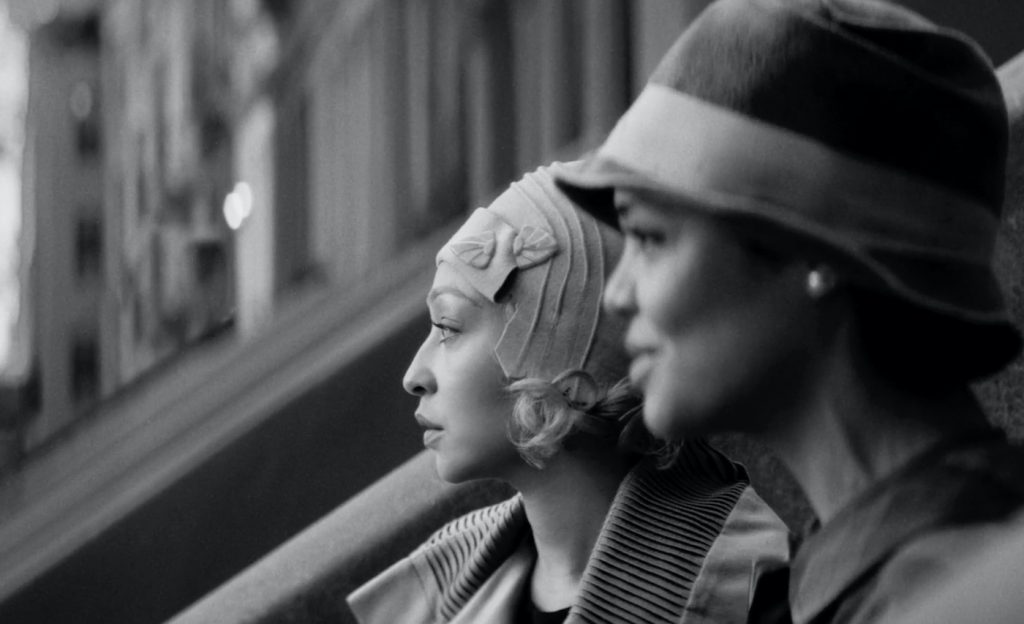
Irene’s quiet fretfulness deepens as Clare, suddenly eager to experience her old life in Harlem, gets involved with Irene’s civic work and her world at home with Brian and the boys. Shot in black and white, using lomo anamorphic lenses from the 1970s, and cropped to the center to achieve a 4:3 aspect ratio, Passing has a vintage look that’s hard to tack onto any particular era. Noting that Hall turned down financing offers in color, knowing from the start the film would work best in black and white, cinematographer Edu Grau (A Single Man, The Gift, The Way Back) spoke with us about how he used lighting to play with skin tone and our perception of it, enclosed characters in their beehive-like worlds thanks to the 4:3 aspect ratio, and what he took from Larsen’s original novel to get the storytelling exactly right.
How did you get started shooting a black and white film?
We shot on a color camera because that’s the market standard, but we never even considered making this movie in color. It was always conceived and thought of as a black and white movie. But you have to use a color camera because the black and white cameras are not as good.
In that case, how do you account for the color, knowing the final product needs to be in black and white?
Basically, you lose all the color saturation in all the monitors so you’re only seeing the movie in black and white. There are a few things you have to consider and they change, obviously, from color to black and white. Especially the color contrast — there is no color separation if the wall is red and the face is the same level of contrast or brightness. You have to work around it. You have to use the black and white, which is quite easy to use and quite beautiful. Black and white, at the end of the day, is a simplification of an image — you lose the color as a noise or disturbing element. It’s all about contrast and brightness and the use of light and shadow. It’s a joy as a cinematographer to be given that opportunity, to play with black and white, and the light and shadows are telling you something — about the characters, about the story, about how we perceive that. It’s actually part of the storytelling. It’s always a joy when that happens when the form and the meaning are related.
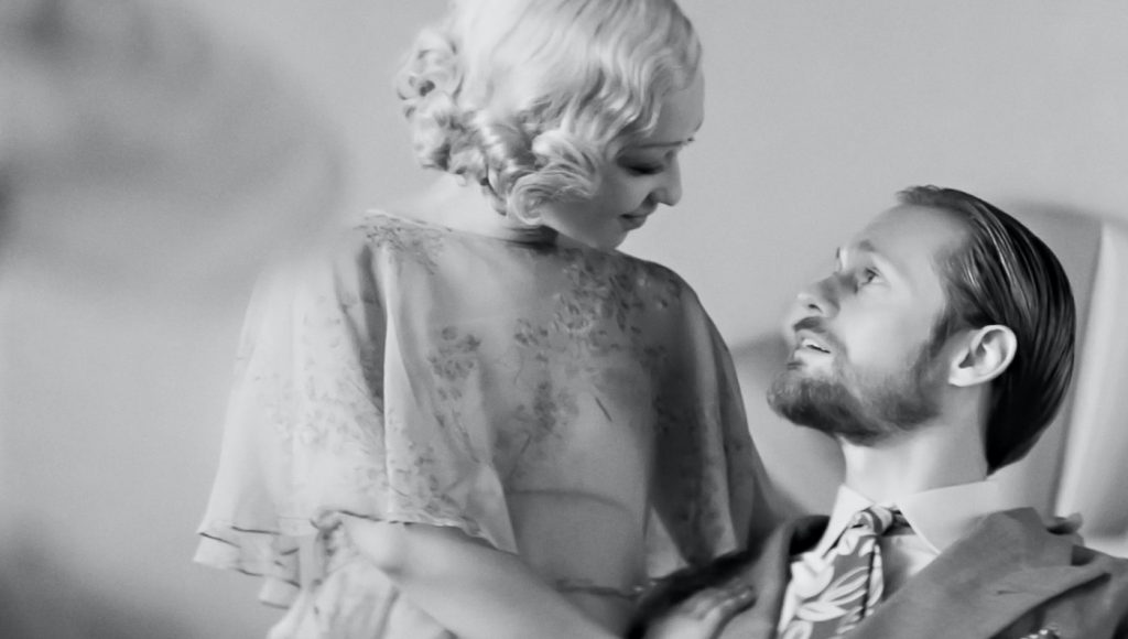
The film opens on very light, bright black and white tones. How did you arrive at that?
Rebecca Hall, the director, was always very adamant at having a very bright, summer feel for the movie to not disguise to the audience what color the skin was of each character at the very beginning. So you have these questions. At the end of the day, it’s about this, skin color, and who is passing for what. It was important for us to make a movie about colorism in black and white, and not being able, at the beginning of the film, to tell who was who. At the beginning, it’s summer, and our character Irene, played by Tessa Thompson, is in a white world. We wanted to portray that that character is kind of undercover. It was very interesting, the fact that, making that part of the film so white, enabled us to explore the other dynamics of color throughout the movie. We start in white, we explore the grayness, we go into pure shadows, pure black at some point, and then we end up in white at the end scene as well. We were trying to play with black and white and all the shades in between.
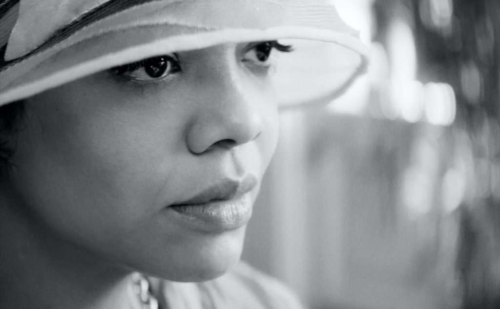
In contrast to the opening scenes, Irene’s Harlem brownstone is dim, cozy, and enveloping. How did you decide how you wanted to light the brownstone interior?
That was the world where Irene shows us who she truly is. That’s why it’s full of mirrors. That’s why there’s brightness but also darkness. When we’re at home, in our nest, we show our true identity, more than the one we show to the world. For us, it was important to get into that intimacy of Irene and discover who she truly is, even though she’s showing a different side of herself to the world. We discover her Blackness. I also liked the idea that her whole world is a beehive. The way it’s framed, the 4:3 aspect ratio, and how enclosed the framings are, there are no surroundings. Four-three doesn’t allow you to show a lot of the world; it’s very character-centric. They are enclosed in that aspect ratio, in the world they’re living in. What we’re portraying here is how this world gets disrupted by exterior forces that we can’t always control. In this case, it’s a friend from childhood who comes in, is passing, and lives a totally different life than Irene, even though they came from the same place. We liked that way of playing that the home is the safe place but it’s also your true identity, and that’s where you’re more scared or challenged by yourself. You can escape the world, but you can’t escape yourself. And Irene has to deal with her world and all her personal issues when she’s at home. A lot of the drama in the movie happens in her home.
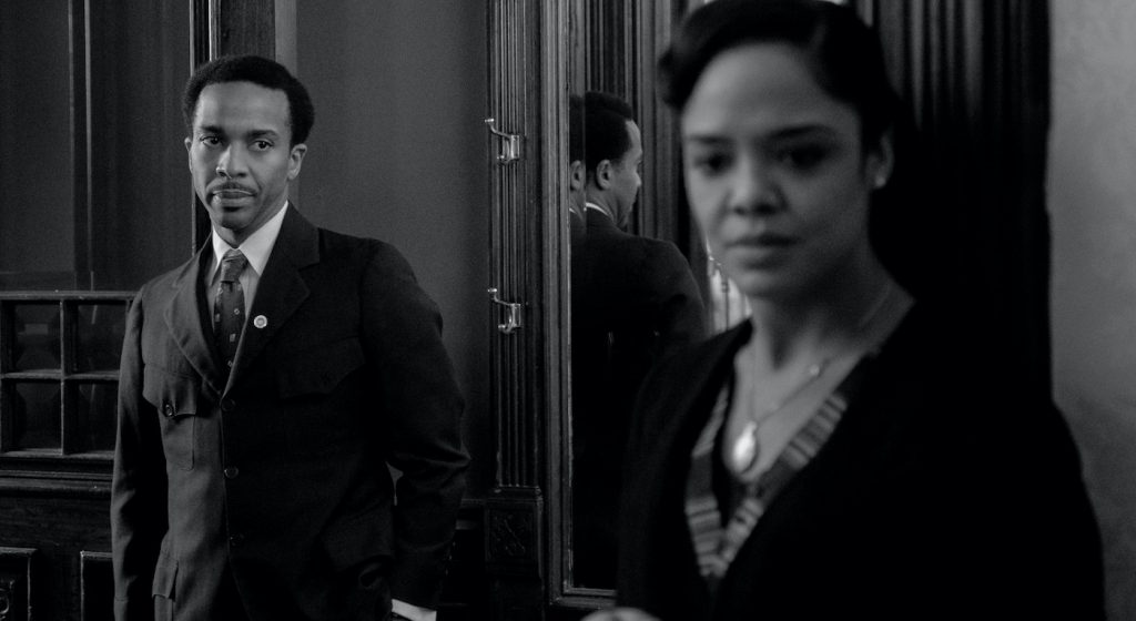
Did you look to older films for inspiration?
Totally. We looked at Hitchcock, British period, old classics, black and white, 4:3. But we also didn’t want to make our film too period-y. We also looked at new 4:3 black and white films, and we learned from all of them and just went our own way. It was like, so, what would tell our story the best and hasn’t been done and is truly contemporary? That’s also why we shot on anamorphic lenses, which didn’t exist during the black and white era of filmmaking. We added grain later. We did a lot of new techniques and new compositions as well. We kind of mixed and matched. We’re telling a story that happens in the late 1920s in Harlem, [but] we didn’t want it to be seen as old. We see this as if it has no time. It’s still happening. We’re all passing for something all the time. We’re all hiding something from the world. In a way we also wanted it to be a movie that can be watched and rewatched and it doesn’t get old. That’s what we tried to achieve, a movie that looked and felt contemporary and old, and also difficult to say when it was shot.
Did you read Nella Larsen’s original 1929 novel?
Absolutely. After I got the script, I read the book. All the subtext of the book was difficult to understand by only reading the script. So I thought, you know, it was very interesting to learn about the characters, to deep dive into the story. So I could understand what was going through the characters’ minds, basically. That also enabled me to put the camera and the light in a certain place and understand the storytelling a lot better. I thought it was an important part of the pre-production work. The adaptation of the book that Rebecca did is phenomenal. It’s very true to the book. But there are some nuances she created based on the characters that were not in the book, so it was interesting to see both sides of the story and understand it.
How was working with Rebecca Hall as a director?
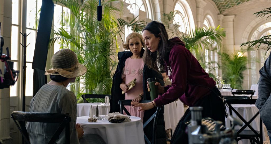
I’ve worked twice with Rebecca as an actress, on The Awakening and The Gift. I was the DP, and so we knew for sure that we got along. We come from a similar background, we have a similar sensibility in a lot of ways. Working with her was a joy. She’s a super talented smart director with a vision. It’s not the usual thing. She has a strong vision of how she wants the movie to be, feel, and when you have a doubt or question, she always has the right answer. It was a super productive and interesting learning experience for me. I’ve done 19 or so movies and I still learn a lot, shooting with Rebecca. It was super challenging, respectful, and enjoyable.
Featured image: Ruth Negga and Tessa Thompson appear in “Passing.” Courtesy Netflix.

