How the Creative Team Behind “Army of the Dead” Built An Apocalyptic World
In Zack Snyder’s Army of the Dead, a ragtag group of mercenaries embarks on a life-changing $200 million dollar heist. The problem isn’t that the money is hidden in a vault underneath the Las Vegas strip—although that’s not an insignificant detail—but rather the tens of thousands of zombies lurking in their path as an outbreak has turned the vibrant lights of Sin City into a desolate wasteland overtaken by the undead.
The original story by Snyder is a new spin on the zombie apocalypse genre (one he reinvigorated years ago with his 2004 remake of Dawn of the Dead). Here, Snyder enlists Dave Bautista (Guardians of the Galaxy) as a mercenary leading a rag-tag ensemble into the quarantine zone. An added complication? The place is a ticking time bomb as the government is set to nuke it at any minute.
Snyder’s movie stylized the visual grammar so the audience is connected to the hip of our human combatants as they fight through the maze of endless zombies. The decaying world was curated by production designer Julie Berghoff (Saw, The Handmaid’s Tale) as production filmed in parts of Los Angeles, Las Vegas, Albuquerque, and the Showboat in Atlantic City, New Jersey, which stood in for the Bly, the Vegas casino that held the hidden cash.
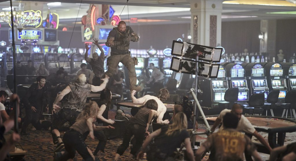
Berghoff approached the design in a very practical way, giving the actors as much reality as possible to work with. Aiding her effort was visual effects supervisor Marcus Taormina and his team of artists. The process established by Berghoff and implemented by Taormina allowed the production team to concentrate its efforts on visual details and work from a practical perspective, using in-camera techniques rather than relying solely on visual effects to fill the void.
“From a visual effects standpoint, we wanted to make it feel grand, so we talked a lot about the scale of the movie and how we could be smart about filming it,” says Taormina. “We didn’t want to have all these crazy visual effects shots, but instead, we wanted to ground it in the reality of the world.”
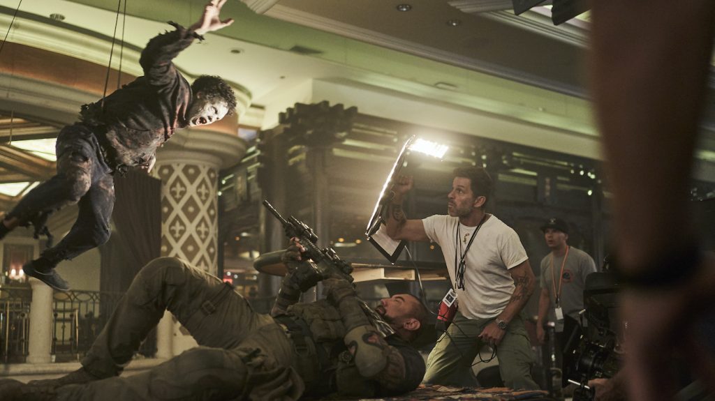
During preproduction, one of the biggest challenges was mapping out where the action would take place in Las Vegas. The production team honed in on several key places to film the bigger set pieces in the movie by staging miniature foam core models of the Vegas strip. This allowed Berghoff to design the physical build of what was needed, and then visual effects could spend the rest of the time digitally creating the tops of buildings and skyline.
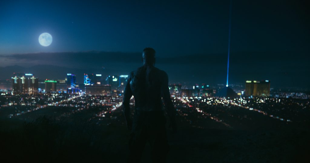
“Knowing the physical size of the Las Vegas strip was important, so we knew exactly what the camera would be seeing while filming,” adds Taormina. “If Zach moved the camera in one direction or another, we could favor it towards the physical build and then pay it off with digital assets when necessary to give the movie more scope and scale.”
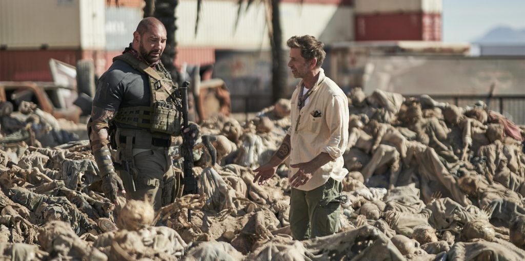
Another trick Berghoff used while designing the sets were modular pieces that could fly in and out to create a different location in the same space. Visual effects would then swap out the digital builds to match the new location.
The visual realism didn’t stop with the set design, either. It continued with the hair-raising look of the zombies overseen by makeup effects designer Justin Raleigh.
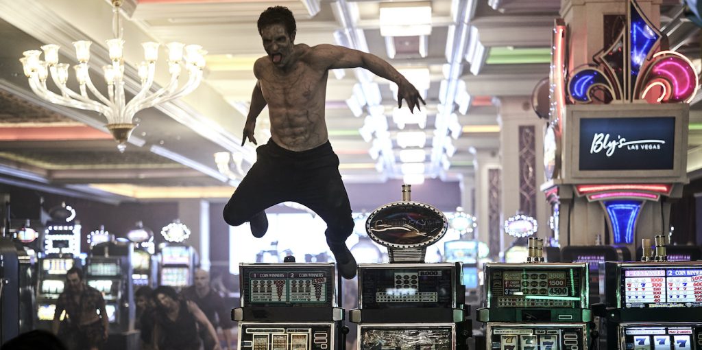
The zombies in Army of the Dead are not your typical undead that walk around aimlessly in search of brains and blood. Yes, they do that, but it’s more organized. There’s a hierarchy involved. The lowest on the zombie totem pole are the Shamblers, followed by the Alphas, who are all ruled by Zeus, played by Richard Cetrone, who serves as patient zero. In detailing the different zombies, Raleigh relied on prosthetics and makeup to transform the living into flesh-seeking monsters.
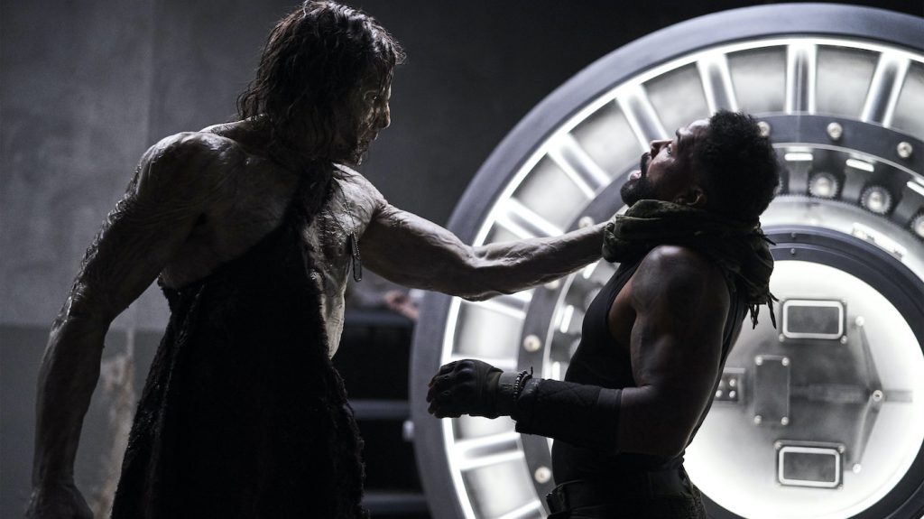
“Zack’s vision was to create polar opposites,” says Raleigh. “The Shamblers are dried, defecated mummies, and then you have these vicious, hyper-aware, and hyper-elevated creatures with the Alphas. With the Alphas we wanted to make a huge difference aesthetically and create this embryonic, almost translucent flesh. The Alpha characters basically have depleted all the pigmentation of their skin where you can see every little detail.”
In creating Zeus, Raleigh says the script points out that he’s “a walking bruise” so he took that translation and tied that into different stages of decomposition and rigor mortis. But since the Alpha zombies are evolving, there are elements of decaying tissue tied to hints of strength. Raleigh used 20 different silicone translucent prosthetic pieces to create the look of Zeus.
“Everything you see close up is physical practical makeup,” says Raleigh. That realistic approach was also used on the Alpha Queen (Athena Perample), who needed 18 different prosthetic pieces to create her look. It took the team around 3.5 hours each day in the makeup chair to finalize both characters, both of whom needed new prosthetics each day of shooting.
In all, Raleigh’s team was made up of around 60 people to deliver the thousands of prosthetics needed for the movie. Even the contacts worn by the undead were painted by hand. But when it came to the injuries and holes you’d see in the zombies, that’s when visual effects stepped back in.
One scene, in particular, involved the deception of a zombie, which combined practical and visual effects to pull off the gory moment. To film the scene, a rig was placed around the neck of the actor who played the zombie with a tube underneath that squirted blood. The camera was then placed to best conceal the rig, and as the zombie’s head is removed, visual effects did all the heavy lifting and added more blood splurt on top of the practical effects. “We have to praise our editor Dody Dorn for making that scene feel seamless,” says Taormina.
Another character visual effects had to concern themselves with was Valentine, which is referenced in the movie as one of Siegfried and Roy’s tigers, the famous duo of entertainers who had shows at the Mirage up until 2003, when Roy Horn was tragically dragged off stage by one of the tigers.
“We built Valentine from the ground up,” says Taormina. “Zack had concept drawing which we took to create full-body variations, and we discussed how the tiger needed to look after being desolate in this dirty city.” The team came up with a character study and backstory for Valentine, grooming her with dried blood, mangy fur, and decomposing flesh.
For the animation, they reached out to a number of tiger sanctuaries in the U.S. and one in Florida allowed them to film a real-life tiger to replicate the movement for Valentine. That sanctuary turned out to be Carole Baskin’s from the now infamous Tiger King: Murder, Mayhem and Madness documentary on Netflix. “This was before the documentary came out,” says Taormina. “She allowed us to come down and film a tiger named Sapphire in action, along with curating some of the movements that would be in our movie. Obviously, at the time she didn’t know the scale of what Tiger King would become and we didn’t put it together until my wife was watching the documentary and I heard Carole’s voice.”
The majority of the animation is based on the capture of Sapphire, and then on set they had a stunt performer using a stuffed tiger head to bring Valentine to life and provide the actors with an eyeline.
“At the end of the day, a lot of what’s in the movie is a combination of practical and visual effects,” notes Taormina. “From prep to the final cut, everyone was looking for ways to make it more realistic or look better. Our aim was to make a fun popcorn movie that everyone could enjoy, and I think we did that.”
You can see the fruit of all this labor—some of it realistically rotting, thanks to folks like Taormina and Raleigh—on Netflix right now.
Featured image: ARMY OF THE DEAD (L to R) ZACK SNYDER (DIRECTOR, PRODUCER, WRITER) in ARMY OF THE DEAD. Cr. CLAY ENOS/NETFLIX © 2021


