How Hitchcock Influenced the Bold Design of Netflix’s “Ratched”
Ratched will keep you on edge. The pseudo-origin story follows nurse Mildred Ratched (Sarah Paulson) from Ken Kesey’s book One Flew Over the Cuckoo’s Nest, a character first enshrined by Louise Fletcher in the 1975 film adaption.
Penned as a spec script by Evan Romansky, who’s credited as a creator and executive producer, Ryan Murphy stepped in to purchase the rights and turn it into an eight-episode series on Netflix (it begins streaming today), which has already been picked up for a second season.
To stylize the unnerving story, production designer Judy Becker was tapped for the job, who’s known for her work on Carol, American Hustle, Silver Linings Playbook, and Feud where she was nominated for an Emmy.
“I’m always interested in what directors are referencing as a look. Ryan mentioned Hitchcock and the movies he made that were placed in Northern California like the opening driving shot to Psycho,” says Becker. “We also talked about Vertigo and I was really interested in that because the palette is amazing. It’s something I went back to study, and in doing so, some interesting things came out of that for Ratched.”
The biggest challenge Becker faced was designing the psychiatric hospital where Mildred is determined to work. The concept from the initial meeting was for the hospital to look glamorous almost like a resort that had been turned into hospital movie stars went to. “Ryan wanted it to look very Northern Californian, with a lot of dark wood and very Hitchcock in a way,” notes the production designer.
Location manager Robert Foulkes scoured Northern California, and though he was able to find a few options, he and Becker “weren’t in love with them.” It wasn’t until Foulkes discovered the Arrowhead Springs Hotel in San Bernardino, California, a luxury resort that opened its doors in 1939 to stars like Judy Garland, that they found a fit.
“We ended up taking a trip there and as you drive up, it’s like the opening to The Shining,” says Becker. “It’s just this gigantic white hotel that sticks out and there’s nothing around it except for some hot springs and trees. It’s beautiful.” The interior of the hotel had been designed by Dorothy Draper, an icon in the interior design world known for creating Modern Baroque, a look that blends modern flair to a classical style.
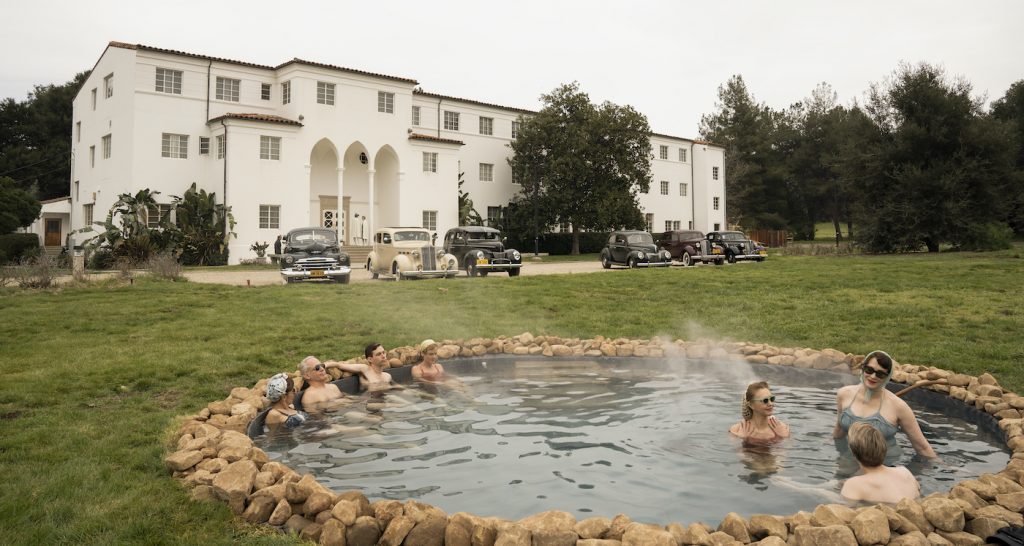
Though not the exact Northern Californian look Murphy sought, the production designer knew it was perfect for the story and pitched the creator to see it for himself. “He loved it,” says Becker. The only hurdle left was to secure the location. “I felt confident it was going to work as the manager of the resort was optimistic, but cut to six weeks later, we didn’t get it. The owners just didn’t want anyone to shoot there.”
Those owners happened to be San Manuel, one of the clans of Serrano Indians who are indigenous to the area. The group, who also owns San Manuel Casino, paid $60 million in cash for the 1,900-acre property in 2014 from the Cru, a Christian parachurch organization, who owned it since 1962. Unable to use it for production, Becker did the next best thing and rebuilt a nearly exact replica on the stages at 20th Century Fox.
“Recreating it ourselves meant we could do anything with it,” says Becker. “We used the real location as a blueprint and changed it from there, manipulating things and adding more of the Northern Californian style into the design.”
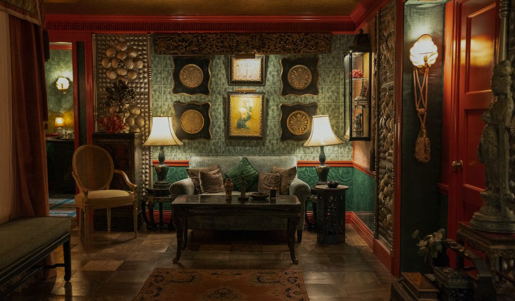
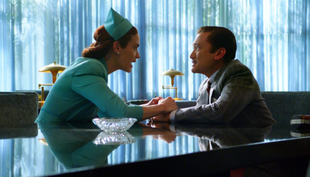
Viewers get to see its grandeur through the eyes of the characters. In a scene where Mildred insists on being interviewed for a nursing job by Dr. Richard Hanover (Jon Jon Briones), she enters the hospital through the lobby. The frame not only shows the space but her reaction to it.
“I always want to create a realistic world so that even when that place doesn’t’ exist in reality, the viewer believes it’s real and they’re immersed in the story and not distracted by the set,” Becker explains. “When Mildred walks into the psychiatric ward for the first time, there’s this wow factor. She’s wowed by it. So you’re feeling what the character is feeling. It’s not just the audience looking at some big set. It’s something the character feels and they feel too.”
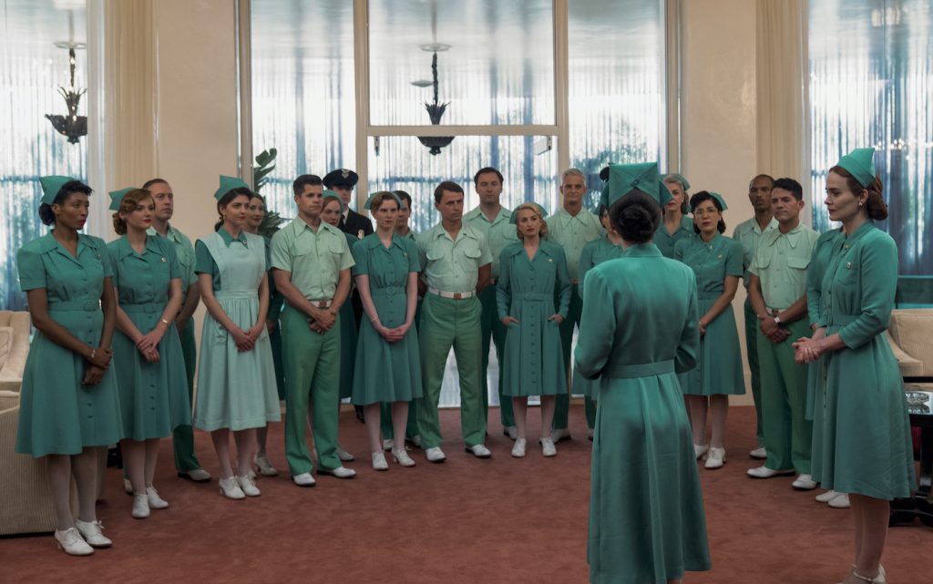
The hospital is styled in with classical design elements that are laced with timeless Hollywood glamour. Color plays to our senses with different shades of greens being placed throughout each mainstay set. “Besides black and white, green is the most used color in the series,” says Becker. “We used both red and green judicially, and you want to pay attention to how you’re using green because it’s a complicated color.”
A set in the hospital Becker needed to design was the hydrotherapy room, a place where patients would literally be boiled to try and “fix” their symptoms. “I researched images from the period and many had green in them. Ryan only wanted two tubs and a shower in the set so the room was sparse. Each element to be carefully thought out,” says Becker.
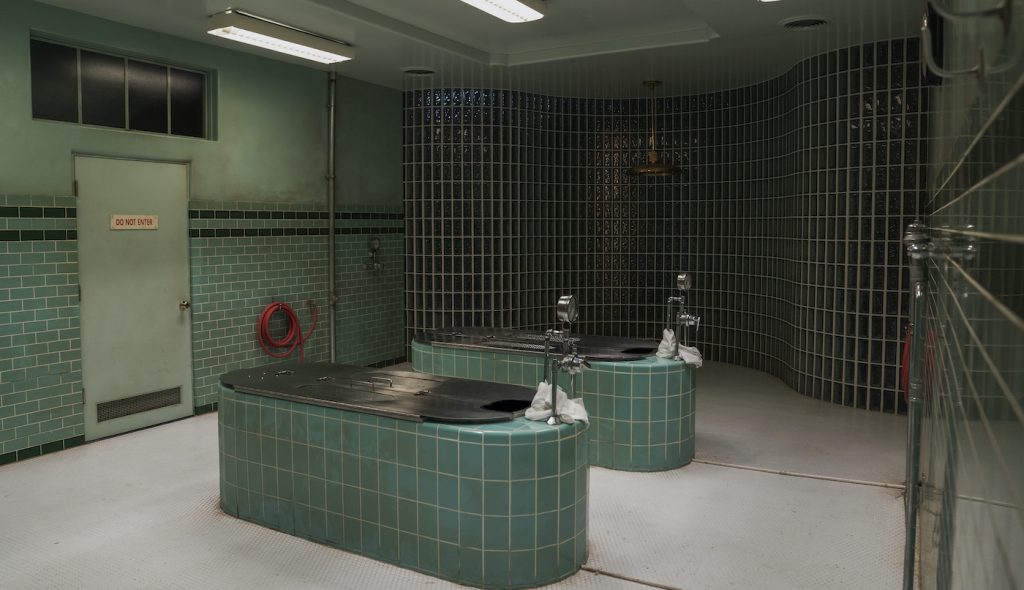
Creating minimalist spaces is something the production designer enjoys as it makes her think about it more than compared to a cluttered set. The green hues of the hydrotherapy room also played to the unsettling storyline. “Green can be so many things. It can be a reassuring color or an uneasy color. It can also make people feel queasy or relaxed. The color worked really well for this space.”
When designing Dr. Hanover’s office, the production designer found inspiration from an old postcard. “I’ll often search on eBay for postcards as they are not often reproduced and I can find fresh images. I found one an interior of a sanitarium that had a curved glass wall and floor to ceiling drapes and carpet. It was a great image that showed a sanitarium in a glamorous way. I showed it to Ryan and we both found this excitement in the image which influenced the design.”
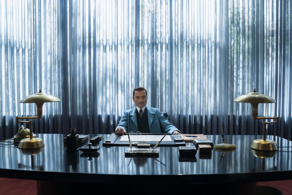
For Dr. Hanover’s office, the set was custom built and styled with period piece furniture that was also custom made. One of the motifs Becker added to the office was a secret passageway from the private bathroom that leads into the pharmaceutical wing of the hospital. “The audience may not notice it, but it’s one of those things that help the actors. It adds to his secret vice in a way.”
Another nod to Hitchcock is found in the hotel where Mildred stays. “One of the things in watching Vertigo is the crummy hotel Judy stays in. There are these curtains that are being made green by the neon outside the window. We love that and talked about having that shade of green in the hotel interior,” says Becker. To bring it to the color palette, the production designer tracked down hundreds of different green sheer swatches to get the same exact shade as the green in Vertigo. “That’s the fun stuff,” says Becker. “Getting that green through the curtains made it so provocative.”
The choices made by Becker were about creating an immersive world. “I don’t need to over-design something to feel like I designed it,” she says. “I feel like every single aspect I do is part of the production design, and sometimes that means finding the perfect location where you do nothing. Other times, I have to do plenty of work. My hope is to create a certain sense of realism without the audience being distracted. I don’t want people looking at parts of the set. I want them in the story, listening to the dialog.”
Featured image: RATCHED (L to R) SARAH PAULSON as MILDRED RATCHED in episode 101 of RATCHED Cr. SAEED ADYANI/NETFLIX © 2020


