Artist Steve Chorney on Crafting Once Upon a Time in…Hollywood‘s Poster & More
Movie poster artist Steve Chorney has been creating images for Hollywood films for decades, but he has rarely had his designs used as the key art. Also, traditionally illustrated movie posters are almost never commissioned anymore. For those reasons, Chorney was surprised and delighted to discover his hand-painted image has been used as the key art for Once Upon a Time in…Hollywood. He spoke to The Credits about his career, and the many images he created for the new film, both for the key art and for use as props in the film as movie posters from the career of Leonardo DiCaprio’s character, Rick Dalton.
How did the job for Once Upon a Time in Hollywood come about?
We began with layouts that the art directors composed and tried to jazz it up with paint and pencil to make it look like a period piece from the 70s. It went around to other ad agencies. They threw in their ideas, but it came back to us because nobody was really happy with the way things were going. I remember I’d gone on vacation while they were pitching the images I’d worked on, but they were not based on my designs at all. There were so many things that the Tarantino people wanted to put in there, that it became a real bowl of spaghetti. Eventually, it came back to BLT [the company Chroney works for], and they asked me to work on it again. This time, I was asked to sit down and come up with designs for it. I did a simple thing, using the elements we’d already been monkeying around with, but making it easier to look at.
I wanted to have that Once Upon A Time in Hollywood logo treatment in the center, and then everything surrounding it, with all the characters, but I took a departure in the way we portrayed the main stars. I wanted to make it simple and put the three heads really big, and then we can add those Hollywood klieg lights behind them. I was referencing an old TV show from the 60s called The Mod Squad. It reminded me of that. I painted it after they approved a thumbnail with scribbles, and put it together and submitted it, and they liked it. We ended up using my piece from BLT, but they were shopping around to other agencies as well.
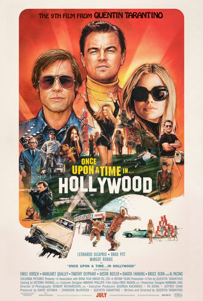
I love the negative space below the lead actors, and how you use that. It’s like a moment of rest for the eyes, but also helps us focus on all the poster’s elements.
There’s an interesting thing about that. I saw the chatter on the internet was, in fact, that the ellipse was some sort of mistake. It’s not a mistake, it’s a negative image, which I thought was pretty clever. It’s the very well known Hollywood Cinerama Dome theater, which is part of the ArcLight Hollywood complex now. In the 60s, it stood alone as a very unique movie theater, in that it was this very architectural white dome.
You did other images used in the film as movie posters for Rick Dalton movies.
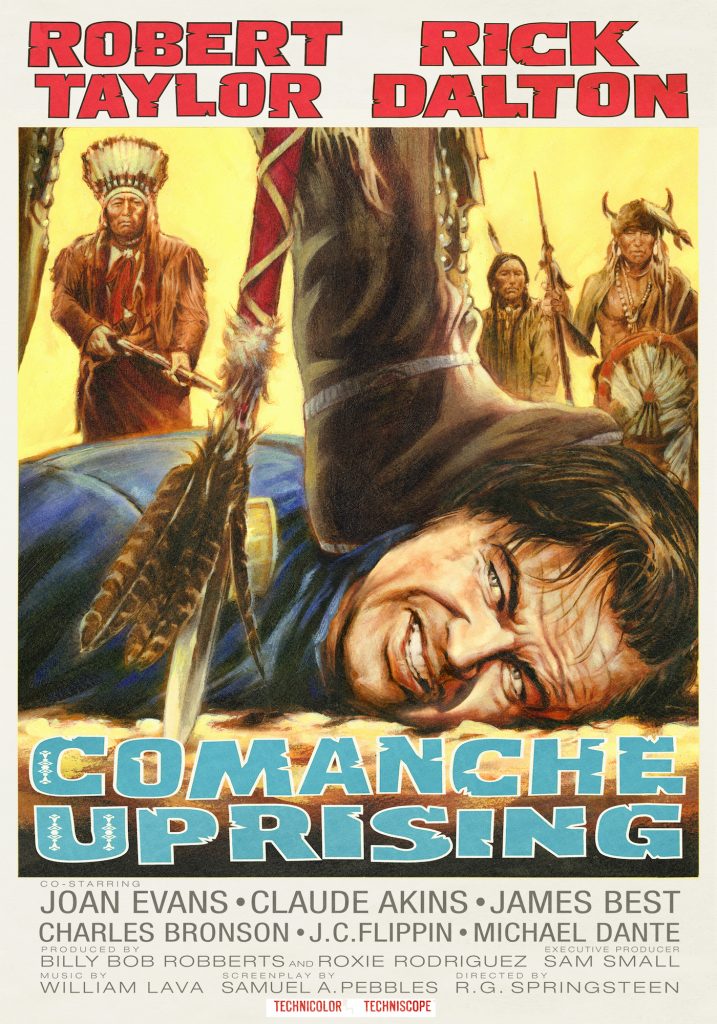
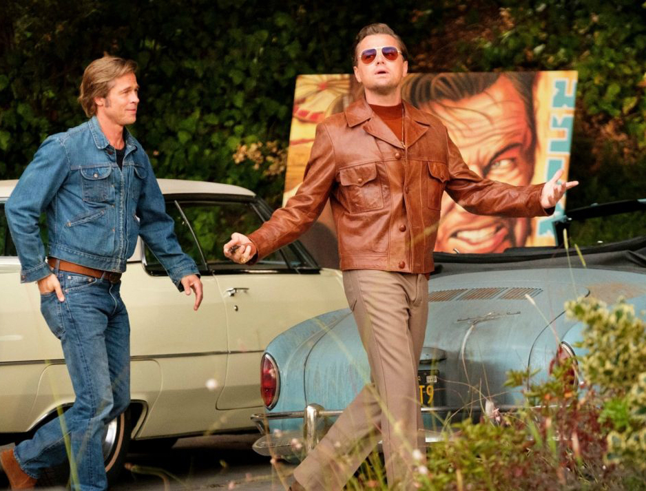
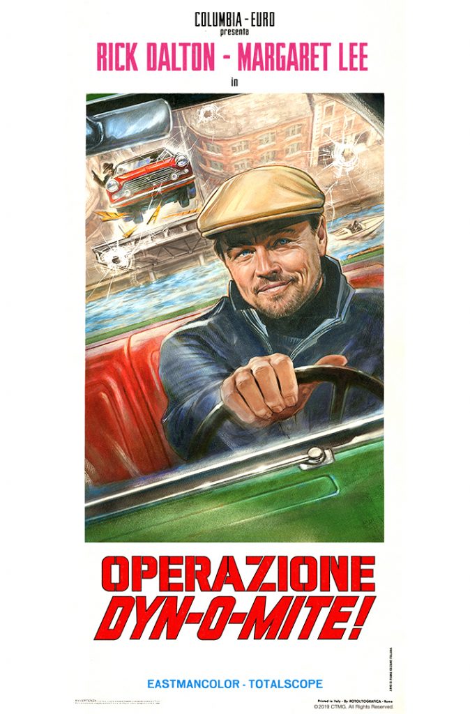
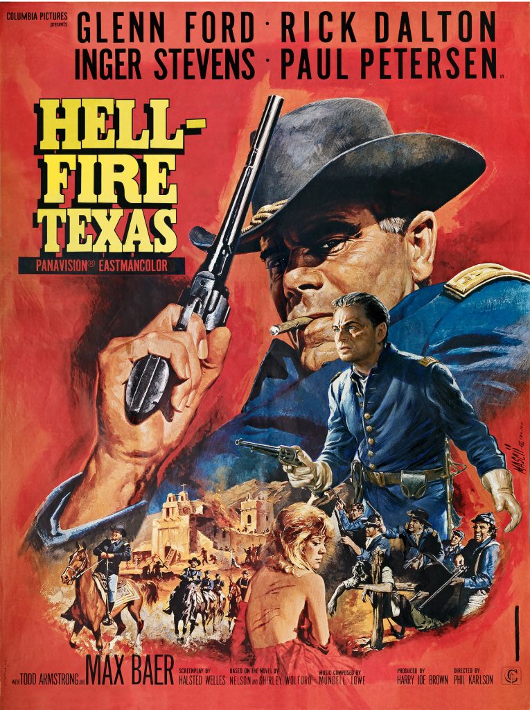
I did about 6 different posters, and the classic movie poster artist Renato Casaro did some as well, of Uccidimi Subito Ringo, Disse il Gringo, and Nebraska Jim. Two I remember doing, and apparently are shown in the movie, are Comanche Uprising and Operazione Dyn-O-Mite. A close-up of a part of the Comanche Uprising poster is reprinted for Rick Dalton’s parking spot, so you see that a lot.
In doing the Comanche poster, I tried to tell them it wasn’t accurate, because I’ve done a number of Native American images, and I know how important it is to get the historical elements correct. They wanted me to have this leather boot squashing Leonardo’s head, which the original poster had way back when, but only the women had those kinds of boots, not the men. They made me do it anyway, so that’s him, getting his head squashed by a female Native American foot.
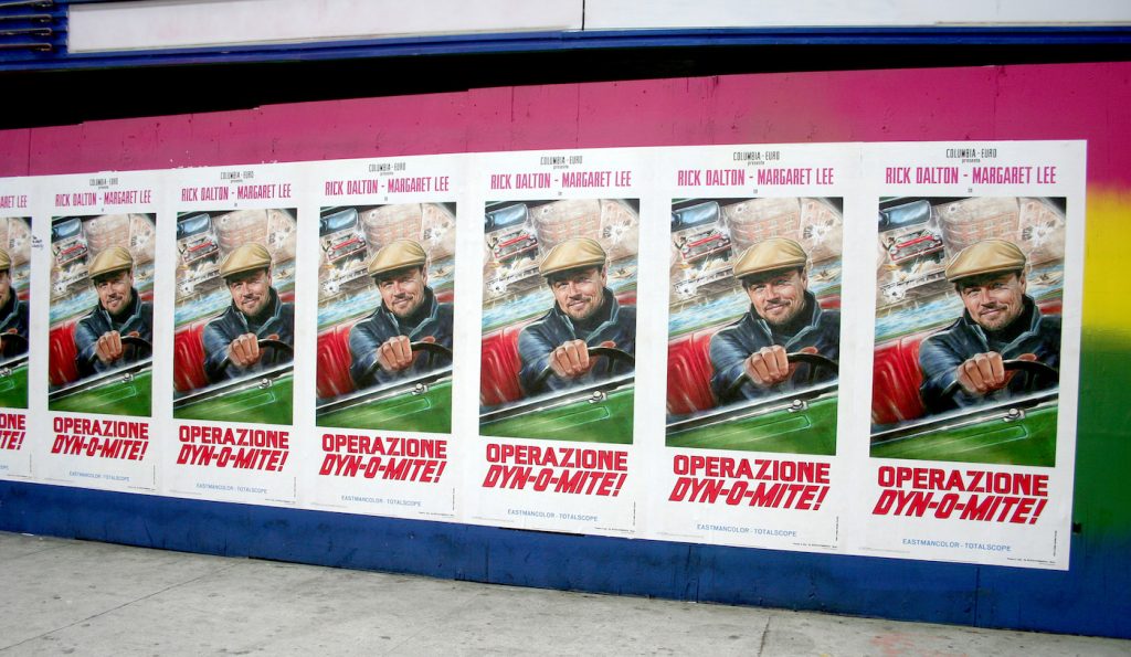
You said your poster for Operazione: Dyn-O-Mite was all over Hollywood.
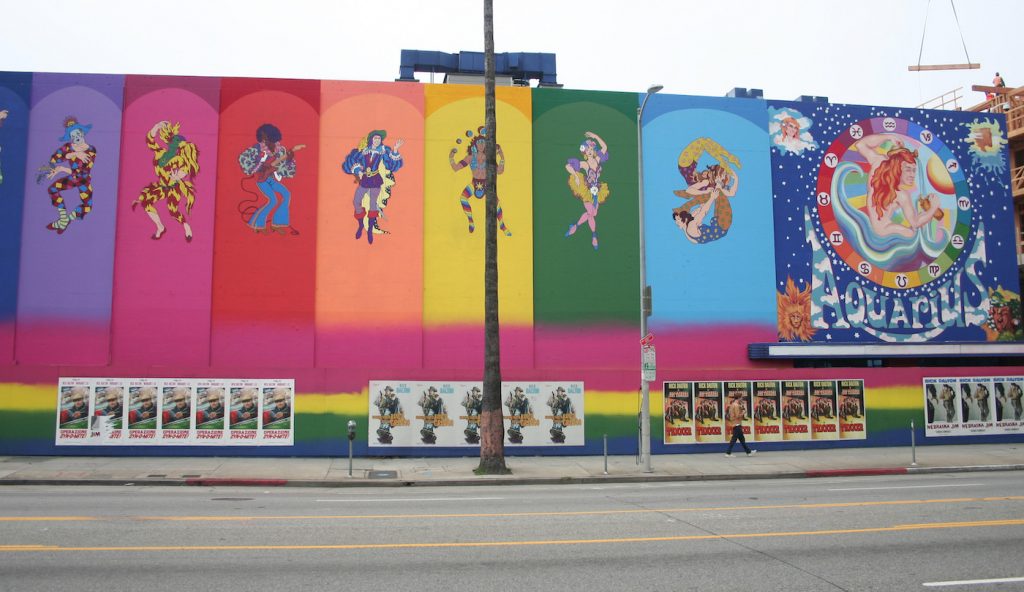
They were large-sized posters, thinner and way bigger and plastered all over 6 or 8 of them at a time, along with Renato Casaro’s work. Around town, while we were filming this, they kind of reinvented some of the old venues that existed in the 60s. One of them was the Aquarius Theater, where you could go and watch various groups play, like The Doors and such. They repainted that whole building to look the way it did in the 60s, and then posted a bunch of these posters in front of them.
You really never know what will be used. It’s all in a day’s work. I didn’t know if this key art from Once Upon a Time in…Hollywood would get used, but what a great surprise!
For more on Once Upon a Time in…Hollywood, check out our interview with makeup designer Heba Thorisdottir, and caricaturist Tom Richmond, who created the film’s bespoke MAD Magazine and TV Guide covers.
Featured image: ‘Once Upon a Time…in Hollywood’ finished poster, no typography copy. Courtesy Steve Chorney.

