How Rent: Live‘s Production Designer Created a 360-Degree World on Live TV
One of the most ambitious TV projects of this year that didn’t include CGI dragons and battles with ice zombies happened on Sunday night, January 27. This was the moment when Fox aired a live version of the iconic musical Rent. To call staging a live version of Rent on TV ambitious is probably underselling it. The musical, which focuses on seven artists living in New York City’s East Village in 1996, dealing with immense social and political turmoil, including homophobia, AIDs, and their own mortality, is hard enough to stage for a regular theater. While the live musical has become something of a trend (Jesus Christ Superstar, The Wiz, and Hairspray have all been produced for live TV), you could argue that none are as of the moment, or inspire as much passion, as Rent.
Enter production designer Jason Sherwood. The young artist was tasked with re-designing the legendary stage for a live TV audience, only Sherwood had an even more ambitious idea. What if you could turn New York’s gritty East Village in 1996 into a 360-degree world that completely surrounded the audience, where not a single member of the crew, a lightbox or a camera could be seen? Sherwood pulled it off. We talked to him to find out how.
Rent has been both an iconic Broadway musical and a film. What were your initial thoughts about giving it new life?
My primary interest was that the vantage point for the live musical would be one that would be looking back and reaching forward at the same time. I hoped it would be rendered in three dimensions, in a completely rounded way. We’ve seen it as a film in full naturalism version, and we’ve seen it on the stage as an abstract production, so I thought, ‘What if you put those two things together, inclusive of the audience, and tell the story at the same time?’
Rent is set in such a specific time and place. Yet it’s also still so topical, considering the LGBTQ community is still fighting for their full rights in this country. Did you feel the need to make any overt connections in the set design between 1996 and today?
I was primarily interested in the idea that 1996 and 2019 would meet and intersect. I was also very was preoccupied with the idea that the characters would feel of their period and very contemporary simultaneously. The fact that Jordan Fisher, a man of color, plays the character of Mark Cohen, was thrilling and important. I was really invested in keeping the DNA of the original, and yet make sure audiences feel it was made by artists of today.
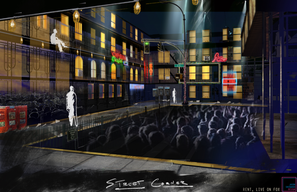
And how did you manage to fit the audience into all these New York spaces?
That’s how we sort blended the two eras of 1996 and 2019, we’re putting a contemporary audience on camera for virtually every shot of the show. I got the job by thinking there would be an actor telling this story, plus the audience around them. The energy of the audience, their presence, the very contemporary nature of putting on a live music event in that way. It’s a period piece, this is NYC during the AIDs crisis, but the parallels between then and now are right there with the audience.
Did people think you were crazy when you suggested making this an entirely 360-degree set?
A lot of people were really scared when I came in with this 360 idea, they were excited, but it scared a lot of folks because it required so much planning. Typically half of the room is back of house—camera, lighting boards, where we’re going to call the show from—but in our case, everything was everywhere. The lighting programers were sitting at a desk behind a wall that porous enough so they can see through them and do their work.
That sounds like a monumental challenge.
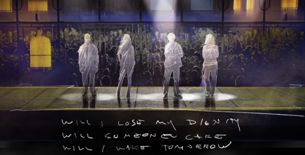
The greatest challenge is the intra-departmental communication. I create a space that the actors act on, but it has to accommodate a camera, audience, fire code rules, lighting, and it has to keep the crew out of the shot. Costumes, sound, everyone has to work together so that we can do something fluid and seamless. One of the most challenging sequences is the song “Will I” when we leave the support group and follow Mark around, which is a complicated moment. We’re lighting all of these people, doing a continuous steady cam shot through this space as the audience is taking the candles we’ve given them and lighting them.
‘Rent: Live’ in 3D with production designer Jason Sherwood from The Credits on Vimeo.
The sets you built feel both very industrial, battered East Village New York of the late 90s, but there’s also a sense of community, of hope, in these spaces. How did you manage that?
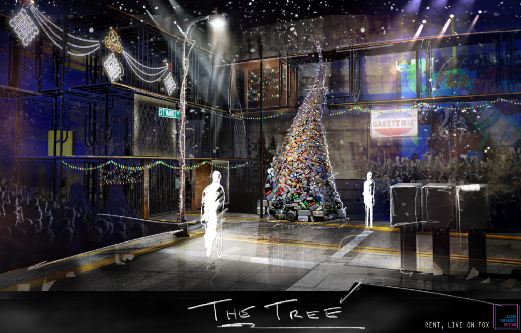
The thing I think about a lot is the current political and social landscape we’re in, the world feels really incredibly dark. The one thing that feels like it has light are people. The world of the show was industrial, metal, dark and rough textures—no place was remotely warm. The physical environment was a hard and difficult place to be. I wanted to find ways to inject a huge amount of color in it. Then you had all these artists in the East Village at the time, Keith Haring painting huge murals down on Houston street, you have the iconic toy sculpture in Alphabet City, which inspired me when I was designing the Christmas tree.
There are so many memorable sets in Rent, perhaps none more so than Mark and Roger’s loft, where so much of the action takes place. Tell me about designing that space for a live TV audience.
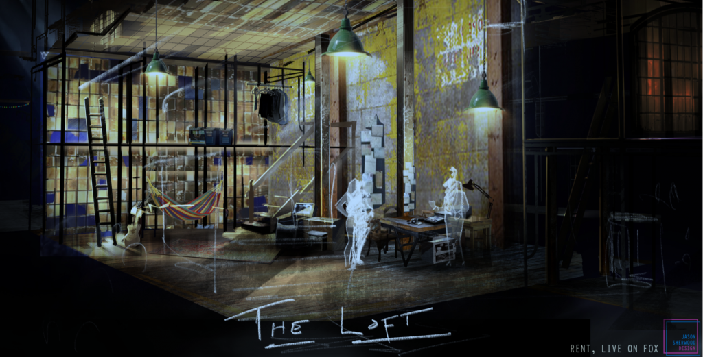
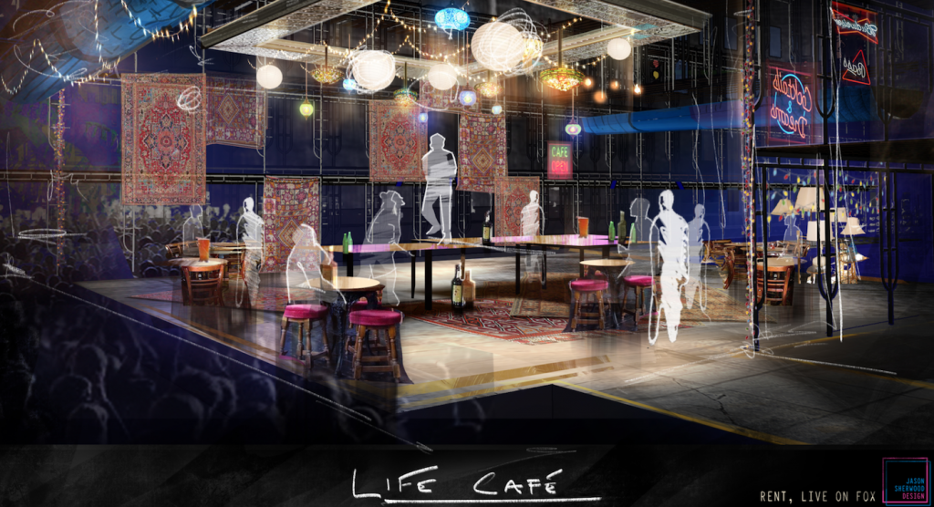
Before we put any dressing or paint or furniture anywhere, we thought it should look really depressing. Mark and Roger’s loft is this big, ominous space, and they’ve come in and turned the old printing press into a home. Or the Life Café, a bohemian safe haven, there’s this hanging tin ceiling and exposed sprinkler pipes. Yet the thing is, there are hundreds of photos and mementos of every party that has ever been thrown in that room. These people have created homes here. That’s what people do today, they find little pockets of the world and they make their art on top of it.
On an emotional level, how did it feel for you to enter the world of Rent and help pull off this spectacular live event?
When I first saw the show, I was a young teenager and I watched it from a rush seat from the front of the audience. It was the first time I ever saw two gay people kiss live, and it wasn’t corny, it was real. The responsibility and care that this team and I personally took to make this a beautiful thing for a new generation of people to experience was enormous. Rent was seminal. This is probably the touchstone moment for so many of us. Getting to make Rent: Live was a dream job, and the greatest privilege on earth you could possibly imagine. Every single decision was about how do we satisfy, surprise, and move the audience.
Featured image: “What You Own.” Rent, Live on Fox. Courtesy Jason Sherwood Design

