How Color Created Character in Brie Larson’s Unicorn Store
Captain Marvel aside, Brie Larson makes her feature-length directorial debut with Unicorn Store, now on Netflix. First screened at the Toronto Film Festival in September, the fantastical allegory written by Samantha McIntyre follows Kit (also played by Larson), a colorful art student who receives mysterious invitations to visit The Store where she’s granted owning the unicorn of her childhood dreams.
The use of color was fundamental to the story as it painted a metaphor for Kit finding her identity. Larson collaborated with production designer Matt Luem and costume designer Mirren Gordon-Crozier to detail a vibrant palette and tone that influenced subtext.
Before sets even saw a drop of ink, Larson and Luem discussed who Kit was as a person and as an artist. The symbolism of color and how it would affect Kit was a central topic. Luem explored different artistic expressions and painters throughout the 20th Century to shape Kit’s point of view. She even looked at how pop music might inspire her artwork. “We thought she might be a fan of Grimes. I even saw a bit of Kim Gordon from Sonic Youth in the character,” notes Luem.
What they found in Kit was someone who takes low quality and everyday materials and in an opportunistic way creates a new vibrant world using those materials. By defining what kind of artwork Kit would make it became the root of every other part in the film. “We had the freedom to explore our designs the same way Kit would respond to color,” says Luem. “And Brie was open to it being a feast of color. It became our rallying cry, ‘go for more color’.”
In an early scene, Kit is in art school painting a self-mural of bold saturated hues against a white wall. Luem strived to create an immediate contrast between Kit and the art school setting. “School is a form of institutionalization where you’re dogmatically forced to do something,” says Luem. “It can backfire in terms of what your artistic point of view is and how you approach your process, so we wanted that idea represented in the location and stripped it down in terms of color and aesthetic to make Kit standout.”
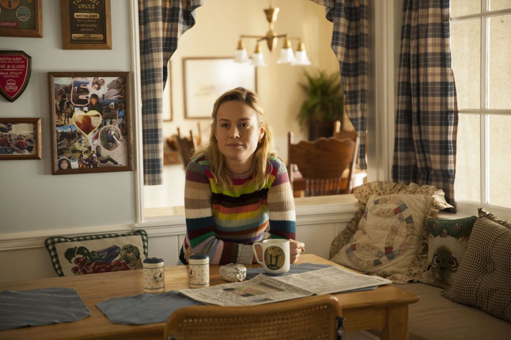
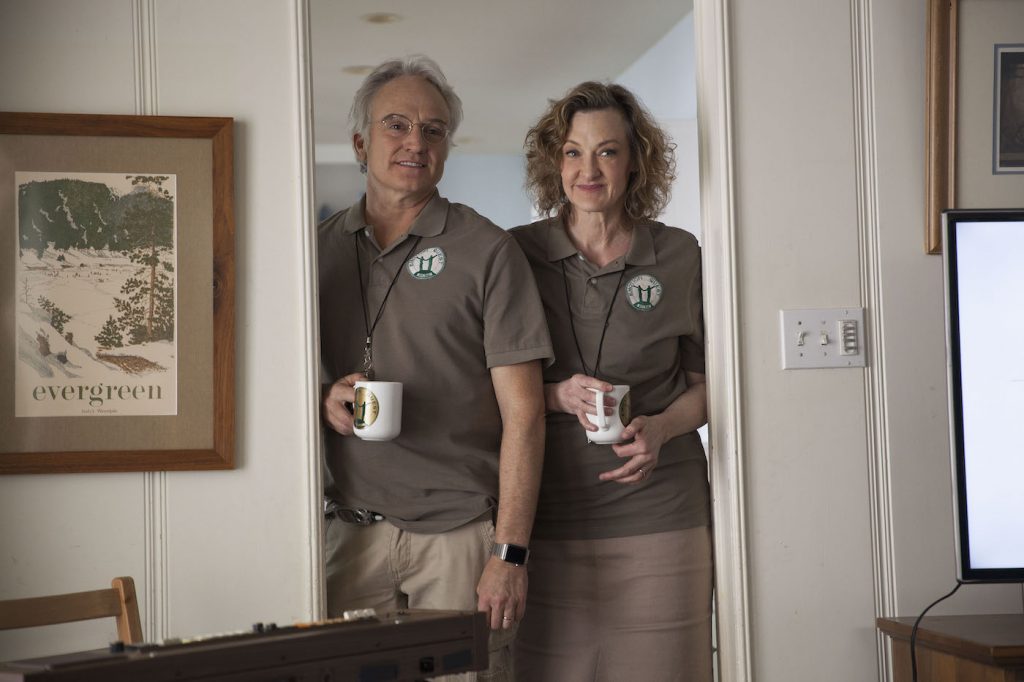
It’s Kit’s misunderstood creativity that gets her kicked out of art school sending her back to her parent’s house, played by Bradley Whitford and Joan Cusack. Color is restrained inside the home with more earthy tones of browns, creamy whites, and yellows defining the space. Costume design echoed the flavor of the house as Whitford’s and Cusack’s characters dressed in a similar palette of greens and light browns. “When Kit is at home she needed to be the source of color,” says Gordon-Crozier.
Pressed by her parents to do something with her life, Kit takes a temp job at a PR agency humorously called PR&R PR. Luem designed the space to be void of color using a neutral palette of blues and dark grays. Symmetrical cubicles paved the large open space to intentionally create a contrasting dynamic with Kit’s character.

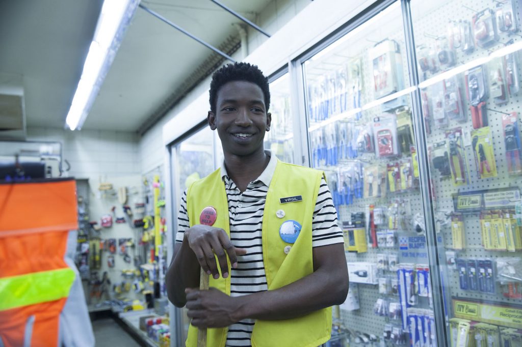
Gordon-Crozier dressed Kit in a vintage ‘70s suit and accessorized it with a vibrant yellow bag as a way “to keep her grounded in her child-like state.” Yellow also linked Kit to Virgil (Mamoudou Athie), who she meets later at a hardware store “It’s subtle but Virgil is wearing a yellow vest which connects them as a potential love interest,” says Gordon-Crozier.
Kit stumbles upon invitations to visit The Store. The Salesman (Samuel L. Jackson) runs this magical place. This mercurial, multichromatic figure offers her the unicorn she always wanted. Yet nothing in life is free. In order to be worthy of the creature, Kit must complete several tasks and do some soul-searching. “The invitations The Salesman sends to Kit needed to have a different artistic style than hers,” says Luem. “We researched Japanese graphics and posters from the ‘60s and created the aesthetic for those graphic treatments around those influences.”
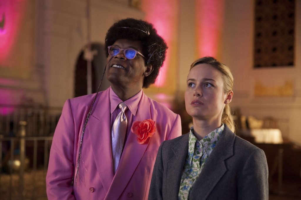
The Store carried its own unique look, too. The Salesman and his wardrobe popped with vibrancy. “He’s the most colorful in that space,” says Gordon-Crozier. “We detailed his suits in pastel colors where everything harmoniously matched down to his tie. The thought was to use colors on him that made you associate with the feeling of a rainbow or things that are soft and sweet.”
Kit presents an adverting campaign for a vacuum in the PR agency’s boardroom in one of Unicorn Store‘s defining moments. She wears a flowy outfit as if hundreds of brightly colored tree icicles lined her body. “It was a very special piece handmade by Gucci,” Gordon-Crozier says. “When I saw it I knew there was nothing better than it for this movie. The scene includes a dance sequence, and we wanted something with movement. Something that had vibrancy and reflection to it.” Underneath, Kit wears a shamrock green suit symbolizing energy, life, and money.
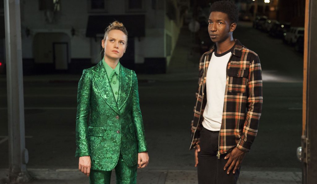
Color created a symbolic depth to the allegory where its progression paralleled Kit’s character. This shared vision Luem and Gordon-Crozier had with Larson allowed them to explore the story in the most creative and imaginative ways.


