Back to the Future With Star Trek: Discovery’s Production Designer
Star Trek: Discovery has been boldly going places even past incarnations of the iconic TV series have never been. It took a mere two episodes for the show to break completely new ground; the Starfleet’s first mutiny carried out by the star of the show, Sonequa Martin Green’s Michael Burnham.
The major advances are not the only narrative. Behind the scenes, a top-flight crew has been making the most of the latest technology and some very special locations to pull off the kind of show Star Trek creator Gene Roddenberry would have loved and made, had he possessed the same resources at this fingertips.
Enter production designer Tamara Deverell, the head of Discovery’s brilliant art department. Working with folks like set designer Emilie Poulin and art director Jody Clement, TD has helped create a show that is as visually arresting as its storyline, which is set ten years before Captain Kirk on the bridge of the USS Enterprise, in the midst of a Klingon-Federation war.
How much research into the Star Trek oeuvre did you do before you got to work on Discovery?
I was not the original designer; I started on episode 105 in Season 1. When approached to do the job, I did watch some of the shows. Having grown up in the ’60s, I was very familiar with The Original Series (TOS), so I mostly familiarized myself with the Star Trek movies that creator Alex Kurtzman had been a part of, and some of the other shows in the series. As Star Trek: Discovery predates TOS, I wanted to come at it with some fresh ideas.
Because Discovery takes place before Kirk, Spock and the Enterprise crew were plying their deep-space trade—how did you use this timeline when you were considering what the design of the show would look like?
A lot of fans commented on the high-end and technologically advanced look of the show initially and there was a fair bit of backlash because we were presenting something so much slicker and more developed than TOS. My response to this has always been that we needed the show to have the latest in technology and to emulate the future of space travel. That has always been the mandate since the early days of Star Trek and we needed to honor that while also giving the fans something high end, amazing and comparable to the advanced look of the Star Trek films and other franchise shows.
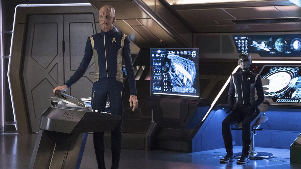
To watch an episode of the original series now, you really do get struck by how relatively limited the filmmaking technology was back then.
The original series was charming and it was great for that period, but nobody wants to look at sets like that today. We had so many discussions about canon and trying to stick with the essence of the show. The essence of the show is this is a human story. The technology is an important aspect, but really we’re doing stories that have survived through human history. We’re concerned with human relationships, these great themes that are the essence of Star Trek. We’re trying to capture the thematic elements. Visually, we said, ‘Let’s go as far as we can afford to go and take audiences to new realms and do whatever we can make to make it look cool!’
Star Trek is famous for displaying far-out technologies that would become reality, like Captain Kirk’s communicator, which became the flip phone.
Yes. That is Star Trek history, offering up new, glamorous technology. We have a responsibility to do that. Gene Roddenberry would have gone even further. So much of our day is asking ourselves how can we go further while still being respectful.
Are there specific Star Trek design elements that you were particularly fond of from previous incarnations of the show? Were there any that you felt strongly needed to be updated or jettisoned?
Definitely the Transporter Room needed to be brought into a new level of design while honoring the original series. I think we did that successfully. We were able to play up the curved nature of the ship more in corridors and rooms like the Mess Hall. I think that was important to make the show have a very real and striking environment compared to the shorter, squared rooms and hallways of the original.
Any callbacks we can expect going forward?
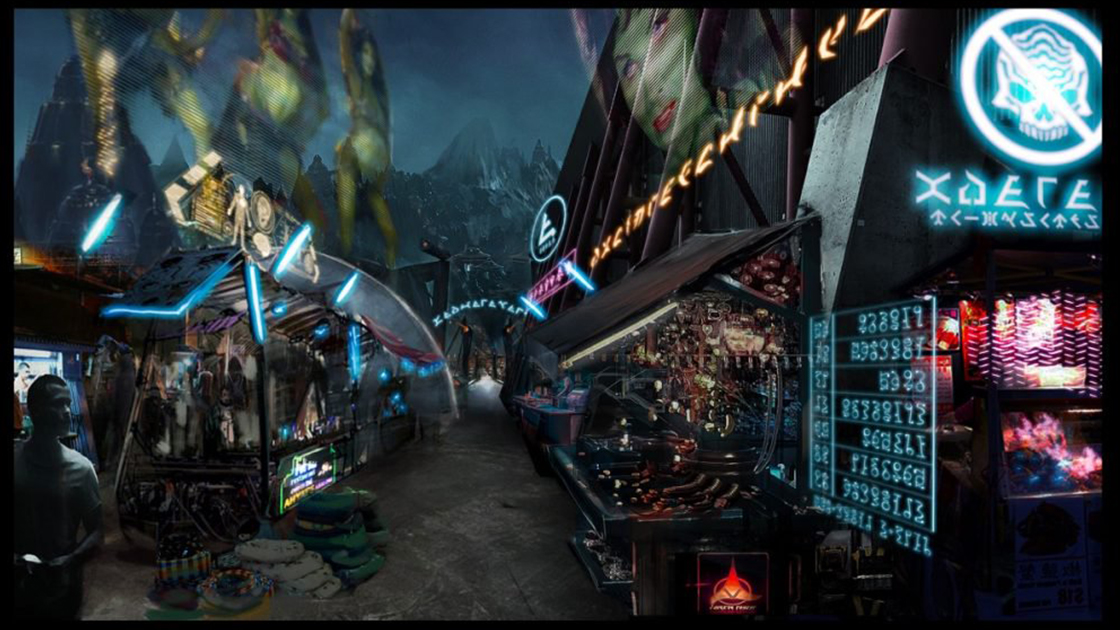
There are a lot of season two surprises that I can’t divulge here that were indeed takes on some old original series classics. I love when Star Trek lands on new worlds, and we got into that a little bit towards the end of season one, going to Pahvo, the rebel planet Harlak, and then to the Klingon planet Qo’nos. We are also going to some new worlds in season two. I looked a lot at the original series for inspiration for those interplanetary travels. Of course, we had the luxury of actual locations with real rocks instead of the paper mache ones you see in the original series.
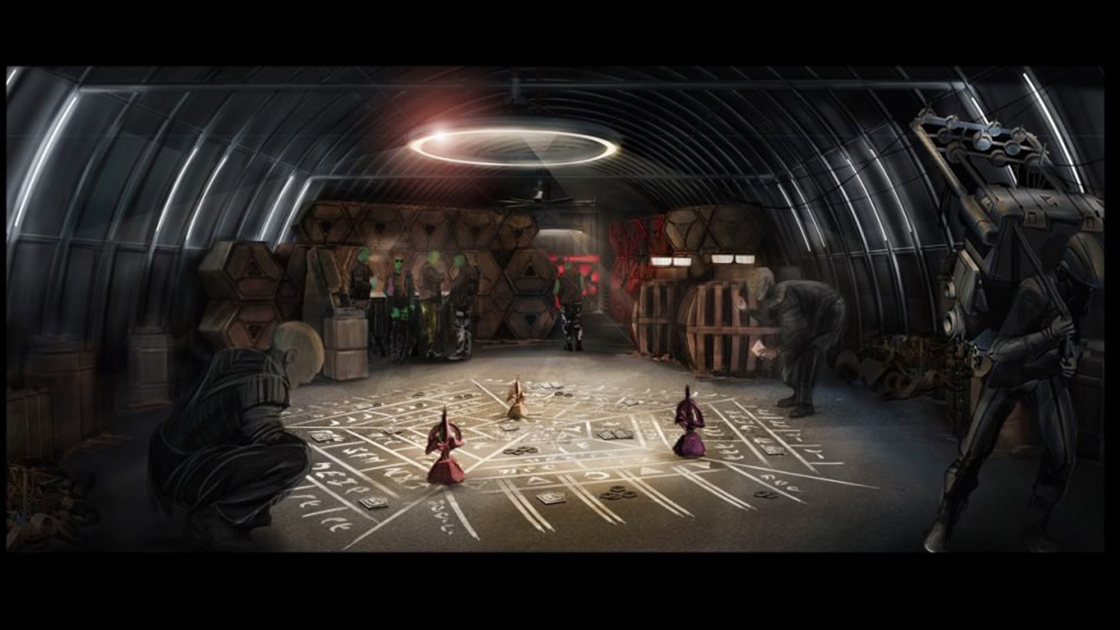
Yeah, the planets we’ve seen thus far in Discovery definitely have a much grittier, realistic feel than we’ve seen in past Star Trek series.
When we were going to other rocky, barren planets, we wondered how we were going to do this on stage, because it’s so hard to move the whole company. We thought about how hard it was going to be to make rocks look real, to create a big, expansive quarry. We decided to use a real quarry.
This was for the rebel planet Harlak?
Yes. This is a new planet, not in the Star Trek canon. We used a quarry near Uxbridge, near Toronto. It’s a big Lafarge Quarry, and it was an area where they were no longer excavating or doing any work so we were able to control it. Quarries are actually quite dangerous; you have to have safety equipment and be escorted in. They were really good about it. People hear Star Trek and think, oh, so exciting. You’ll see a quarry coming in season two for a different planet—and this planet is canon. Also, we looked into going to places like Iceland and Scotland for other planets—that might be in the future for Star Trek.
Is there a particular set you’re most fond of?
I think my all-time favorite for season one was the Orion Cabaret in the last Episode 115. Mostly because we were able to do something new and different and sexy and outlandish with fabric and pillows and beaded curtains…it was a good way to end the season with something that was completely off-the-rails from all the hard-edged, smooth surfaced and glossy space ship interiors we had been doing.
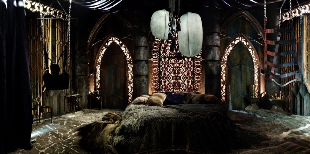
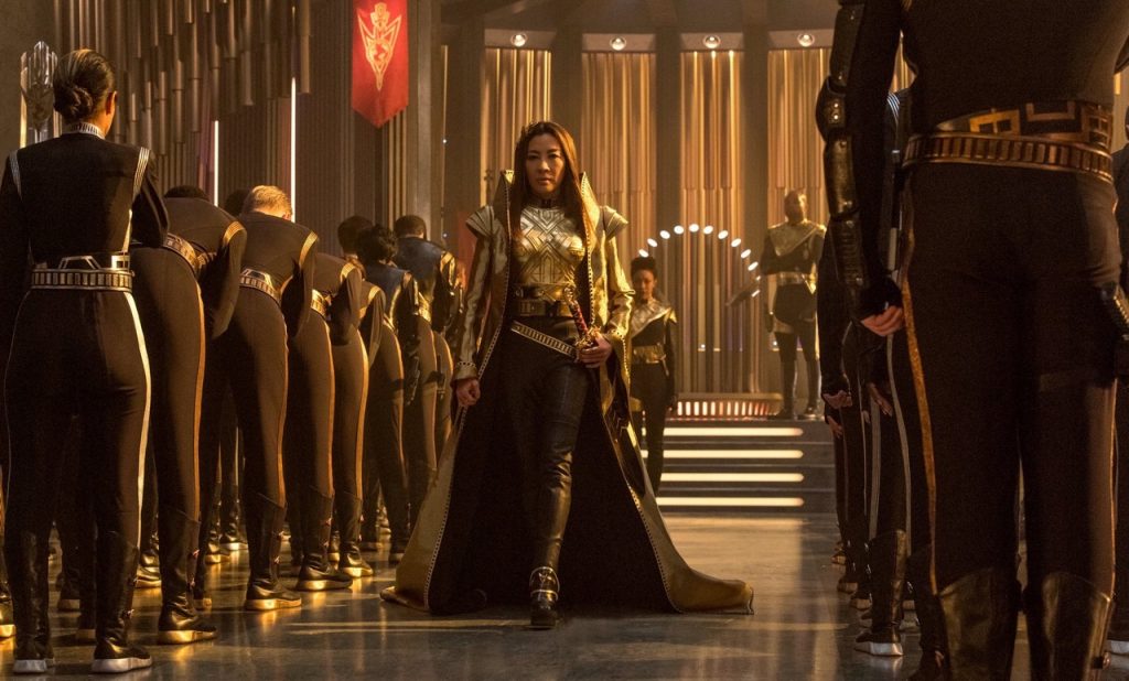
Having said that, the mirror universe with the Terran ship and its interiors was also something new and different that I am particularly proud of.
What were some of the biggest challenges you faced when taking on this huge project?
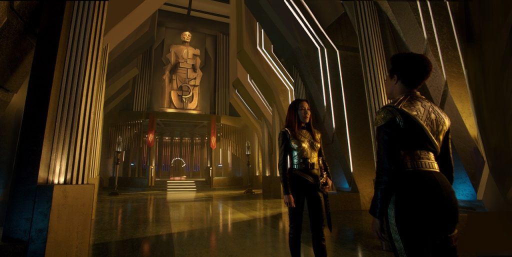
Managing such a large art/set decoration/construction/paint department was definitely a challenge… a rather unwieldy beast that took some getting used to. Also, with such complex builds, getting the design work thought-out, approved, drawn up and implemented was daunting, particularly with an episodic television timeline. The Terran interiors were particularly difficult as we had to come up with something that was enormous and spectacular and, yet, that could be built, painted, dressed, and lit within a tight few weeks. I went with a Brutalist aesthetic, using large repeated forms to create this new world.
Aside from other incarnations of Star Trek, did you rely on any other TV or film references for inspiration? Are there any other production designers whose work you particularly admire?
I found myself looking a lot at sci-fi/ fantasy video game design for inspiration as well as different architectural styles, such as Brutalism and Soviet neo-constructivism. Looking at geometry in nature, like concentric circles. If you look at microscopic nature and the innate mathematical aspect to it, there’s so much there to the structure. We did a lot of geometric natural design research for the sets last year. The Kelpian planet, for instance.
For the color palette, what were some of your guiding principles?
Most of the Discovery colors were already developed when I started. Very metallic based, monochromatic, more about the surface glossiness than the color. We made very specific color choices for some of the new planets, opened up the palette as it were and set it apart from the look of the Discovery Ship. I did avoid purples and yellows; those colors just don’t seem to work in film and television. Awesome reds and blues used sparingly to great effect.
On February 9, Deverell will join eight other Star Trek: Discovery artists for a Q&A about their work hosted by the Directors Guild of Canada Ontario. These are the folks responsible for turning Toronto into whatever world the Discovery crew finds themselves on next.
Featured image: “Context Is for Kings” — Episode #103 — Episodic coverage the CBS All Access series STAR TREK: DISCOVERY. Pictured (l-r): Mary Wiseman as Cadet Sylvia Tilly; Sonequa Martin-Green as First Officer Michael Burnham; Anthony Rapp as Lieutenant Paul Stamets. Photo Cr: Michael Gibson/CBS © 2017 CBS Interactive. All Rights Reserved.


