Oscar Watch: A Quiet Place‘s Production Designer on Creating Killer Spaces
In John Krasinski‘s A Quiet Place, sound kills. Yet it’s not only what one might say (or scream) that can get you killed, but anything you come into contact with. This means the spaces within the world of A Quiet Place can go from a sanctuary to a trap in a heartbeat. In order to create an environment that was as claustrophobic and terrifying as the film’s brilliant premise, Krasinski tapped production designer Jeffrey Beecroft to build him a world in which everything was potentially fatal.
We spoke to Beecroft about the unique challenges presented not only by the premise, but also A Quiet Place‘s blind, seashell eared monster, and how thanks to a modest budget and major ambition, the filmmakers turned practical effects and tight spaces into cinematic gold.
So much of this incredibly tense story takes place in tight spaces—the basement, the bathroom, the silo—how did you envision these spaces?
Each space presented a different challenge and each was a set we had to build. All of them needed to be absolutely real, using the exact proportions that would have been there. In working with actors, I think the best thing you can do is give them a real space so they can feel it and work with it in an embodied way with their process.
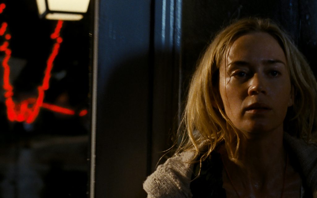
There were no wild walls, which would normally accommodate the camera in the bathroom. However, we needed to make the bathroom set look out into the hallway and the staircase so you could feel and see the impending danger coming toward you, so that entire set was built for that shot and for the reveal of Emily giving birth, at the end of the scene.
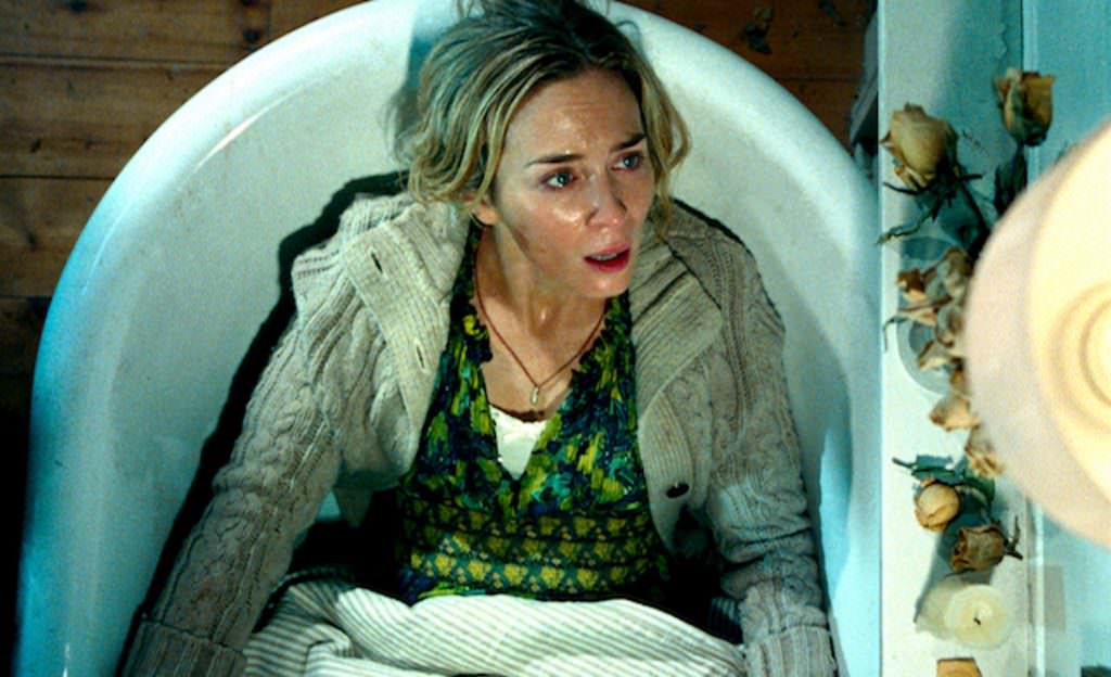
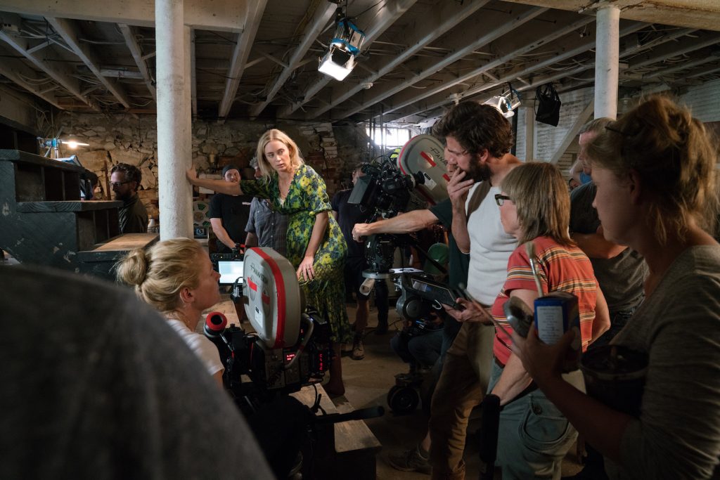
The basement was built with two wild walls a complete ceiling and submersible 3’–7″ pool. The walls were built so the audience felt completely enclosed, and when the water came through the ceiling there was nowhere to hide. I also worked with much lower ceilings then normal so they would be in the shots.
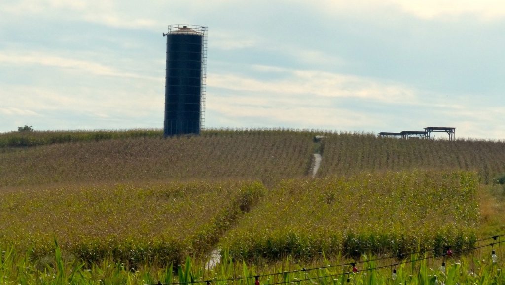
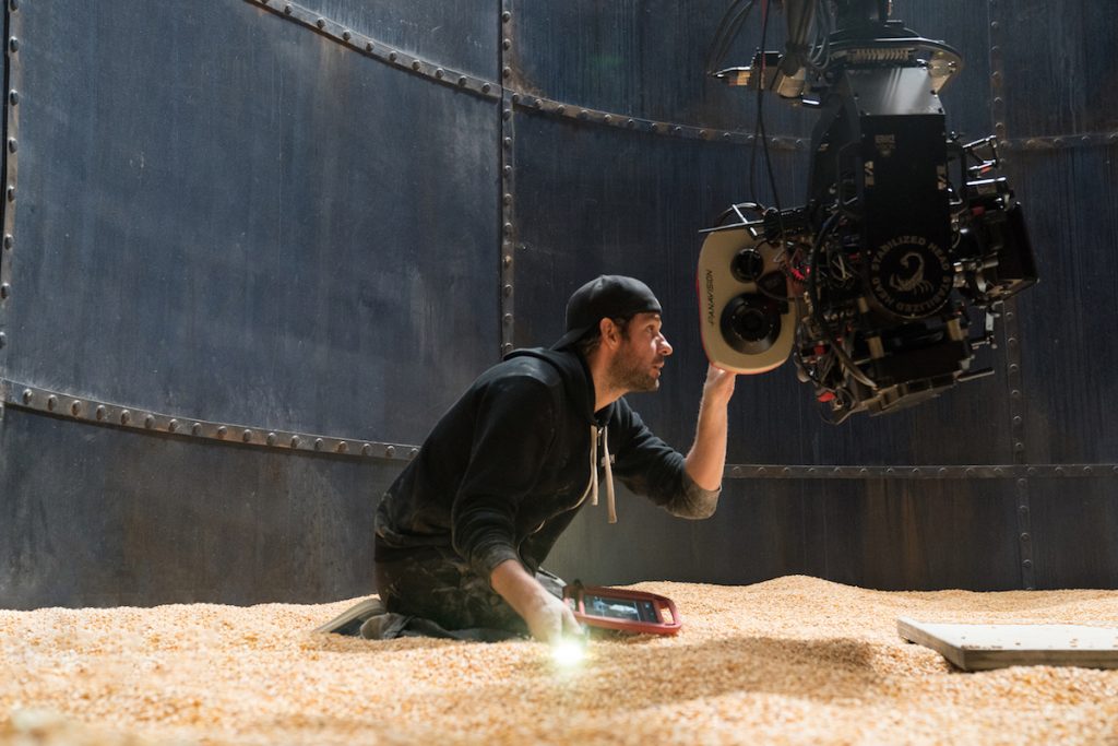
There was a total of five silos built for the silo scenes, each with a specific use, as well as 40 tons of corn. The first silo was a real 70-foot silo. The second was a false roof that was brought to the stage. The third silo was 3/4the size, with a quicksand rig for the two children at 8 feet.
One of the best moments in the film (and in any horror film of the year) is when Evelyn is trapped in the basement, which is now flooded, and the monster quietly slips under the water. How much of this scene were you able to create practically versus what was added in post? Was there actually water in that space?
The entire scene in the water was real. We had an actor in a green suit playing the monster. He created the movement and his movement was married to the creature. This was all created by the FX genius Scott Farrar. Although we had limited funds on the film, as much as possible of this scene had to be in camera to the greatest degree possible. I think that was exciting for all of us, and perhaps that translated to the audience.
Were there any references or touchstones from other monster movies that you took inspiration from when you were plotting the design of AQP?
To tell you the truth, I looked at westerns and WPA photographs to create the images of timelessness for the film. John suggested we look at Jaws, which is always inspiring, as it comes from a family both on and off the water. I looked into sound and what struck me is how sound moves, and we started looking at Nautilus seashells, and that is where the design for the hearing of the creature came from. The creature’s body was made of a shell-inspired design.
Does your job change at all when you’re designing a space that will contain a creature that will be added in post?
Absolutely, yes. Each film is different, in that it is always about the relationship between the actor and the creature. This dynamic requires different space for the actors as well as for the CG characters. In A Quiet Place, I have been incredibly helped by my friend, Scott Farrar from ILM, both in creating the creature and the space. Our creature is a very much a real character in the film. Its terror was essential. The creature represented in my mind a spiritual luminosity.
Was there any space or design element, in particular, you’re most proud of? Was there any space or design element you’d have liked to have had more time on?
I am most proud of telling the story of the family on a farm that felt real and timeless. An important part of the look and feel of this narrative is a father protecting the family and a mother maintaining ritual. I’m also proud that John and I were able to figure out a way to tell a story in images, rather than is just a verbal language. John wrote a visual story, and I hope I was able to help him tell the story while creating a world for these characters. I anticipated that the audience would experience and relate to this very real, yet extraordinary story in a theater.
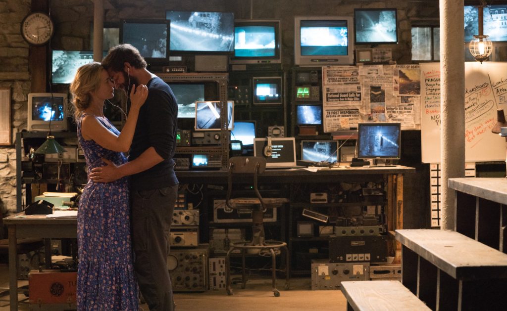
Featured image: Left to right: Emily Blunt plays Evelyn Abbott and Millicent Simmonds plays Regan Abbott in A QUIET PLACE, from Paramount Pictures. Courtesy Paramount Pictures


