Bad Times at the El Royale’s Production Designer’s Brilliant Build
When Laramie, a vacuum cleaner salesman with an off-sounding drawl (Jon Hamm), steps behind the bar to make a pot of a coffee in the lobby of the El Royale, no attendant to be seen, it’s clear this fancy yet faded, empty hotel isn’t your average roadside motel, no matter how welcoming the vintage neon sign outside. For a traveling salesman, Laramie seems to know an awful lot about the history of his abode for the evening, explaining to Father Daniel Flynn (Jeff Bridges) and singer Darlene Sweet (Cynthia Erivo) the hotel’s once glorious past and its strategic location, split as it is by a red line across the Nevada-California border, which continues out into the parking lot.
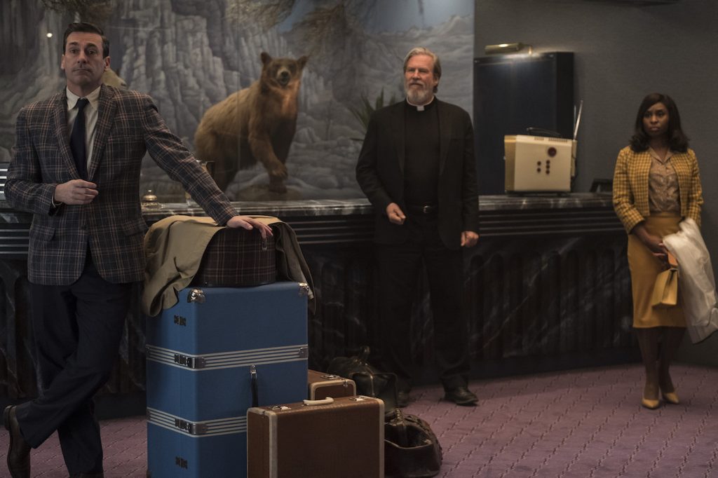
The uneasy opening party of Bad Times at the El Royale is broken up by the arrival of Emily (Dakota Johnson), a hippie type who seems to be having a bad day. A twerpy concierge, Miles (Lewis Pullman) gets his motley crew of guests checked in, not bothering to inquire too deeply into the deliberation Laramie and Father Flynn, in particular, demonstrate regarding the rooms where they’d like to stay.
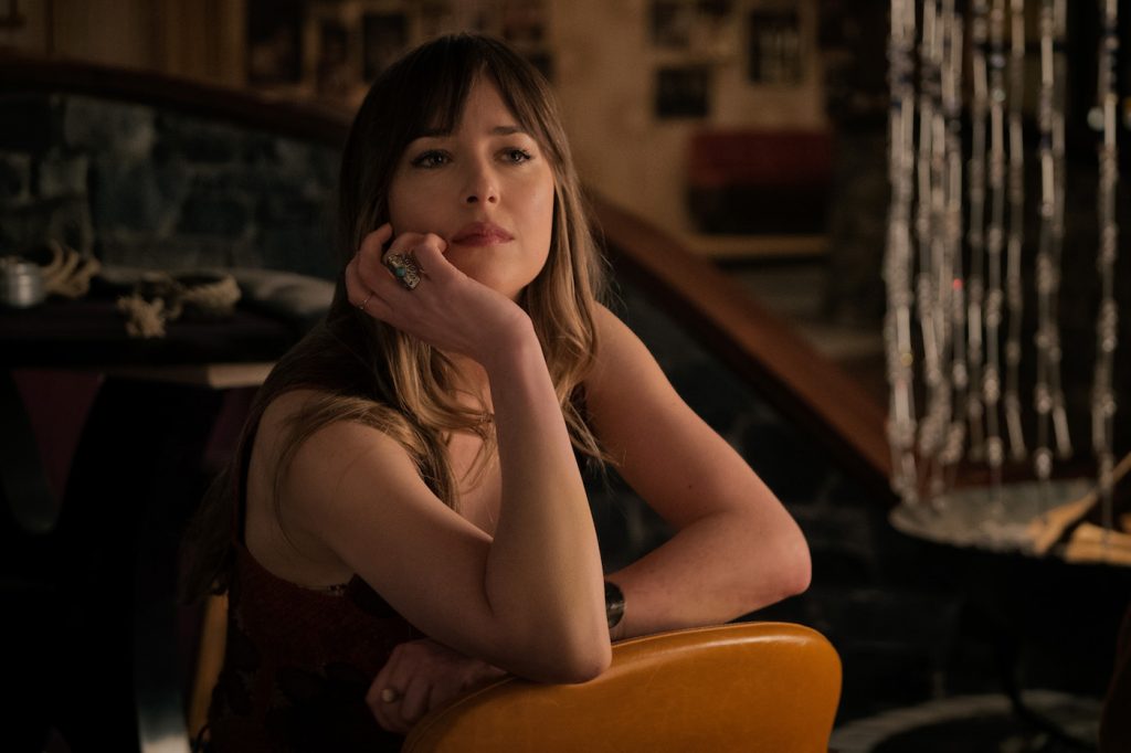
Night falls, rain comes down in sheets, and the characters’ stories reveal themselves, veering away from the hotel’s lurid guest rooms to times past: Father Flynn in a podunk town, operating the heist that has brought him back to the El Royale a decade down the line, Darlene had a viciously bad day at work in a music studio, Emily had an even worse evening at home, as a child with a suspect bump on her head, hiding her little sister under a bed. Laramie’s Southern drawl, as one might have already guessed, is fake. Miles’ ineptitude, although most certainly not the true extent of his job at the hotel, becomes sympathetic. We come and go from the present, director Drew Goddard (Cabin in the Woods) toting his audience between decades, perspectives, and in particular, the hotel’s distinct spaces, with Swiss-movement precision.
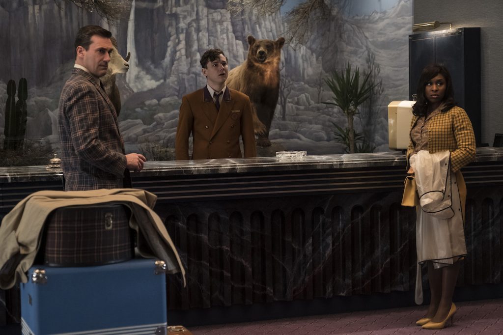
If this seems like a carefully timed movie, the characters’ movements almost choreographed to where they stand, that’s because it is. Martin Whist, the film’s production designer, worked with Goddard on Cabin in the Woods and several other projects, and for El Royale, he engineered the look of the hotel — a studious, seamless mix of references the audience might recognize from the 1940s to 1969, when the film is set — from the ground up. He spoke with us about designing the space, not just in terms of its aesthetics but down to exacting measurements, as well as the effort that went into composing the scenes—a task the script makes infinitely more complicated once charismatic cult leader Billy Lee (Chris Hemsworth), his abs, and his armed crew show up.
The hotel functions as a character unto itself. How was the set created—how did you bring this location to its final form?
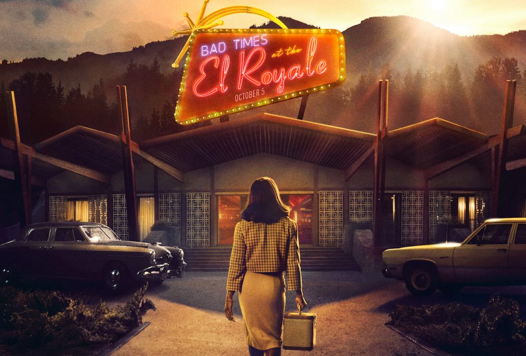
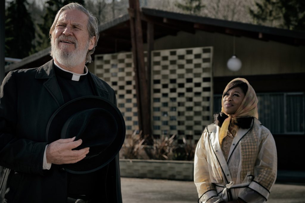
That’s funny—it’s not a location. It’s 100% built. It’s all interior, in a massive old warehouse space in Vancouver that’s used for filming. Usually, you do multiple sets inside this space, but I did just the one. The interior and the exterior [of the hotel] are all inside this warehouse space. I should qualify that—I did a partial exterior build-out on location. The opening scene when Darlene is driving to the hotel and meets Father Flynn, he’s looking in one direction, and then they go inside—that was built on location, just to get that daytime shot. Once they went into the hotel, that cut to a built set inside the warehouse. So the exterior parking lot, which [was shot] for all night, the rain, and everything after, that was in this warehouse space.
At one point people talked about looking for a location, very early on, but there was no way in hell we were going to find a location that was going to work for this because the script was so tight and specific. It wasn’t loose, it wasn’t like we found a location and then designed the scenes around it. Drew wrote the scenes and then Drew and I choreographed all the scenes and the spacing, just he and I walking around in an empty warehouse, making sure all the distances were correct. Once we had the framework of the design, which was based on the blocking of the scenes—for instance, you walk in the front of the hotel, we knew the distance to the reception, and we knew we wanted a large distance from the reception to the bar—all those spatial considerations were mapped out. And then, I knew I wanted a bar over there, and I knew we wanted a line down the middle, of course, the jukebox was of primary importance, and we wanted Darlene and Father Flynn having their pie date on the California side, near where they got the pie, there was a reception and Miles behind the reception, and of course at the culmination, we needed to create fire.
So in terms of the design, it started with the script and then the layout of what was required for the scenes, and then I started the look of the design—the colors, textures, and all the rest. But going back to the question of build vs. location, there was no way we would have found something that specific because Drew and I are extremely specific, it’s not the other way around.
Without giving too much away, what are the challenges involved in staging a massive hotel lobby fire?
That was tough for safety reasons, basically. As we were inside a warehouse and closed set, and we needed to burn it down, it certainly wasn’t like you light a match and hope to see what happens. Where the fires start, where they go, what level they grow to, was all pre-tested and pre-planned. Actually, my brother, Joel Whist, was the special effects coordinator, so he was in charge of doing all the rain and all the fire. We worked together very early on, laying out where the fire would be. That determined what we could burn, and even the design of some of the architectural elements. The screens were designed in accordance with what would burn well, what would look good burning, and what conceivably would burn.
What happened was, everything was built to look a certain way, but once the fire started, we had to pull out certain sections of the set to bring in the fire [scene] versions of, for instance, the railings. The screens that were wood in the movie, that lit on fire, were all metal tubing so that gas could go through the whole thing, and Joel had perforated them so a flame could come out. Even one of the banquettes had to be pulled out, and that banquette was made of a fire-retardant material that was painted. The carpet that caught on fire was initially carpet, but we printed the pattern of the carpet onto a fire-retardant material on the ground. The point is that everything was pre-planned, and once we determined where the fire was going and how big it needed to be, I had to design that aspect into the actual design [of the hotel] so that it was seamless. You certainly didn’t want it to look a certain way because it had to be on fire. But for safety and practicality reasons, you needed to be able to turn the fire on, [the actors] are acting, and then you needed to be able to turn it off. When you want to have a certain level for a certain shot, you need to turn it on, turn it off, and turn it higher as it goes and goes. The thing that was unexpected was that I had to fire-retard all the painting and pre-paint everything in fire-retardant, which was ridiculously expensive. So that was kind of a surprise.
Considering that you had to create this entire hotel world from scratch, are you now something of an expert on fading glory mid-century modern American roadside hotels?
I’d say I’m not an expert. I didn’t want it to be a museum piece, I didn’t want it to showcase all the iconic design and architectural elements from the era. My inspiration started with going through Architectural Digest, but even that was a little too highbrow, so [then] just home magazines and advertising, and what they were selling, and photographs of events or spaces from back in the day. But not necessarily photos of the iconic Lautner house, for example. I was looking at Lautner, Neutra, and all these people for spatial ideas, famous mid-century architects, Quincy Jones, and all this, but really, truly, I was more interested in the architects and looks of the era that weren’t the most popular ones. The hotel was a bouncing spot, back in the day, in the story, but it was off the beaten path. So it wasn’t the fanciest of the fanciest.
What I love about that era was they, with no apologies, combined textures, materials, colors, and patterns. It’s verging just on the edge of gaudy and tacky, but can be very elegant, if the color palette is somewhat uniform. My inspiration I found from unexpected things I might see from the era, the “oh my god, I can’t believe they thought that up” type of thing. And also, frankly, not just specifically from that date. We move so fast right now. You look back in time, this wasn’t very long ago, but nonetheless, it’s long ago enough that things spilled over. The 40s held on for a while, the 50s held on. As this wasn’t just a showcase of the most current cutting-edge design and architecture, I was looking further back for the type of glass for the gaudy light fixture, the type of wall surface it might have hung on.
Once you found the aesthetics you were looking for, how did you source material for the set?
Almost everything was built. In the hotel rooms, we designed and built the beds, we designed and built the furniture. My set director, Hamish Purdy, found these amazing stools for the casino, the roulette wheel, the jukebox, and the tops of the card tables, but then we built the bottoms. All the banquettes were built, all the elements in the bar were built, all the elements in the rooms were built. Part of this goes back to the specific nature of the scenes. Everything was in its place for a purpose and in anticipation of scenes that were coming up, so that there was no accident that it was there.
Featured image: Arrival poster with Chris Hemsworth. Courtesy 20th Century Fox.


