Graphic Designer Erica Dorn Sweats the Details for Wes Anderson’s Isle of Dogs
When Erica Dorn heard Wes Anderson needed a London-based, Japanese-speaking graphic designer for his new stop-motion movie, she jumped from the world of advertising into her first feature film and helped produce the precision-tooled typography, signage, documents and product packaging now on display in Isle of Dogs. Born and raised in Japan, Dorn moved at age 18 to England to study illustration, then worked on branding campaigns. Passing a two-week Isle of Dogs audition, she found a mentor in Annie Atkins, who’d helped design Anderson’s Grand Budapest Hotel. Speaking from London, Dorn recalls, “Annie gave me a crash course not just in film design work but also in the Wes Anderson method, which would have otherwise taken lot longer to figure out.”
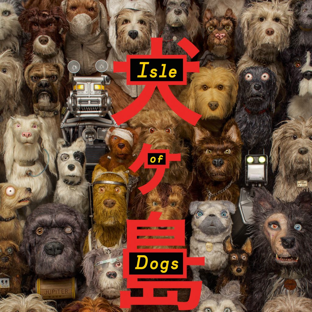
Over the next two years, Dorn immersed herself in this “method,” which involved lots of back and forth with the famously perfectionist director. For example, The Isle of Dogs title, which embeds English letters within Japanese characters, resulted from myriad meetings, Dorn recalls. “Wes was very hands on, right down to the pixel. Sometimes when you finish something you go ‘Did I do that? or was that Wes?’ It might take one try or it might take 25 before Wes decides it’s done.”

Set in a semi-futuristic Japan, Isle of Dogs tells the story of 12-year-old Atari as he searches for his beloved “Spots” on Trash Island, where all dogs have been banished by Megasaki City’s villainous Mayor Kobayashi. Dorn and her team designed a set of dog tags for the mongrels voiced by Bryan Cranston, Bill Murray, Jeff Goldblum, Liev Schreiber and Bob Balaban. “The machine-engraved typography on the dog tags couldn’t be too perfect,” Dorn explains. “We intentionally messed up the spacing and pushed the second S on ‘BOSS’ too far over and a little too high up because we wanted to show the hand-made ness of everything.”
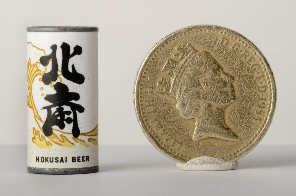
The film’s analog aesthetic, miniaturized to match the film’s 1/4 scale puppets, also incorporates traditional Japanese wood block carvings, Dorn says, “Our illustrator Molly Rosenblatt hand carved portraits of the dogs into wood and Atari and the mayor, printed them with ink onto paper which we colored by hand,. We ended up scanning the images and shrinking them because it’s impossible to deal with woodblock at 20 millimeters. That’s true of a lot of the props in the film. As much as you’d like to create them by hand, there isn’t a pen thin enough.”

The Isle of Dogs aesthetic lifts directly from movies by master Japanese auteurs Akira Kurasowa and Yasujiro Ozu. Dorn says, “We spent a lot of time watching their movies and collecting graphic details. Every time we saw a book shelf or a wallpaper pattern or an arm badge, we’d screen-shot the image and file it. Later, whenever we needed interior details, textiles, things like that, we’d look at the stuff from Kurosawa and Ozu. About half of our references came from those movies.”
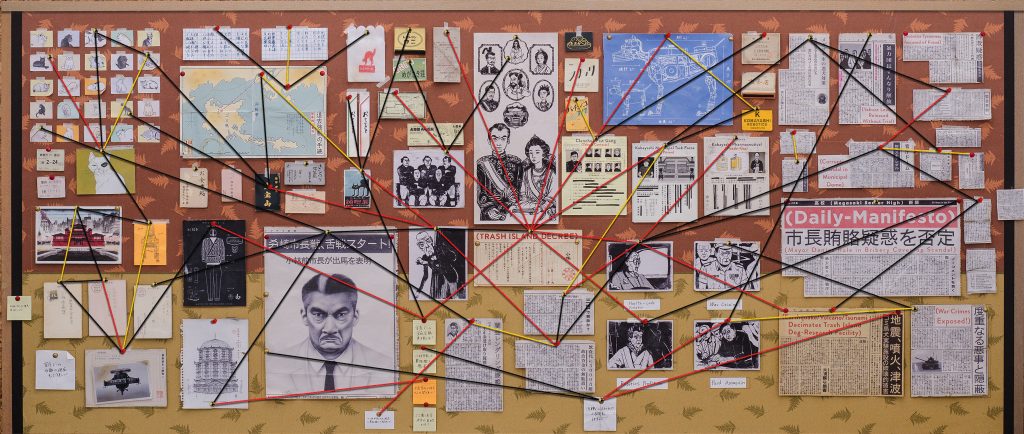
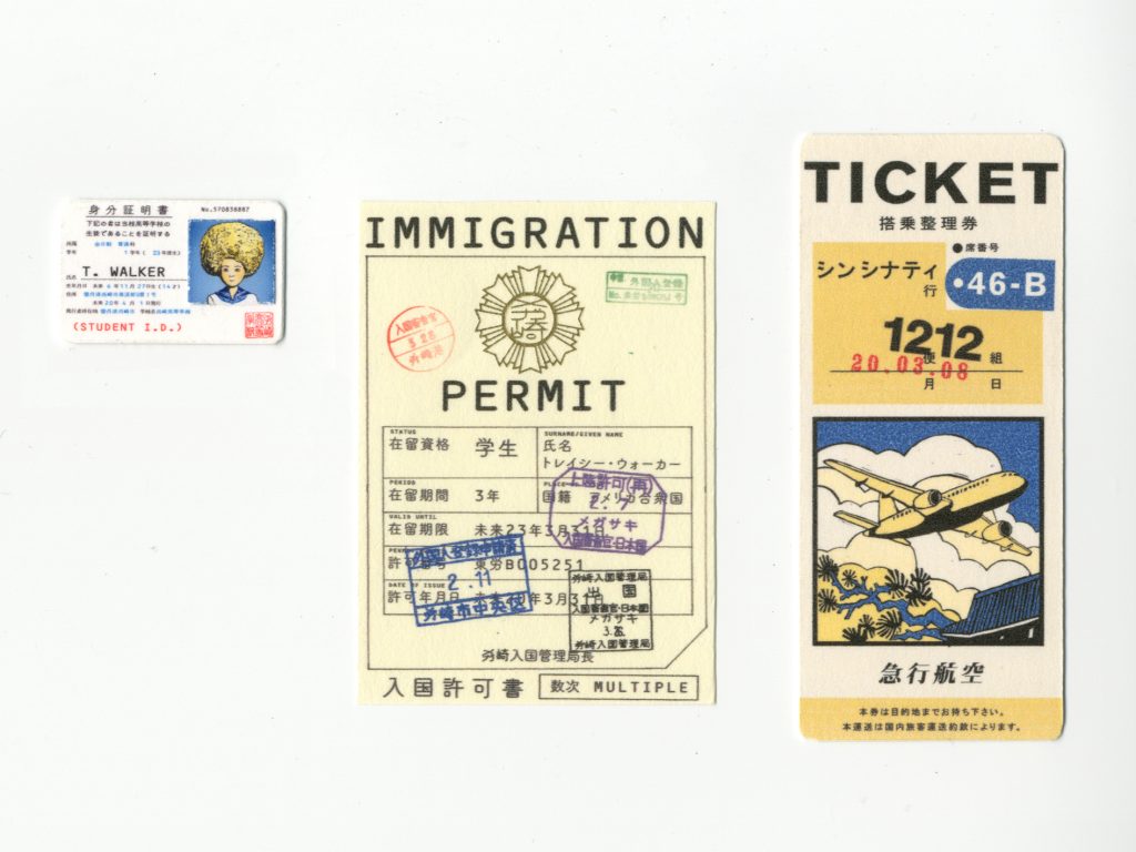
One of the film’s most intense displays of visual detail takes shape on the “evidence board” compiled by American exchange student Tracy (Greta Gerwig) so she can connect the dots behind the dog deportation conspiracy. “We actually wrote all of those articles that were pinned to the wall and made real content for the ID cards and receipts and maps,” Dorn says. “It was all hands on decks with seven of us churning out these pieces.”

Those tiny documents later got crammed into the “Tracy” puppet’s minuscule scrap book decorated with even more minuscule decorative stick-on stars. Dorn says, “It’s almost like Wes had channeled his inner 14 year old girl: ‘Tracy’s this amazing detective but she’s also a teenager with a crush.’ We made the stars with this piece of hobby machinery called a silhouette cutter because they were too small to do by hand. The silhouette cutter was nightmare to use because it never did what you told it to do and was always off by a couple of millimeters.”

Like Anderson’s previous movies, Isle of Dogs features densely layered detail, wry humor and hyper-symmetrical shot compositions. Unlike his earlier films, Isle of Dogs takes place in Japan. That setting has prompted criticisms in some circles that Anderson disrespectfully “appropriated” Japanese culture. Dorn respectfully disagrees. “Wes loves Japanese culture, otherwise he wouldn’t have bothered to hire two Japanese graphic designers to do all of the text in the movie,” she says “Isle of Dogs is sort of Wes’ fantasy version of Japan. He made an authentic Wes Anderson film as opposed to imitating exactly what other filmmakers have done. And from my own perspective as a Japanese person, a movie goer, whatever, I think it’s awesome that our culture is a source of inspiration.”
Featured image: Atari revision by Erica Dorn. Courtesy Erica Dorn/Fox Searchlight.


