Unsane‘s Production Designer & Set Decorator on Perfecting Paranoia
On the surface, the most notable thing about Steven Soderbergh’s Unsane is that the ever-experimental filmmaker captured the frenzied 90-minutes with the assistance of a handful of iPhones, a down and dirty technique that nevertheless gives the film what Soderbergh calls a “velvet” smoothness. It’s a daring choice from an ever evolving filmmaker, but Usane’s greatest strength isn’t all in its technical wizardry. It’s the film’s ability to send any viewer veering off kilter nearly as soon as the action onscreen begins – it’s all unsettling angles, claustrophobic spaces and oppressively dull, eerily faceless interiors, the kind of surroundings that make even sitting in a roomy theater feel uncannily restrictive.

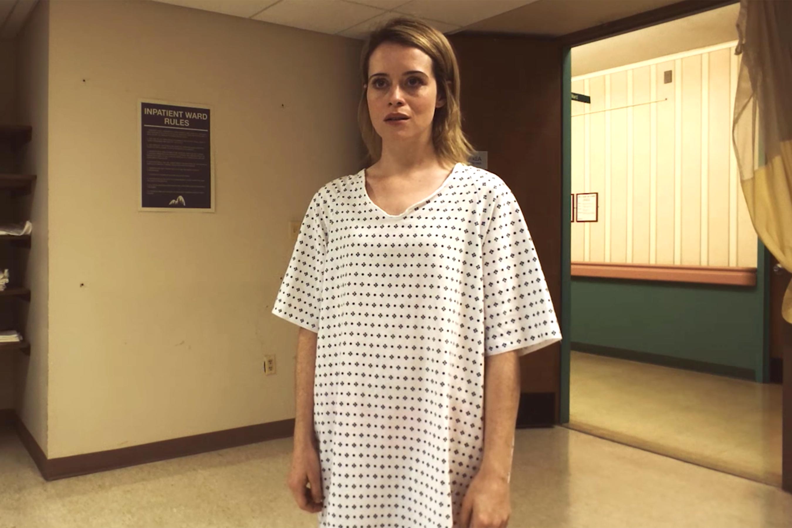
This is the world in which Sawyer Valentini (Claire Foy) lives, complete with the requisite boring job, leering boss and a personal life impeded by years of trauma. But when she seeks help, a casual lunchtime meeting with an available therapist, she finds herself involuntarily committed to a mental hospital for observation. Those 24 hours of observation quickly turn into a week of hell. “We basically wanted to evoke a sterile world disguised as someplace homey,” production designer April Lasky tells The Credits. Lasky and set decorator Kimberly Fisher began to formulate the look of Highland Creek by looking at drug rehabilitation centers and nursing homes, rather than classic institutions. “We didn’t want to create the cliche look of a mental hospital – bars on windows, white walls, things like that. We liked the idea that this place seemed oddly homey, like they wanted you to stay for a while.”
Lasky and Fisher worked with the existing space, a hospital adorned with a wallpaper that fed much of the inspiration for the look of the film. “Kim and I used that for our color palette. Using a lot of pastels, vinyl cushions and hard plastic chairs.” And while he certainly afforded Lasky and Fisher room for creativity, Soderbergh insisted one small tweak that would became key to underlining just how stranded Sawyer really is. “We were thinking the facility should have a sign to identify it as Highland Creek, but Soderbergh said he didn’t want one so that it would be more nondescript.”
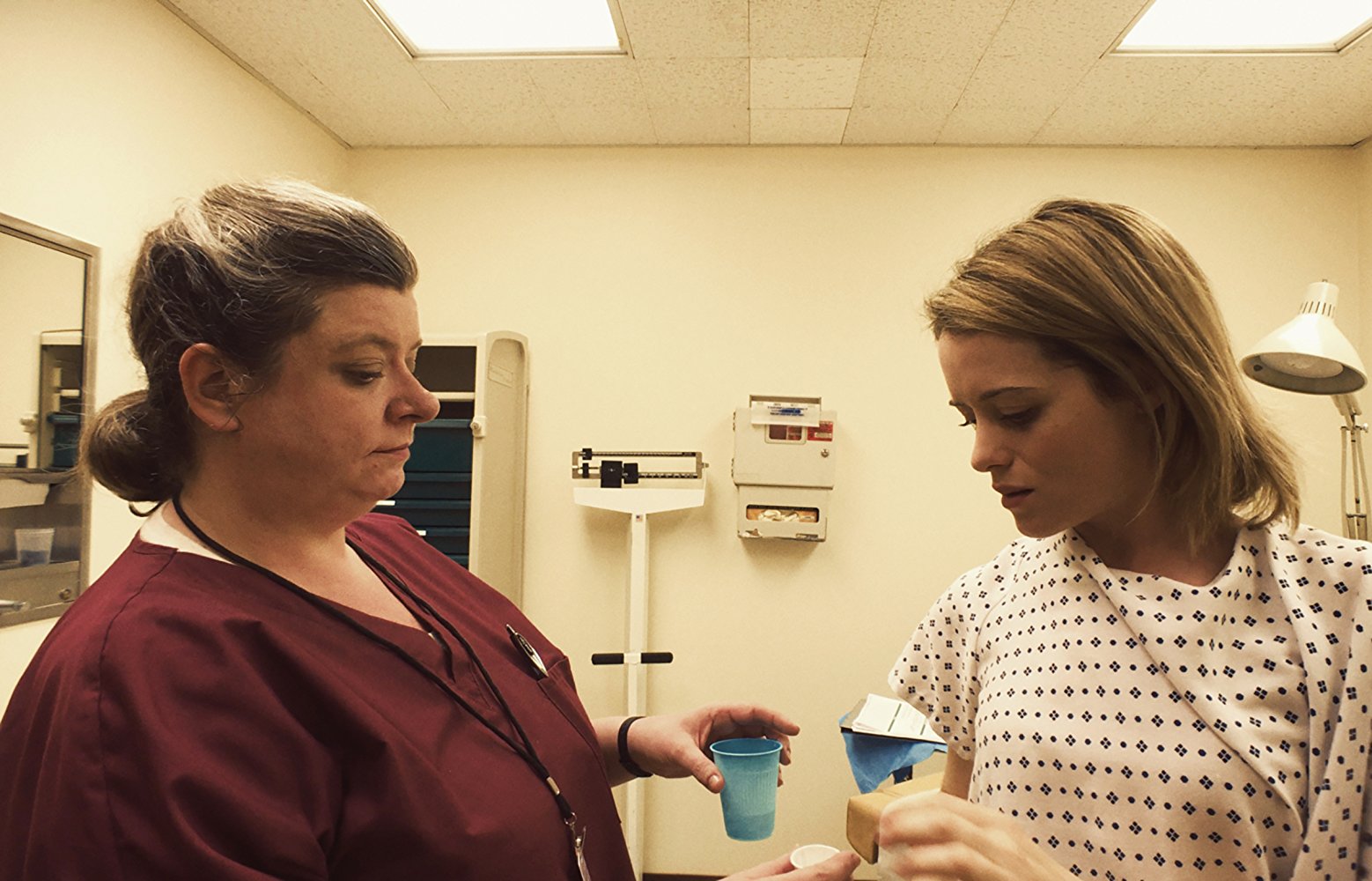
The inspiration for the facility’s interiors wasn’t just sourced from the existing space, and Lasky and Fisher were sure to differentiate the institution from the iconic looks of everything from Grey’s Anatomy to One Flew Over the Cuckoo’s Nest. “There’s a look that most hospitals have, and this wasn’t a super modern hospital. It was an older, creepier, sadder hospital,” Fisher tells The Credits. “Very static. Everything feels like something that hasn’t been changed in years. Just something that got lost in time.”
Even Sawyer’s other spaces, the age-soaked white walls of her office and the personality-free caverns of her apartment help to crystallize her sense of imprisonment even outside of the facility. Lasky stripped the existing office space of any identifying marks to help make her surroundings as bleak as possible. “Offices can have that same sort of empty feeling that an institution might have with white walls and nothing going on of interest,” says Fisher. “Not a ton of variety or things to look at. Everything’s functional. We’re seeing her as this panicked, paranoid, isolated person and that’s sort of her world. No matter where she is, that’s around her, this paranoia.”

The film’s first line, uttered by Sawyer’s terrifyingly possessive stalker, describes his object of affection in blue, as he reminisces about the first time he set eyes on her. But to hear Lasky and April tell it, the color’s persistent presence in the film was as much a happy accident as it was a conscious thematic throughline. “[Blue] is a standard color in hospitals because it’s supposed to be soothing, and that’s kind of the irony is she’s not feeling any of those things in this place,” Fisher says. “And if anything, I don’t think it evokes the feeling of safety in this movie, it’s a scary place and I think a lot of people are freaked out by hospitals.”
Even so, the film’s most impressive set piece, a grueling verbal showdown between Sawyer and her stalker in a padded cell, is the most striking occurrence of the color in the film: a tiny, 9×11 cell padded entirely in inky blue panels. “That room was actually a real solitary confinement room,” Lasky tells The Credits. But to make it even more claustrophobic than the tiny space and crafty cinematography could suggest, Lasky and Fisher made one, impactful tweak to turn the room from a standard padded room to a black box theater of nightmares. “We switched out the padding and added more to the floor to make the entire room covered,” Lasky explains, a decision Fisher says was to make the space even more cramped and imposing.

But for all the intense planning that went into pre-production, once Soderbergh got on set with his iPhone in hand, things moved fast. “He’s just so decisive,” says Fisher. “And especially with the iPhone, on this it was just amazing to watch. He always knows exactly what he wants to shoot and he doesn’t waste any time getting there and I think that’s such an amazing quality as a director.” Even beyond the flexibility of the iPhone, Lasky says Soderbergh hardly used any light setups, preferring instead to shoot with natural light. “That felt odd at first but then I realized it made everything seem like less of a movie and more like real life,” Lasky adds.
Ever efficient, even shooting at breakneck speed (Lasky says they shot 10 pages a day in 12 hours or less) didn’t cause Soderbergh to sacrifice any of his trademark ingenuity. “He just moves so quickly and he’s so decisive,” says Fisher. “Even like little things, like he would use the wheelchair as a dolly. Steven would be sitting in a wheelchair with this iPhone and someone would push him around and he could get a smooth shot like that. That was a really smart thing to do.”
“I just think the script is really scary,” Lasky confesses when asked why she chose to do the project. “It makes you feel even kind of crazy yourself…this is obviously a thing that happens, women get stalked. And very often, people don’t believe women. It just feels very timely, with the #MeToo movement and everything else.” But even after praising the script’s astute observance of the country’s healthcare industry and systematic treatment of women, she’s quick to point out that the script wasn’t the only selling point: “I was going to do it either way. It’s Soderbergh.”
Featured image: Unsane poster. Courtesy Bleecker Street Media.


