Costume Designer Sandy Powell on her Gorgeous Period Pieces in Wonderstruck
Opening this week is Todd Hayne’s film adaptation of the illustrated novel Wonderstruck, the seemingly separate dual tales of two different children who make their way to New York, each taking refuge in the Museum of Natural History, in 1927 and 1977. The book’s author, Brian Selznick, is regarded as a master of magic in a particular written realm that transcends the border between children and adults’ literature; he first met acclaim for the work “The Invention of Hugo Cabret,” which Martin Scorsese adapted into 2011’s Hugo. The director Todd Haynes came to this project, which stars Julianne Moore and Michelle Williams among the adult characters, by way of his long time costume designer, Sandy Powell, who introduced him to the writer (Powell had been the costume designer for Scorsese’s Hugo). We chatted with Powell about coming on board not just as the costume designer (her incredible roster includes Oscar wins for The Young Victoria, The Aviator, and Shakespeare in Love), but as a first-time executive producer, and on designing for Rose and Ben, the film’s young protagonists who respectively pursue absentee, longed-for adults in the wilds of 1920s and 1970s New York City.
This is your first time executive producing a feature as well as leading the costume design. How did you take on this new role?
It came about because I actually read “Wonderstruck,” and I’d met Brian on the set of Hugo, which I did the costumes for. So we met and became friends. I was visiting him one day and picked “Wonderstruck” off his bookshelf, and said, wouldn’t this be a great film. He was having a shot at writing a screenplay, and when that was done, I suggested he show it to Todd. Todd responded immediately, and somehow, miraculously, it also got picked up almost immediately. It was something that kind of just happened, and making it happen was quite thrilling. Actually, it wasn’t that difficult to have an idea and move forward with it.
Given the two distinct eras depicted in the film, one in black and white, one in color, designing for Rose and Ben must have seemed like working on two different movies. How did you approach the process?
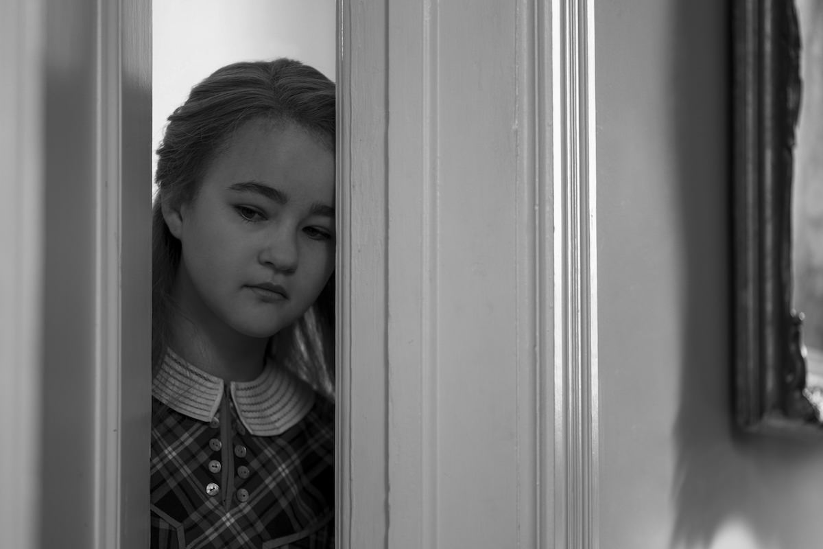
It actually was like working on two different movies. You go with the 70s in one way and approach the 20s in another way. In a way the process was the same, but it really was like two different projects. The concepting and research processes, of course, were the same. And actually whether it was in black and white or color, one still tries different versions of the clothes on the actors. But for [Rose] I had to [imagine] everything in color, in black and white. In the 1920s [scenes], I had no idea how anything would look until we photographed it. At that point I realized that things that work well in color don’t necessarily work in black and white. It meant I had to work a lot more with contrasting tones, textures, and pattern work in black and white. And things that don’t work well in color, like pattern, busy floral, work well in black and white. You’re just dealing with tone, and not dealing with color that’s either clashing with or interrupting the vision. So I’d put together an outfit that looked brilliant in color, but looked really bland in black and white, because they’d come out the same color — different shades of gray. You had to be constantly aware of putting in contrast.

Millicent Simmonds. Courtesy Amazon.

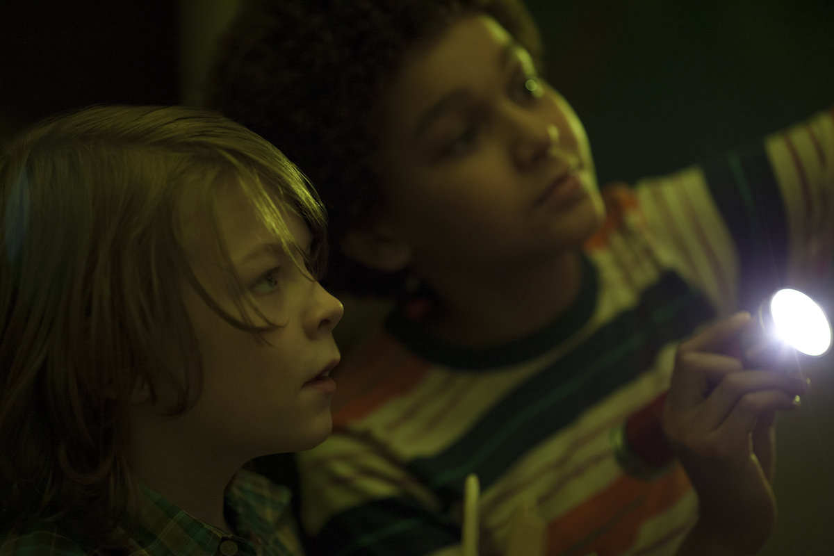
Oakes Fegley and Jaden Michael. Courtesy Amazon.
How much of the costuming was dictated by Brian Selznick’s original book?
Most of it was my own invention, which is interesting because when Brian wrote the book, he had a clear idea of his characters and what they look like. Quite often, he finds models for his projects and uses them as a template for his characters. When it comes to a film, those characters weren’t cast based on his drawings, but whether they were right for the film, for the part Todd wanted them to play. I don’t design costumes until I know who I’m designing for, so I designed for those kids, which is not necessarily what Brian has drawn. It’s the same as the Julianne [Moore] character, he drew her as an archetypal granny character, and we made her a bit edgier, put her in pants. I don’t think Brian particularly takes offense at that.
Since the costumes were then totally original, what kind of research did you do for each role?
The research for both the kids was general. It was a lot of looking at street photography from both periods. The world we were creating was a real one, there was nothing fantastical about it. So we looked at a lot of documentary footage, and films based in reality, not fantasy. So I had images of kids, and I know what kids wore in those periods, but it wasn’t until I had the [actors] in front of me that I knew what worked for them.
This is your fourth time working with director Todd Haynes, after 2015’s Carol. Can you tell us about your ongoing collaboration?
It’s always great to work with the same people more than once, provided you have good relationships. It’s so much easier and more fun when you already have a relationship with someone. There’s a kind of shorthand, and there’s a dialogue that’s already there. Not only are we friends, but I respect his way of working and his vision. He’s so visual and so inspiring, and I know any project he chooses, it’s going to be interesting and different from anything else. It’s going to be exciting, and there’s always a bit of risk — and I find that essential.
Featured image: Millicent Simmonds in Wonderstruck. Courtesy Amazon.


