The Artistry of 007: Bond’s 7 Best Posters
With the highly-anticipated Spectre opening this week, it feels only fair to pay homage to the films (and the Bonds) that came before it. In a franchise where looks are nearly everything, it’s fitting that Bond’s posters have become nearly as important to the look and feel of each outing as his perfectly tailored suit. With 23 films to choose from, the key art for the films runs the gamut from astonishing highs to dismal lows, but just like the best Bond films, when they’re good, they’re in a class of their own.
After the Spectre poster left a strange taste in the mouths of certain discerning fans[1], we’ve collected the best 7 posters from the past 53 years of 007’s exploits with a look at why they work so well. Also, here's the full Spectre poster below—while we don't think it's in the top 7, it's not nearly as disastrous as the Awl would lead you to believe.
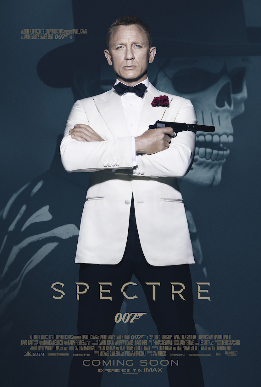
Now, onto the list, which is in no particular order.
From Russia With Love [ Eon Productions, Designed and Illustrated by Renato Fratini and Eric Pulford]
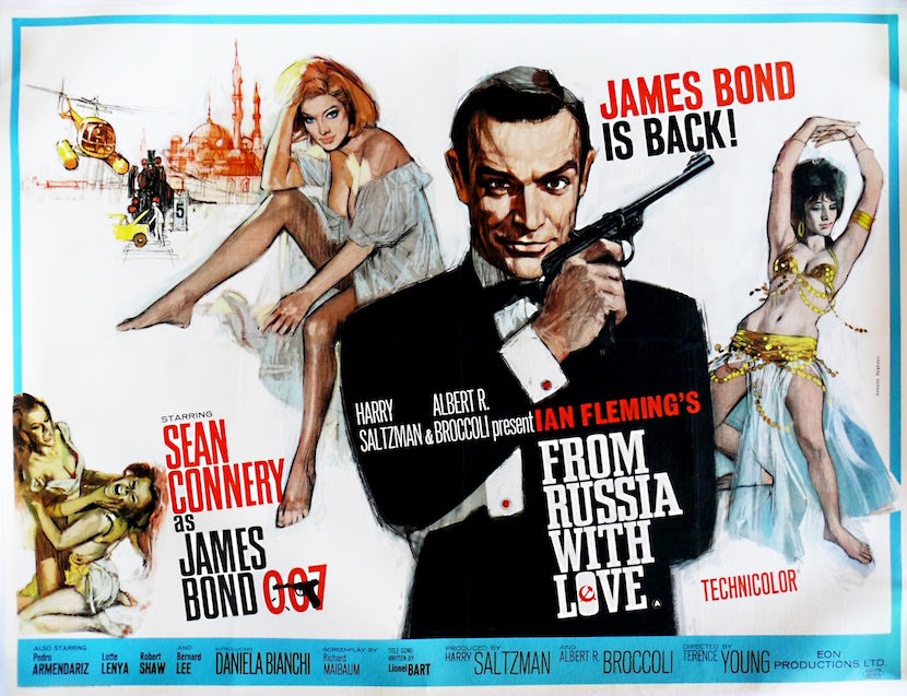
The follow up to Bond’s first outing sees Sean Connery reprising his role as the iconic international spy with smirks and style aplenty. Certainly a step-up from the underwhelming key art of Dr. No, From Russia with Love promises bellydancing, helicopters and lots of beautiful Bond girls. In predictably romantic 007 fashion, Russia finds Bond falling for the wiles of a beautiful woman in order to retrieve a stolen encryption device, but this Cold War thriller has enough chills and action to keep even passing Bond fans entertained. From Russia With Love’s got all of the ingredients of a great Bond film, and a poster that more than fits the bill.
Diamonds are Forever [Eon Productions, Designed by Robert McGinnis]
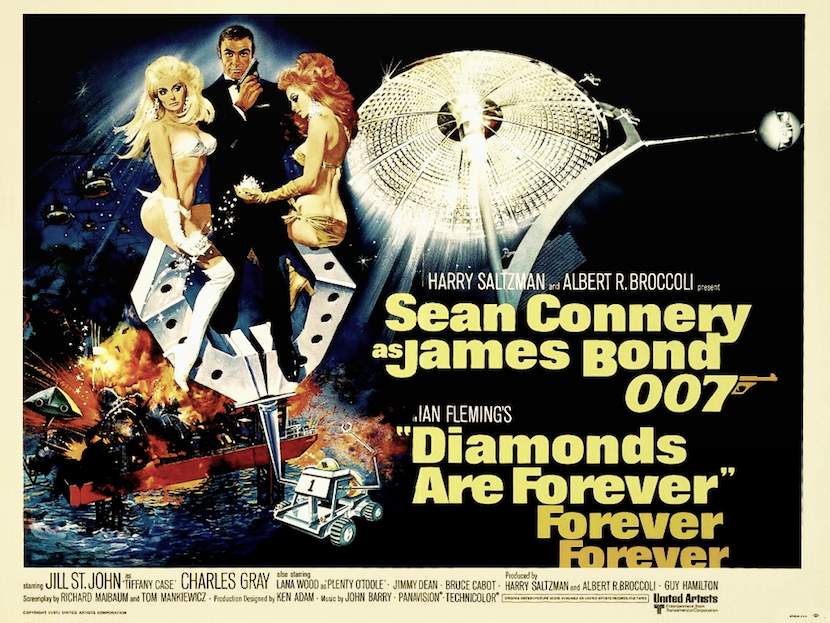
Though Diamonds are Forever is certainly not considered one of Bond’s best, when it comes to ranking posters it’s hard to argue with a giant diamond laser, a tricked out moon buggy and the superfly Tiffany Case as principal Bond Girl. Though the poster’s approximation of Connery’s face leaves a little to be desired, this handpainted beauty is as lovably chaotic as the film itself. One of the first Bond films to purposefully trade in its sense of camp for a humorous payoff, the poster’s in on the joke, teasing a plethora of explosions and piles of precious gems. Like all the best posters, Diamonds are Forever trades in the kinds of things that make a Bond film so enticing, especially those that glitter and burn.
Moonraker [Eon Productions, Designed by Dan Gouzee]
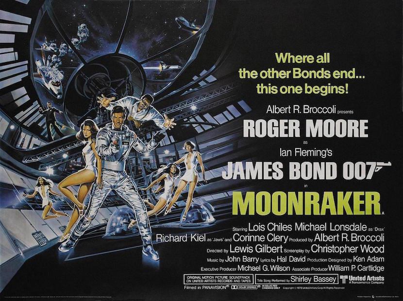
Made in the wake of the Star Wars phenomenon, Moonraker teases more gadgets and less gravity than ever. Possibly one of the most tech-heavy Bonds, the film is as bonkers as you might expect from an outer space outing, featuring relentless attacks by Bond villain Jaws, attempted murder by centrifuge and a laser battle in a space station. Featuring plenty of beautiful women in white and Roger Moore trading his formal suit for one that works a bit better in space, Moonraker’s art shows us the kind of strange Bond exception that kept the franchise feeling fresh and immediate even after Moore tipped past 50.
Octopussy [Eon Productions, Illustrated by Renato Casaro]
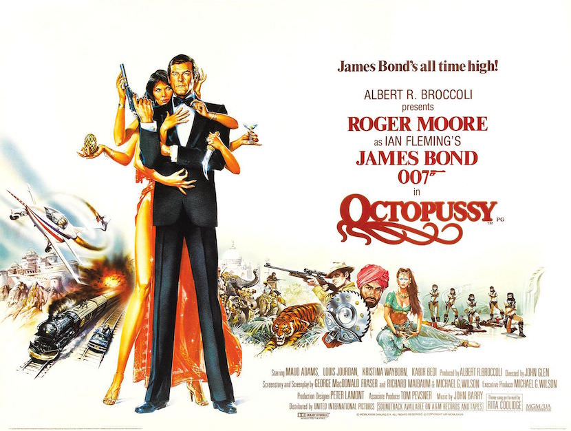
While the idea that Octopussy is any kind of “high” for the series is close to laughable, it’s hard to argue with its poster’s true alluring ridiculousness. When a film begins with the discovery of a dead agent dressed as a clown and toting a Faberge egg, what else could you expect but a little more madness than usual? Fittingly, the art’s got more going on than ever before, with four different sites of action including epic battlefield blows by some Bond beauties and mid-air hand-to-hand contact. And of course, where would Bond be without his dangerous female lover? Octopussy sees Bond teaming up with the titular villainess, whose killer legs and casual cocktail attempt to hide her threateningly glinting dagger.
For Your Eyes Only [Eon Productions, Designed by Bill Gold]
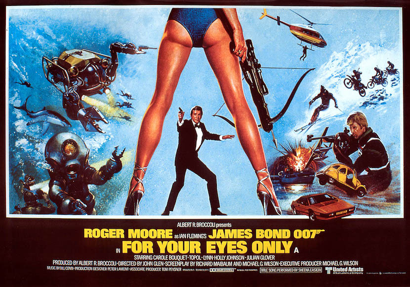
A well-respected and slightly more sober entry in the series, For Your Eyes Only is the great kind of meta-poster that works especially well for a franchise that might otherwise begin to show its age. Featuring a crossbow-toting leggy beauty whose weapon far outweighs Moore’s elegant pistol, we see Bond alone at stance against whatever comes. Which is a lot: Mountain bike chases, helicopter dangling, motorboat explosions and deep sea diving await Moore in his fifth Bond film — finding him more confident and more solitary than ever before.
GoldenEye [Eon Productions, Designed by Terry O’Neill, Keith Hamshere and George Whitear]
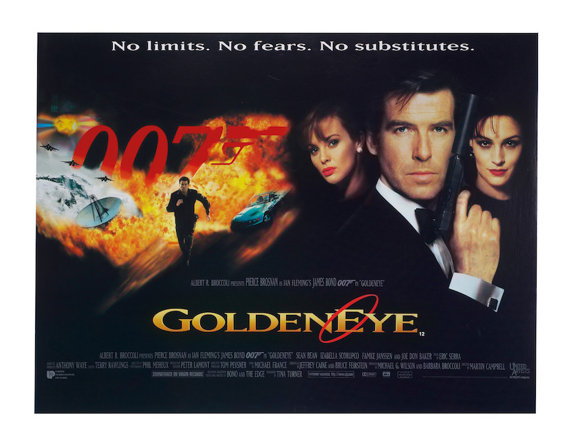
Though the 90s weren’t generally kind to the look of the Bond film, GoldenEye has got enough new tricks while paying homage to the traditions of early Bond to make the list. A wild jump from the late-70s hand-painted work to its over-digitized collage, GoldenEye is the first Bond film to abandon the works of Ian Fleming, seeing a huge shift in what the Bond film can be. Taking place after the dissolution of the Cold War and the series’ six year hiatus, GoldenEye teases a new kind of flashy, gadget-y Bond that serves as a slick look ahead for a series intent on avoiding the mires of its past.
Casino Royale [Eon Productions, Designed by Empire Design]
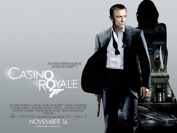
By 2006, the Bond franchise might have been retired for good, considering so much of the series relied on old tropes and social conditions that had long since dissolved. But with the advent of a new, stylish Bond in Daniel Craig and a film that trimmed all the silly gadgetry and showiness of the previous efforts for the franchise, 007 looked fresher than ever. Set out of time, with a new vulnerable and less experienced Bond, Casino Royale’s art acknowledges the history of the series with its debonair flair and devotion to beautiful bond women, while playing with something entirely new, letting Craig loosen his collar and dispatch the old Bond mobile for a revved up Aston Martin.

