Ex Machina Production Designer Mark Digby on Redefining Sci-Fi
Production designer Mark Digby has created believable worlds besieged by young clubbers and virus-mad zombies (24 Hour Party People and 28 Days Later), made the slums of Mumbai a riot of colors and textures (Slumdog Millionaire) and helped translate Kazuo Ishiguro’s haunting novel Never Let Me Go into a sumptuous film. For his last film, Digby turned the future into a believable, beautiful, and as far as science fiction tropes go, counterintuitive world with Ex Machina.
Ex Machina, written and directed by Alex Garland (novelist and writer of 28 Days Later) takes us into the not-too-distant future where a genius billionaire Nathan (Oscar Isaac) has created the world’s first fully sentient artificial intelligence, in the beguiling form of Ava (Alicia Vikander). He invites a low-level employee at his Google-like mega corporation, Caleb (Domhnall Gleeson) to his remote laboratory-home to apply the Turing Test to his creation. Little does Caleb know that Nathan’s designed Ava to appeal specifically to Caleb, and what starts as a field test of his latest invention becomes something much deeper, and potentially dangerous, for all involved.
The look and feel of Ex Machina, of which Digby was a major part, is different from almost any other sci-fi film you’ll see. While we’ve seen sentient robots before and high-tech labs before, we’ve never seen them quite like this. We spoke to Digby about how he went about creating such a visually arresting, but utterly believable world.
Tell us about the early phases of thinking about this project. How did you begin to design it in your head?
In a design sense, the advantage for us that we were a group of filmmakers that had worked with on together for quite a few years. We were comfortable with our collaboration and our honesty. My initial approach to design, but particularly when I’m working with sci-fi or alternative worlds that have more creative license, is I want to keep it real and maintain the integrity and believability.
How do you do that with a film about an sentient robot that is set in a remote estate/laboratory?
The film is set perhaps a few years in the future, if that, but we’re talking about technology or ideas that are not that far away, so we couldn’t go too far away from the norm, from believability, and that’s an important thing for me. The other thing my design team and set decorator (Michelle Day) are conscious of, we try to not be influenced by the language of cinema and popular culture that have previously told us the rules of sci-fi, which are often not based on physics or reality. We tried to brush that aside.
Can you give me some examples?
Sure. Closing doors don’t have to be castellated, the way you’ll see two doors close on Star Trek or Star Wars—they might be big iron doors, and they rarely have a straight edge. We rejected this idea that in the future doors will interlace, like the battlements of a castle. I don’t know why this is, they’re not necessarily stronger like that, they’re weaker (laughs). It’s a lovely design feature, and it looks good, but I haven’t seen many doors built like that. If someone is closing off a circular opening, and they do it often in film, it’s as if the door is the iris of a camera. But very few people build doors like that because it costs so much, and apart from the beauty, why would you spend that much money on beauty when you need to, say, get to space and back?
That makes sense. What other sci-fi elements did you eschew?
We don’t have to use holograms, for example. We don’t have to use technology we’ve never seen before. Hopefully we did a good job marrying the aesthetic with the function. We’ve evolved to see things on screens, and that’s brilliant, but do we need to see a three-dimensional representation of a person to have a conversation with them? No.
What did the story of Ex Machina allow you to do from a design standpoint?
One of the great things for us is we were moving into a world about a man who had large financial resources, so we could push the design elements and tech elements. He had the resources to push those boundaries. Our mantra throughout was about volume control: just push this stuff to the edge of what’s possible, to where people would be saying, ‘Ah, I get it.’ So we tried to think about the evolution of technological things, and the truth is we still haven’t moved from the wheel as the best object to move us on the ground. We might never need to get to hover crafts.
What were some other counterintuitive decisions you made?
Some were script driven, but with that basis, hey, this guy is in the real world, a lot of it is actually character driven. We work out our character, and if he’s this real person, and we ask, ‘What will he be like?’ When we first imagined where a billionaire would live, we imagined a large scale house. We imagined a modernist California building, or post-modern. To some extent we’re still within that range, but the scale is turned down and changed. We reversed that scale, he lives in a small space, actually, It’s pretty cramped, but then again it is only himself and his robots, and his focus is on his projects.
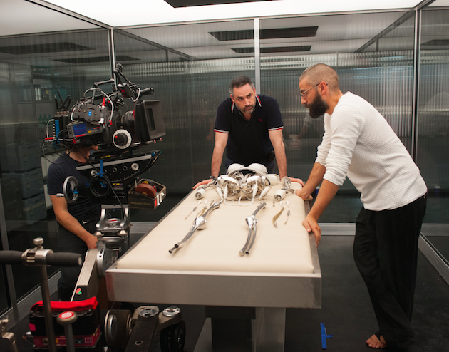
We looked for billionaire places as locations, but we couldn’t get access to many, so we were slightly forced to re-think it. We wondered, ‘What’s another way of showing someone is wealthy, someone who needed security as well?’ His house would be walled, because that’s how you get security.
So what we flipped around to was that another way to get security is you put yourself in a landscape that’s inaccessible and exclusive. The only people who could own that land and build there are people who have wealth beyond our dreams. People like that buy islands, mountains—that’s perhaps a show of wealth and power, but we went against the initial thought of a big old raunchy mansion and you put a wall around it. The security came from being in that isolated, glacial terrain. That was a counterintuitive thought.
The observation lab—we flipped that around from the norm. What you normally do is put the fish in a fishbowl and look into their space. For this film, it’s Caleb, the observer, who sits in the fishbowl and Ava sits outside it. She has the full 360 degrees to walk around us. Normally he’d have a nice room to go and sit in have some tea, and come out and view her and she’d be surrounded by four walls.
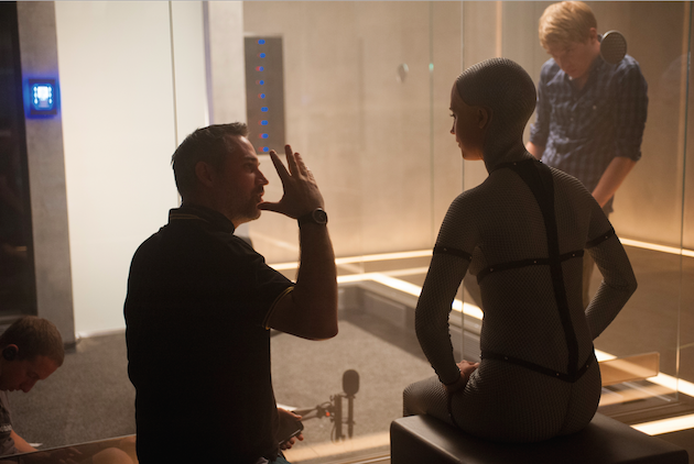
Other elements that were counterintuitive—we could have tried to invent super duper phones, or a physical card for security—instead the card we made transmits a signal that lets him in to the room, just a tiny step forward from what we have now. It’s a key, it’s a lock, currently we use wireless technology, it was just moving that one step forward really.
Here’s a guy whose wealth and resources and knowledge allows him to have whatever he wants. He’s very educated and has great taste in art and history. Many of the pieces in his place are collector’s items—masks from antiquity, they double up and reflect the journey of face, frontage, façade, to what Ava is wearing, which is a mask.
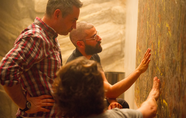
There are other elements that hopefully come across; we wanted to marry the juxtaposition inherent in the central idea that she is man made, but that Caleb is there to wonder if intelligence is necessarily human, and whether she has human intelligence. We didn’t make her fully robotic and we didn’t make her fully skinned, or human, because we constantly wanted to remind the viewer, and Caleb, that as she seduces us and him, she’s still a machine.
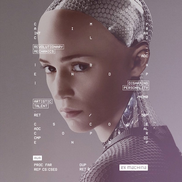
We tried to do that with the structure of the building as well. It’s very much a man made environment—the concrete, the glass, the metal, but it’s set in this immense nature, this immense organic place, and most of the rooms have some form of vegetation in the back. There are living things set against the man made environment. Nature and the organic against the inorganic and man made structure. It allows us some beauty as well.
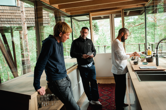
There’s lots of lovely contradictions in the film’s design, and Nathan’s home in particuar. It’s welcoming, and it’s not. Look at the bedroom he gives Caleb—it has no external windows, so it’s a prison. You’re invited into a guy’s mansion, into your own room, it’s pristine and clean and has beautiful lines, but there are no windows [laughs]. Another counter intuitive point about the design was one might lean towards very modernistic future, very hard edges, and I think we headed for mid-20th century design, with a nod towards Scandinavian design, to soften the feel, and it was Nathan’s taste and intellect. He could go for the very obvious, but he likes certain types of furniture. It’s a nod towards modernity, but it’s not the future.

