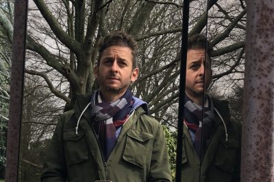
Set Designer Ricardo Guillermo on Creating Meth Labs for Breaking Bad and More
Ricardo Guillermo helped create some of the most iconic sets in recent television history as a set designer on Breaking Bad. Guillermo used his considerable skills as a set designer to help fashion Walter White’s various meth labs, Saul Goodman’s ridiculous/awesome office, Walter, Skylar and Walt Jr.'s house and many other sets on that groundbreaking show.
Guillermo is no stranger to the big screen, either, having worked on The Book of Eli, The Lone Ranger, and We’re The Millers. We spoke with Guillermo about his work.
How did you learn how to draw?
I started drawing before kindergarten as a form of entertainment. Besides art classes, I studied architectural drafting and mechanical drawing in high school and I always drew for fun.
Did you study this in college?
My education continued throughout seven years of college, drawing architectural projects, historical analysis and also through years of life studies and weekly assignments, including drawings from the masters. Da Vinci provides a great balance of art and technology with his studies of the human body that I struggle to recreate.
Tell me a bit about how you got into the film industry.
My friend Mary Holyoke, a set decorator buyer, recommended I contact her friend, Marisa Franz, the art director on Season two of Breaking Bad. It took months of persistent calls to Marisa before finally getting to show her some of my architectural drawings. Timing and good luck were in force as I got a call a few days later to start on Breaking Bad, and I assisted on the set design for Jesse’s apartment. A few days later I accepted the position of lead set designer on Breaking Bad and was assigned the design of Saul Goodman’s office. That was my first set design for TV. After completion of Season two, W. Gilpin, our construction coordinator, recommended me to start on The Book of Eli and that was my first set design for film.
What was it like working on Breaking Bad? The attention to detail on that show was so fantastic—how did you go about designing those iconic sets, especially the meth labs, the White’s home, etc?
It was the start of a very happy time working on Breaking Bad. It was a matter of staying loose and not getting bogged down on knowing what was coming next. The scripts started out brilliant, and with amendments they kept getting better. It was rapid paced. Conceptual changes happened quickly for the sets for each episode, and so I would never now what I would be working on the next day or even from hour to hour. Priorities were constantly shifting and sets often got scrapped. Envisioning the production designer and art director’s concepts and revealing those concepts for the first time were always driven by urgency.
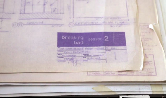
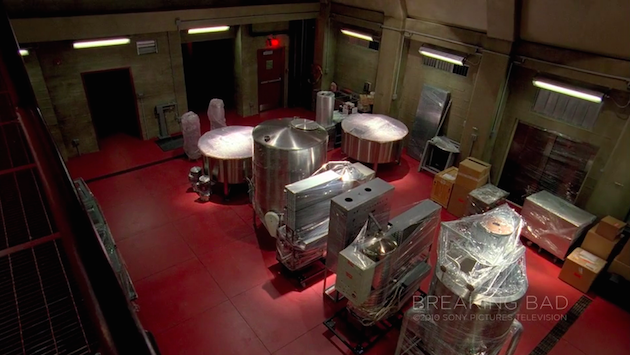
The Super Lab set floor, ceiling and walls, for example, were built in about two weeks and stocked with equipment still in protective shipping wrappers. The script fit the reality that it takes time to gather all the equipment for a lab. Over time, specific lighting, air supply, exhaust, conduit and piping and a new floor were added, as were ancillary rooms. The cinematography limits the parts of what the audience sees over time so a break room or an elevator that were not on stage the week before finally make an appearance as if they were always there.
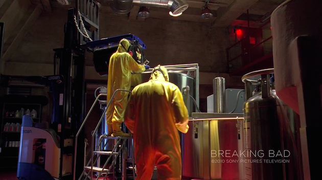
As an aside, to the credit of the amazing work of the welders, carpenters, plasterers, painters and the rest of the construction crew’s technical ability and artistry, a structural engineer was called in to assess the bearing capacity of the lab’s freshly built metal grate entry mezzanine. A board formed a concrete shell, like an underground bunker, that enclosed the set. He was on the set for over ten minutes when I heard him exclaim, “I thought this was real concrete!”
It all sounds like an astonishing attention to detail.
The attention to detail is rooted in Vince Gilligan’s awareness of everything that is going into the story and what will appear on film via sound and light. To some degree that level of awareness flows down through all the departments and all the crew, but the writers and the production team initiate it at the high level.The White’s house was also a set that grew through time, amending and extending the set exteriors, the hot water heater room, crawl space and garage interior, all of it was script driven.
Has there been a moment in your years in the industry that qualifies as the one that gave you the chills the most? Seeing something you designed and how an actor interacted with it, used it?
If by chills one means something extraordinary, that would happen every time I completed a drawing and production designer Robb Wilson King would appear with his immense energy from wherever he had been, wheeling over to the drafting table to see the latest set fully drawn, completed a second or two before. There was an intuitive link that would bring him there at that moment and he would declare, ‘Wizard!”
I am very rarely on set during filming, but I heard second hand how Bryan Cranston had commended all involved in the creation of the Super Lab when they started shooting on it. I learned from Bryan that making sets slightly larger is preferable to smaller, to get the crew into the space without crowding the actors. I believe that authenticity in the set design leads to a better performance by the actors. They need not stretch as much to arrive at a sense of authenticity in their performance if the set is believable.
In the last two years, you’ve done The Lone Ranger, We’re the Millers and Transcendence, all totally different films—how do you modify your approach, if at all, to these very different films?
I’m always modifying my approach in response to the production designer, the art director and the script. Often, there are tone boards, collages of images created by the pre-production team to convey the look and feel of a set using historical references or original illustrations. My job is to manifest their vision so the sets can be built.
What advice would you give to hopeful set designers out there? What do you wish you knew when you started?
I would advise the hopeful to be persistent and to stay loose and selfless in regard to ownership. Show up, be accurate and be quick. Set design is a collaborative process and one needs to strive to develop clear communication of your understanding of the unique script driven vision needing to be conveyed by the art department to the construction crew.
Do you have a favorite tool? A favorite type of pen?
I draw primarily with Tombow hi-precision drafting pencils on vellum. I use mostly the 2H pencil, with 4H for initial layout and dimension lines and B or 2B for definition of the “air-line” the line separating a surface from the air around it and also as a base for any shading. My favorite tool is the proportional divider.
Do you have any dream project you’d love to work, a specific director or a specific art director?
I never know what the next project will be and remain open to what the universe provides for opportunities. Being earnest, staying positive, having gratitude and loving what I do are all key and have worked for me.

